Zahab Jewellers – Logo Design & Branding
About
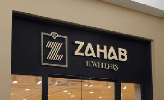
Zahab Jewellers is a prestigious jewelry brand based in Himmatnagar, Gujarat, known for its exquisite gold jewelry collection. The name “Zahab” derives from Arabic and Persian, meaning “gold” or “golden,” symbolizing luxury, opulence, and timeless beauty. The goal was to create a logo and brand identity that reflects the brand’s commitment to quality, sophistication, and elegance.
SCOPE
Logo Design
Branding
Identity
Culture Concept
INDUSTRY
Jewellers
CHALLENGES
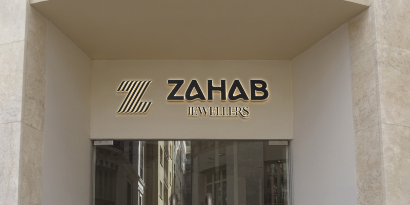
Typography - Elegant and Classic The typography chosen for "Zahab Jewellers" is classic and refined, complementing the logo icon. The font style aligns with the brand’s luxurious appeal, enhancing readability and professionalism while maintaining a high-end feel. Interior and Visual Branding Alignment The store’s interior design was planned to harmonize with the brand’s identity. With plush furnishings, ambient lighting, and secure display cases, the in-store experience embodies the elegance and comfort of Zahab Jewellers. Every visual element reflects the brand’s attention to detail, quality, and customer experience.
- Balancing Tradition with Modern Elegance: Developing a logo that feels contemporary yet honors the traditional cultural value associated with gold.
- Symbolizing Luxury and Stability: Representing both opulence and reliability to establish trust with customers seeking high-quality, valuable jewelry.
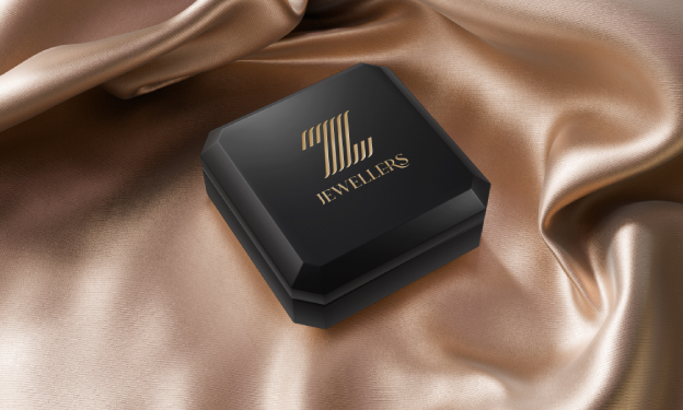
- Ensuring Brand Versatility: Creating a logo that maintains its elegance across various mediums, including store interiors, digital platforms, and packaging.
- Captures the Essence of Luxury: Symbolize the high quality and premium nature of Zahab’s gold jewelry.
Design Solution
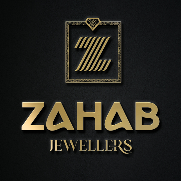
Logo Concept - "Z" and "J" within a Geometric Frame The logo design combines the initials "Z" and "J" within a refined geometric frame, symbolizing balance, harmony, and structure. The structured frame and the interlocking letters emphasize Zahab’s dedication to quality and craftsmanship, while the geometric form adds a modern touch, making the logo feel both elegant and grounded. Symbolism of Gold and Opulence The name "Zahab" directly translates to "gold," and the logo's form and design reinforce this association with a luxurious yet tasteful aesthetic.
IDENTITY,
The objective for Zahab Jewellers was to develop a brand identity
Captures the Essence of Luxury
Symbolize the high quality and premium nature of Zahab’s gold jewelry.
Reflects Brand Heritage and Prestige
Emphasize the cultural and linguistic roots of “Zahab” to connect with the traditional value of gold in the region.
Creates a Memorable and Iconic Logo
Design a logo that resonates with modern luxury while remaining timeless.
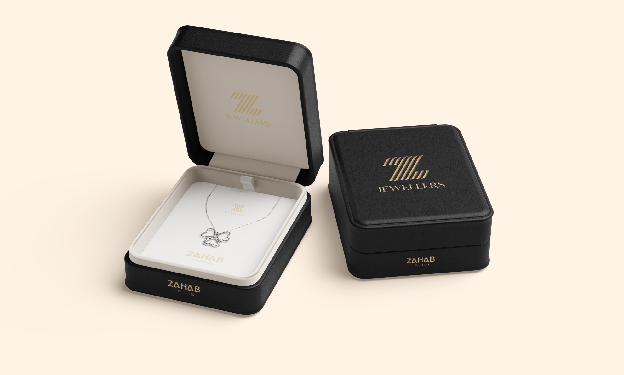
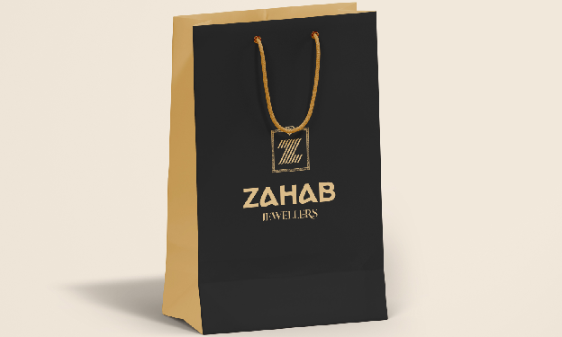
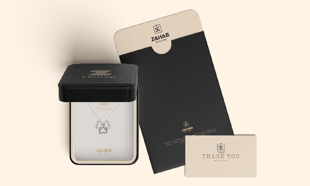
The store’s interior design was planned to harmonize with the brand’s identity. With plush furnishings, ambient lighting, and secure display cases, the in-store experience embodies the elegance and comfort of Zahab Jewellers. Every visual element reflects the brand’s attention to detail, quality, and customer experience.
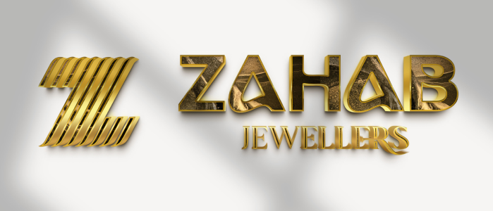
Results and Impact
Enhanced Brand Identity and Recognition: The logo and branding have created a strong, memorable identity for Zahab Jewellers, positioning the brand as a trusted name in luxury jewelry in Gujarat.
Customer Trust and Loyalty: The sophisticated branding and store environment have helped Zahab build a reputation for quality, reliability, and elegance, fostering customer loyalty and trust.
Consistency Across Mediums: Zahab’s logo and branding elements are versatile, translating seamlessly from digital platforms to in-store displays, packaging, and promotional materials, ensuring brand consistency.