Neemsi Restaurant: Branding & Identity

About
Neemsi is a vegetarian restaurant with a unique culinary philosophy rooted in natural, organic, and health-focused dining. The goal was to create a brand identity that reflects the restaurant’s dedication to nature, quality ingredients, and culinary excellence, using the symbolic elements of Neem and Tulsi as key inspirations.
SCOPE
Logo Design
Branding
Identity
Culture Concept
INDUSTRY
Restaurant

Logo Philosophy
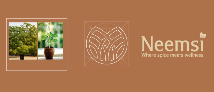
The Neemsi logo captures the essence of a vegetarian restaurant, seamlessly blending the natural elements of Neem and Tulsi. The color palette, featuring vibrant greens and earthy tones, evokes a sense of freshness, health, and organic goodness. The chosen font strikes a balance between modernity and sophistication, ensuring both readability and a distinctive brand personality. The stylized fusion of Neem and Tulsi leaves serves as a central icon, symbolizing the delightful union of flavors and the restaurant's dedication to nature.
- Incorporating Natural Elements Without Complexity: Balancing the visual presence of Neem and Tulsi leaves to ensure a clean, modern look without overwhelming detail.
- Balancing Modernity and Tradition: Designing a logo that feels both contemporary and rooted in nature, appealing to health-conscious, urban customers.
- Ensuring Versatility: Creating a logo that would be adaptable across various mediums, from digital platforms to signage and printed materials.
Design Solution
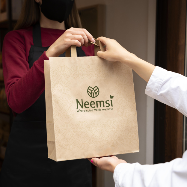
Icon Design - Fusion of Neem and Tulsi Leaves The central icon in the logo is a stylized fusion of Neem and Tulsi leaves, representing the core ingredients associated with health and vitality. This fusion serves as a symbolic representation of the flavors and nutritional values that Neemsi brings to its customers, merging the two plants’ distinct shapes in a harmonious and visually appealing way. Color Palette - Vibrant Greens and Earthy Tones The color palette features vibrant greens, representing freshness and organic goodness, paired with earthy tones that evoke a sense of grounding and warmth. This choice reinforces the restaurant's connection to natural ingredients and vegetarian principles, creating an inviting and appetizing aesthetic.
Objective,
The objective for the Neemsi logo was to design a visually captivating and versatile brand identity that would:
Reflect Freshness and Health Showcase the restaurant’s commitment to organic and natural ingredients.
Emphasize Vegetarian Principles Symbolize a dedication to vegetarianism through the brand’s visual elements.
Create a Distinctive Brand Personality Stand out in the competitive restaurant market with a unique, memorable logo that speaks to Neemsi’s ethos.
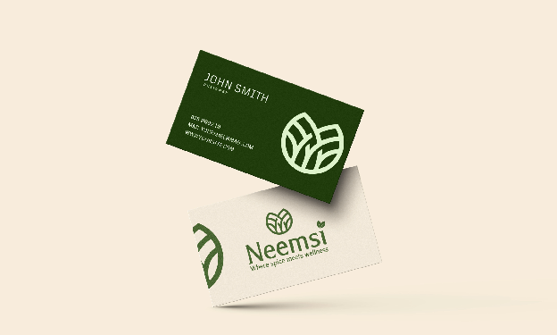
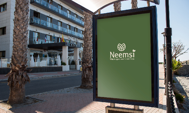
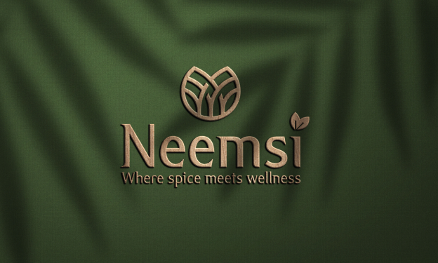
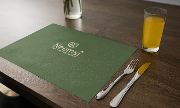
The Neemsi logo captures the essence of a vegetarian restaurant, seamlessly blending the natural elements of Neem and Tulsi. The color palette, featuring vibrant greens and earthy tones, evokes a sense of freshness, health, and organic goodness. The chosen font strikes a balance between modernity and sophistication, ensuring both readability and a distinctive brand personality. The stylized fusion of Neem and Tulsi leaves serves as a central icon, symbolizing the delightful union of flavors and the restaurant’s dedication to nature. Subtle elements within the design nod to the establishment’s ethos, while a carefully crafted tagline reinforces the commitment to vegetarian principles and the unique blend of ingredients.
Results and Impact
Enhanced Brand Recognition The Neemsi logo has successfully captured attention in the market, helping the brand to stand out with a unique visual identity rooted in health and nature.
Attracting Health-Conscious Audiences The health-oriented design has resonated strongly with the target audience, drawing health-conscious diners who appreciate Neemsi’s commitment to quality and wellness.
Consistent Brand Identity Across Mediums The versatility of the logo has allowed Neemsi to create a cohesive brand experience, enhancing its recognition across various mediums, from print to digital.