The Curen – Nutraceutical dietary supplement for Holistic Wellness
About
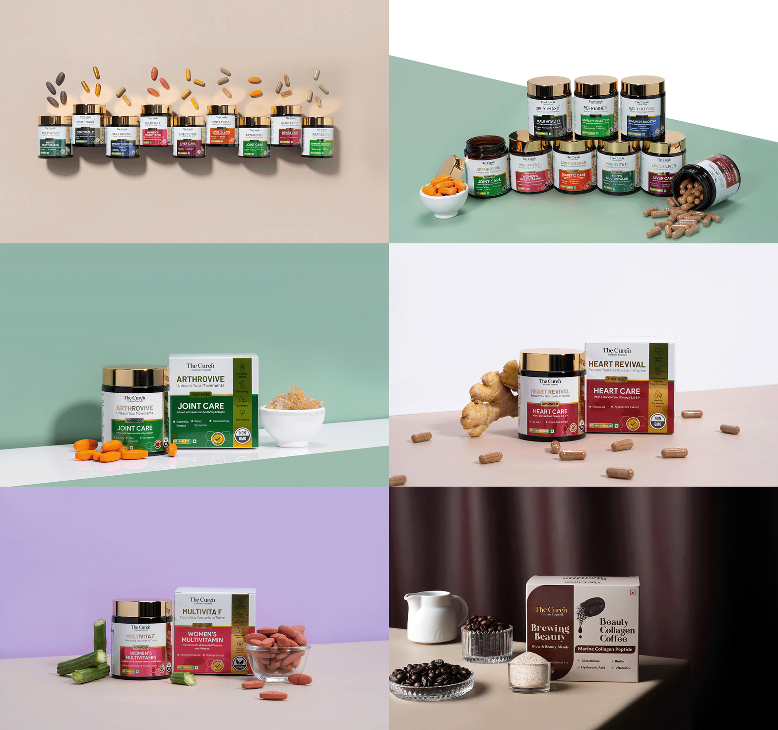
As a Brand Designer and Consultant for The Curen, I was entrusted with crafting a brand identity that would resonate with health-conscious consumers seeking effective, safe, and nature-inspired nutraceuticals. The Curen combines the potency of botanicals, vitamins, minerals, and bioactive compounds to support wellness. This project aimed to communicate its scientific precision and natural origins through a cohesive brand experience, from logo and packaging to digital presence and educational content.
SCOPE
Branding
Packaging Design
Website
Photography
INDUSTRY
Nutraceutical Dietary Supplement
Brand Strategy and Positioning
The goal was to position The Curen as a trusted nutraceutical brand that integrates the best of nature and science. Our strategy focused on three key areas:
- Establishing Authority Nutraceuticals is a competitive market, and The Curen needed to establish its authority as a science-backed and trustworthy brand.
- Balancing Nature with Science Finding the right balance between a natural aesthetic and a modern, science-driven appeal to attract a broad audience.
- Communicating Complex Information Translating technical product details into accessible, consumer-friendly messaging.
- Building Consumer Confidence Ensuring transparency to build trust with a target market that is increasingly concerned with product efficacy and safety.
Solution
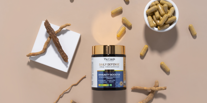
Trust and Transparency: Building a brand narrative that emphasizes ingredient purity, product safety, and scientific rigor. Science Meets Nature: Highlighting the fusion of traditional botanicals with advanced scientific formulations to convey The Curen’s unique selling point. Consumer Education: Developing an approachable brand voice to inform and engage a health-conscious audience, fostering brand loyalty and advocacy.
Visual Identity and Brand Elements,
The visual identity for The Curen was crafted to capture the essence of natural wellness with a modern, scientific edge.
Logo and Brand Colors
The logo incorporates clean, minimalist typography, with an emblem symbolizing the fusion of nature and science. A palette of greens and neutrals represents the brand’s natural side, while deep blue and silver tones signify scientific credibility and professionalism.
Packaging Design
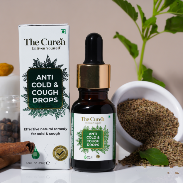
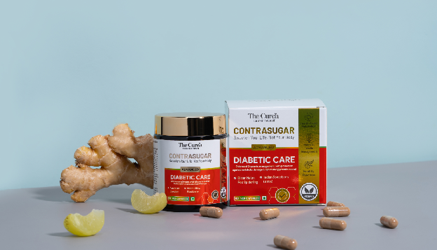
Packaging was designed to be sleek and informative. Each product label features botanical illustrations, drawing attention to the natural ingredients, alongside clear, legible text that highlights each product’s benefits and usage.
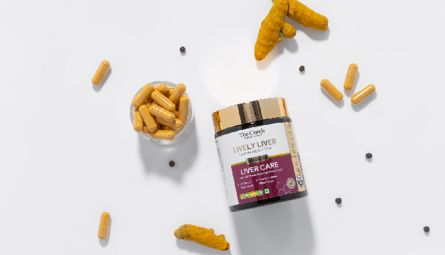
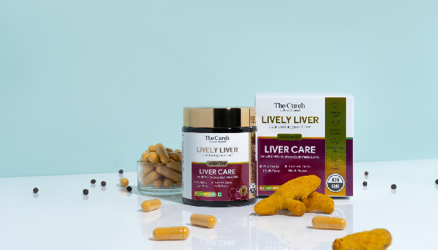
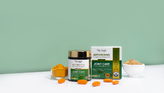
Digital and Print Assets Digital assets, including social media templates, infographics, and website banners, were designed to maintain a consistent, science-inspired look. Infographics were created to simplify complex information about the benefits and ingredients of each product.
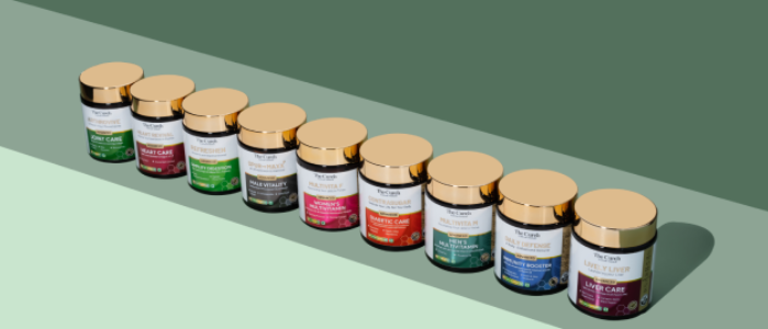
Consulting Approach
As a Brand Consultant, my role was to guide The Curen in aligning business objectives with brand values, ensuring that each element of the brand resonated with its audience
Market Research and Consumer Insights Conducted thorough market research to identify consumer preferences, competitors, and trends, informing the brand’s visual and messaging strategy.
Product Development Consulting Provided feedback on product formulation and packaging to ensure alignment with The Curen‘s brand promise of safe, effective, and natural wellness solutions.