Earth Oud – Perfume & Fragrance
About
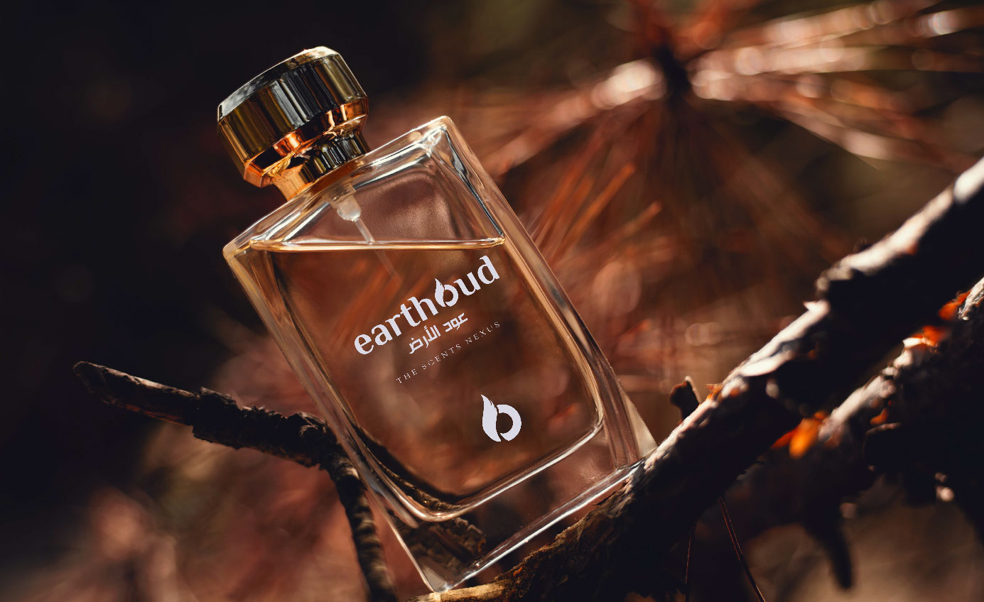
Earth Oud is a premium fragrance brand inspired by the rich and mysterious scent of oud, derived from the ancient Aquilaria Malaccensis tree. Known as “liquid gold” in the world of fragrances, oud is a rare and highly coveted resin that forms within agarwood trees over decades. Earth Oud aims to embody the essence of this luxury scent in a refined and memorable brand identity, catering to connoisseurs of exclusive fragrances.
SCOPE
Logo Design
Branding
INDUSTRY
Luxury Perfume
Objective
- Reflect the Essence of Oud Capture the ancient, exotic, and luxurious qualities of oud wood within a modern, sophisticated logo.
- Create a Symbol of Elegance and Exclusivity Design a visual identity that is both memorable and evokes the premium nature of the product.
- Develop a Distinct Brand Narrative Formulate a brand story that enhances the appeal of Earth Oud’s connection to the age-old tradition and mystery of oud.
Logo Design Solution
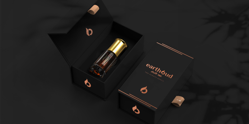
Concept and Evolution From the initial sketches, I explored multiple directions, focusing on a symbol that represents the essence of oud. After testing various options, I moved forward with a combination of a symbol and wordmark. This approach integrated the cultural and natural origins of oud while maintaining the modernity required for a luxury fragrance brand. The Symbol The final logo incorporates an abstract representation of the oud wood grain, suggesting the natural source and intricacy of the fragrance’s origin. This subtle yet striking symbol captures the heart of Earth Oud’s identity—a brand deeply connected to nature, age-old traditions, and the luxury experience of oud. The symbol is paired with elegant serif typography, reflecting the brand’s exclusivity.

Visual Identity and Brand Application,
The color palette is inspired by the natural tones of agarwood, incorporating deep earthy browns, rich golds, and dark ebony hues. These colors communicate warmth, richness, and a grounded elegance that aligns with Earth Oud’s identity as a brand rooted in nature and heritage. The typography, chosen for its refined and timeless quality, complements the logo’s intricate symbol while ensuring readability.
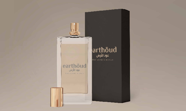
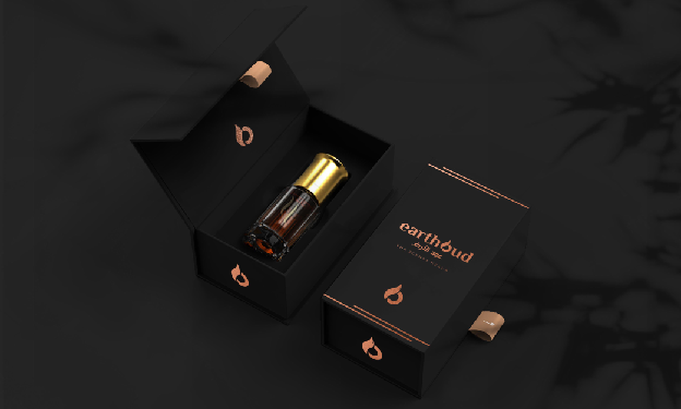
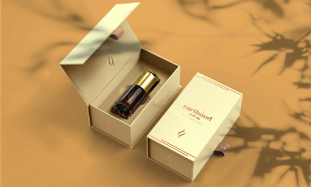
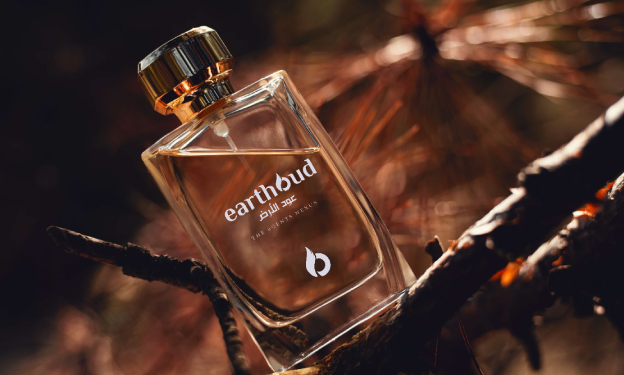
The Earth Oud case study exemplifies how a thoughtful approach to brand identity can encapsulate the essence of a product. The logo design for Earth Oud, based on a deep understanding of oud’s heritage and value, has not only created a recognizable identity but has also positioned Earth Oud as a luxury fragrance brand with authenticity and allure. The end result is a visually captivating and emotionally resonant brand that celebrates the unique beauty and mystique of oud.
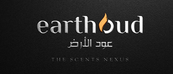
Implementation and Customer Perception
From its packaging to digital and in-store visuals, Earth Oud’s brand identity is cohesive and impactful. The logo’s design carries a sense of tradition and mystery, appealing to customers who value heritage and exclusivity in their fragrance choices. Through Earth Oud’s story, the logo becomes a reminder of the meticulous craftsmanship and deep respect for the natural elements that go into every bottle.