First Steps – Pediatric & Lactation Care Logo Design & Branding
About
First Steps is a pediatric and lactation care clinic founded by Dr. Shagun Shah, a highly trained specialist with experience from prestigious institutions in Mumbai and England. Dedicated to nurturing children’s health from infancy to adolescence, First Steps also offers essential lactation support to new mothers. The clinic’s mission is to provide complete, compassionate care, creating an environment where both parents and children feel supported and valued. Our task was to create a logo and brand identity that reflected First Steps’ dedication to nurturing, professional care and the important milestones in a child’s journey.
SCOPE
Logo Design
Branding
Identity
Culture Concept
INDUSTRY
Clinic | Paediatric & Lactation Care

CHALLENGES
Embodying Early Development Symbolizing the first steps of life, not only for children but also for mothers receiving lactation support, highlighting the clinic’s dedication to foundational stages of health.
- Combining Pediatrics and Lactation in One Logo The logo needed to represent both pediatric care for children and lactation support for mothers in a way that was cohesive and meaningful.
- Balancing Professionalism with Warmth While the logo had to look professional, it also needed a friendly, nurturing touch to reflect the gentle care provided at the clinic.
- Making It Memorable and Inviting The brand identity had to stand out in the medical and childcare sector, while also being approachable for families.
Design Solution
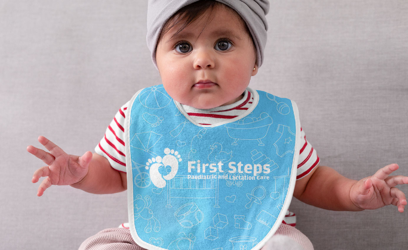
Logo Concept - Two Footprints Forming a Heart The central element of the logo is two footprints arranged to form a heart shape, representing a child’s first steps and the initial phase of their life journey. The footprints symbolize innocence and growth, while the heart shape conveys love, care, and compassion. This design visually encapsulates the clinic’s dual mission supporting children through every step of development and providing care for new mothers. Color Palette - Dark Blue, Sky Blue, and Cyan Green The carefully selected color scheme reinforces the clinic's core values and vision Dark Blue Signifies trust, reliability, and professionalism, important qualities for any healthcare provider.

IDENTITY,
Additional Brand Assets
Additional icons and design elements were created for First Steps’ digital and printed materials, including business cards, brochures, and signage. These elements were designed to carry forward the heart and footprint motif, providing a consistent visual identity across all platforms.

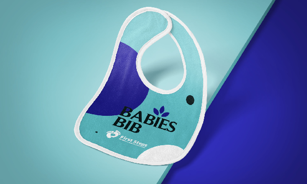

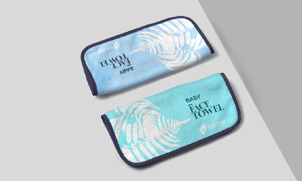
The tagline encapsulates First Steps’ mission, emphasizing the clinic’s role in supporting both children and mothers through essential milestones. This tagline is featured across various brand assets, reinforcing the clinic’s commitment to nurturing early development.

Results and Impact
Strong Emotional Connection The footprint-heart symbol creates an emotional appeal, resonating with parents who want nurturing care for their children. This imagery successfully communicates First Steps’ compassionate approach to healthcare.
Increased Brand Recognition The unique combination of colors and heart-shaped footprints has made the First Steps logo memorable, helping it stand out in the pediatric and lactation care industry.