ZAP Travel & Tourism – Logo Design & Branding
About
ZAP Travel & Tourism is an innovative travel agency based in Saudi Arabia, specializing in both leisure and corporate travel. The brand’s vision is to offer highly personalized, stress-free travel experiences that cater to the individual needs of each traveler. With services spanning flight bookings, accommodations, transportation, tours, and travel insurance, ZAP Travel is dedicated to creating seamless and memorable journeys. Our objective was to craft a brand identity that captures the spirit of adventure, freedom, and innovation that ZAP Travel stands for, while also appealing to a diverse audience.
SCOPE
Logo Design
Branding
Identity
Culture Concept
INDUSTRY
Travel & Tourism - Saudi Arabia
CHALLENGES
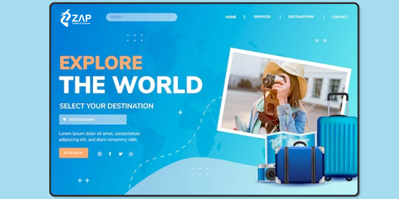
The branding objectives for ZAP Travel & Tourism included: Establishing a Unique Identity Creating a logo that embodies the brand’s core values and makes ZAP instantly recognizable in the competitive travel and tourism industry.
- Balancing Corporate and Leisure Appeal: ZAP’s target audience includes both business and leisure travelers, requiring a design that speaks to professionalism as well as a spirit of adventure.
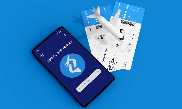
- Creating a Memorable Icon: With many competitors in the travel sector, the logo needed to be instantly recognizable and memorable, even when seen in small formats, like mobile apps and travel tags.
- Cultural Relevance: The design had to resonate with the Saudi Arabian market while appealing to international travelers, ensuring a balanced cultural and global appeal.
Design Solution
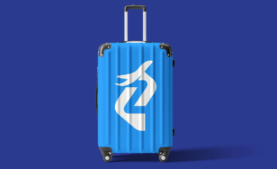
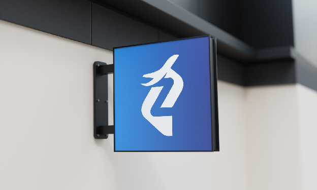
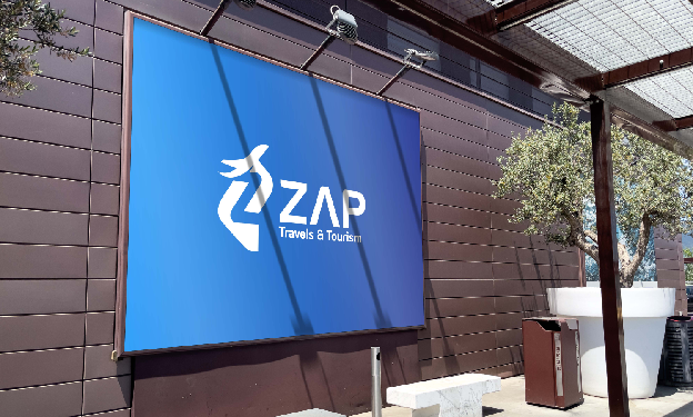
Logo Concept - The ‘Z’ and Flight Icon We chose the letter ‘Z’ as the main element of the logo, representing the brand name and serving as a powerful symbol of uniqueness, strength, and the start of every journey. The ‘Z’ is stylized to form an upward diagonal path, embodying the excitement and anticipation of travel and exploration. Integrated within the ‘Z’ is a minimalist flight icon, symbolizing freedom, movement, and progress. This element visually represents the idea of "boundless skies" and the thrill of venturing into new destinations, encapsulating the brand’s promise to offer seamless travel experiences. Typography - Modern and Clean The font chosen for "ZAP" is modern and bold, evoking professionalism while maintaining a sleek, approachable appearance.
IDENTITY,
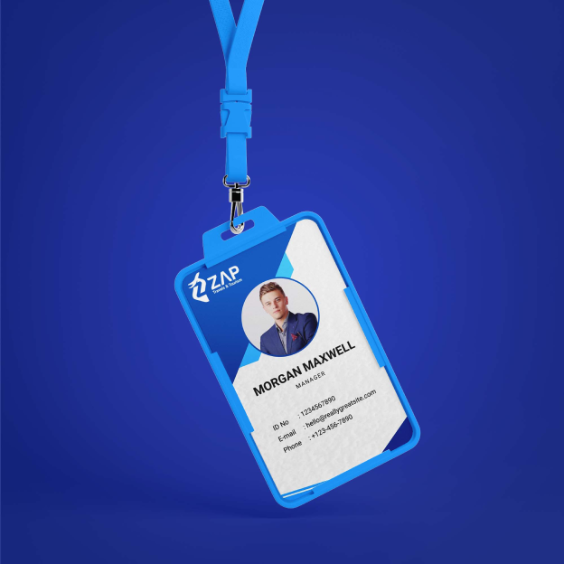
Symbolizing Freedom and Movement Designing a logo that conveys a sense of exploration, adventure, and the excitement of travel.
Appealing to a Wide Audience Ensuring the logo has universal appeal, attracting both leisure travelers and business clients.
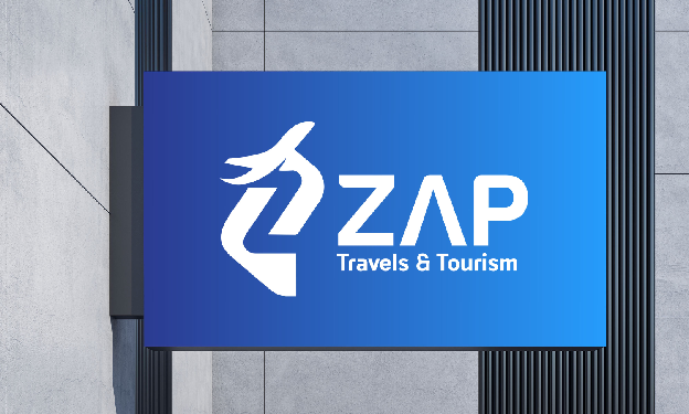
Through thoughtful design and strategic branding, ZAP Travel & Tourism now has a unique and impactful identity that aligns with its mission of offering innovative, memorable travel experiences. This case study highlights the power of a well-crafted logo in setting ZAP apart in the competitive world of travel and tourism.
Results and Impact
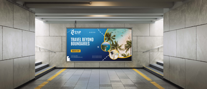
Distinctive Brand Identity The ‘Z’ and flight icon create a strong, memorable logo that stands out in the travel industry and resonates with both business and leisure travelers.
Enhanced Recognition and Trust The balanced color palette and professional typography have contributed to ZAP Travel establishing itself as a trusted, go-to agency for travelers seeking seamless, curated experiences.