Anand Jolliz
Visit SiteAnand Jolliz
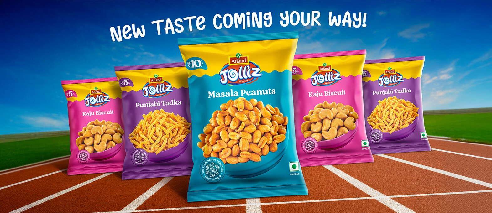
Anand Jolliz is a fast-growing snack brand from Gujarat, known for delivering bold, flavour-driven snacks that resonate with India’s love for spicy, crunchy treats. Born from Tastea Anand Namkeen Pvt. Ltd., the brand wanted a visual identity and packaging system that could match the energy of its flavours and stand out in the highly competitive Indian snack market. Richest Branding partnered with Anand Jolliz to build a punchy, expressive packaging language that puts flavour front and centre, making every pack instantly recognisable on shelf and impossible to ignore.
Industry
Services
Challenge
Anand Jolliz operates in one of the most crowded snack categories in India, where standing out on shelf comes down to split-second visual decisions. The brand needed a packaging system that could do three things at once: communicate the distinct character of each flavour variant, build a cohesive brand presence across the range and create immediate appeal for both traditional snack buyers and younger, experimental eaters. The challenge was to design packaging that feels playful without losing credibility, bold without becoming chaotic and consistent without becoming boring.
Approach
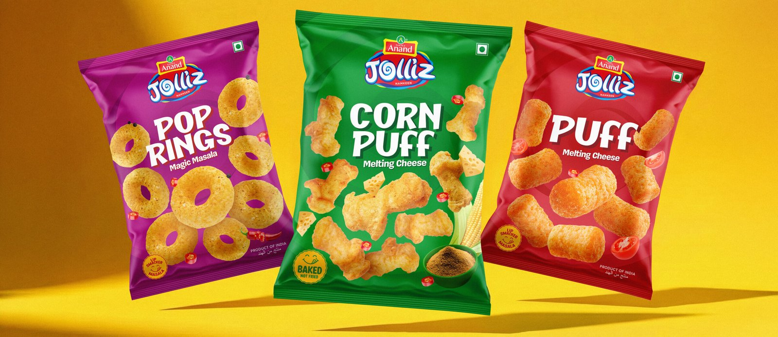
We anchored the identity in one clear idea: flavour first. Every design decision started with the taste experience, from the large, mouth-watering product visuals to the bold colour coding that makes each variant instantly identifiable. The approach leaned into expressive, confident visuals that match the attitude of the brand itself, unapologetically bold, playful and built for impact. Typography, colour and composition were all tuned to create immediate shelf stopping power while keeping the system flexible enough to grow with new flavours and formats.
Process
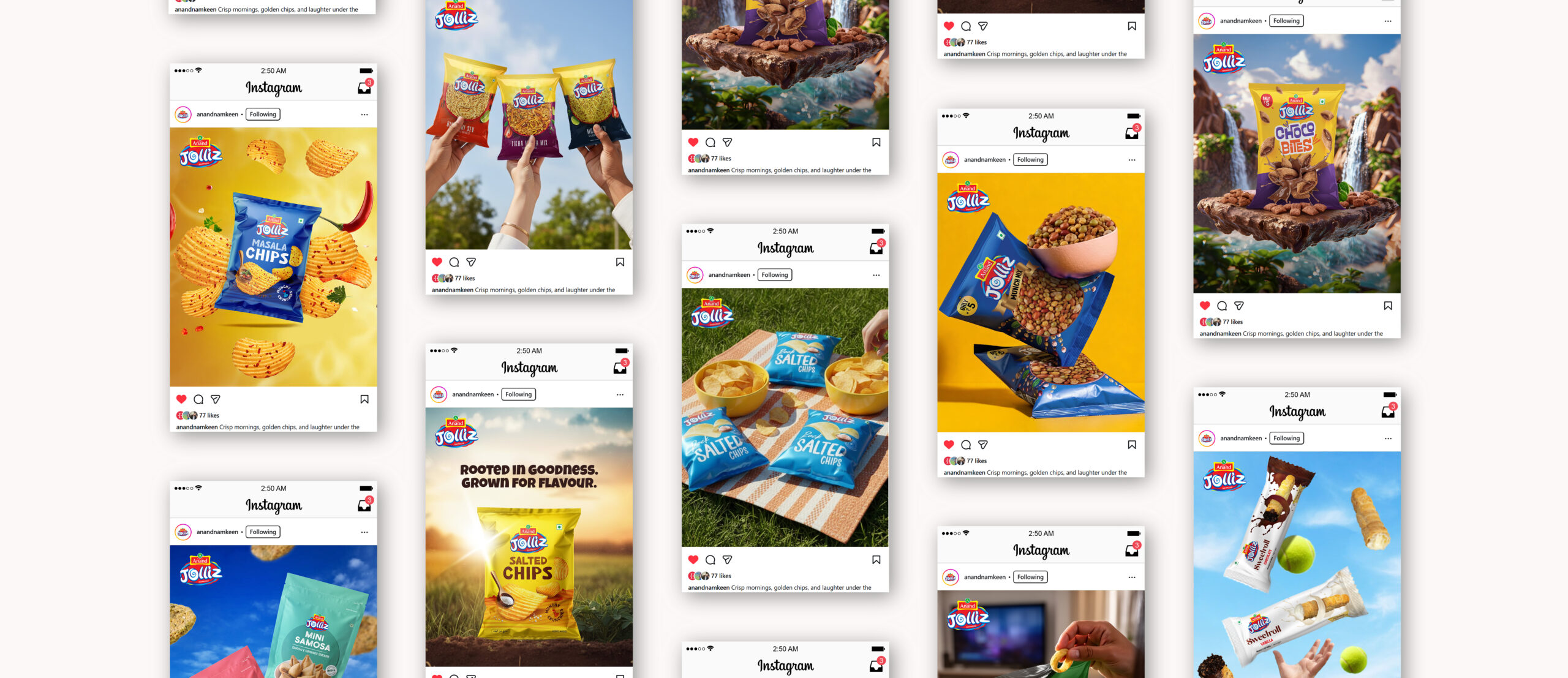
We began by mapping Anand Jolliz’s core flavour variants, Chilli Tadka, Chilli Harissa and Rock Salt, to understand how each one could own its own visual personality while still feeling like part of one family. From there, we built a packaging architecture that leads with large product visuals, tight ingredient compositions and confident colour blocking that reads clearly from a distance. The system was extended across banners, event collaterals and marketing materials to ensure every touchpoint, from retail shelves to trade shows, carried the same energetic, flavour-led language.
Result
Anand Jolliz now carries packaging that feels alive with flavour, giving each variant its own distinct personality while maintaining a strong, unified brand presence across the range. Chilli Tadka brings the fiery heat, Harissa adds a spicy global twist and Rock Salt keeps things sharp and simple, each pack instantly communicating what the buyer is about to taste. Labels, banners and promotional graphics all speak one energetic visual language, positioning Anand Jolliz as a bold, modern snack brand that delivers on both taste and visual impact.
The brand today reads as fun, confident and impossible to miss, exactly what a challenger snack brand needs to win attention in a market that never slows down.
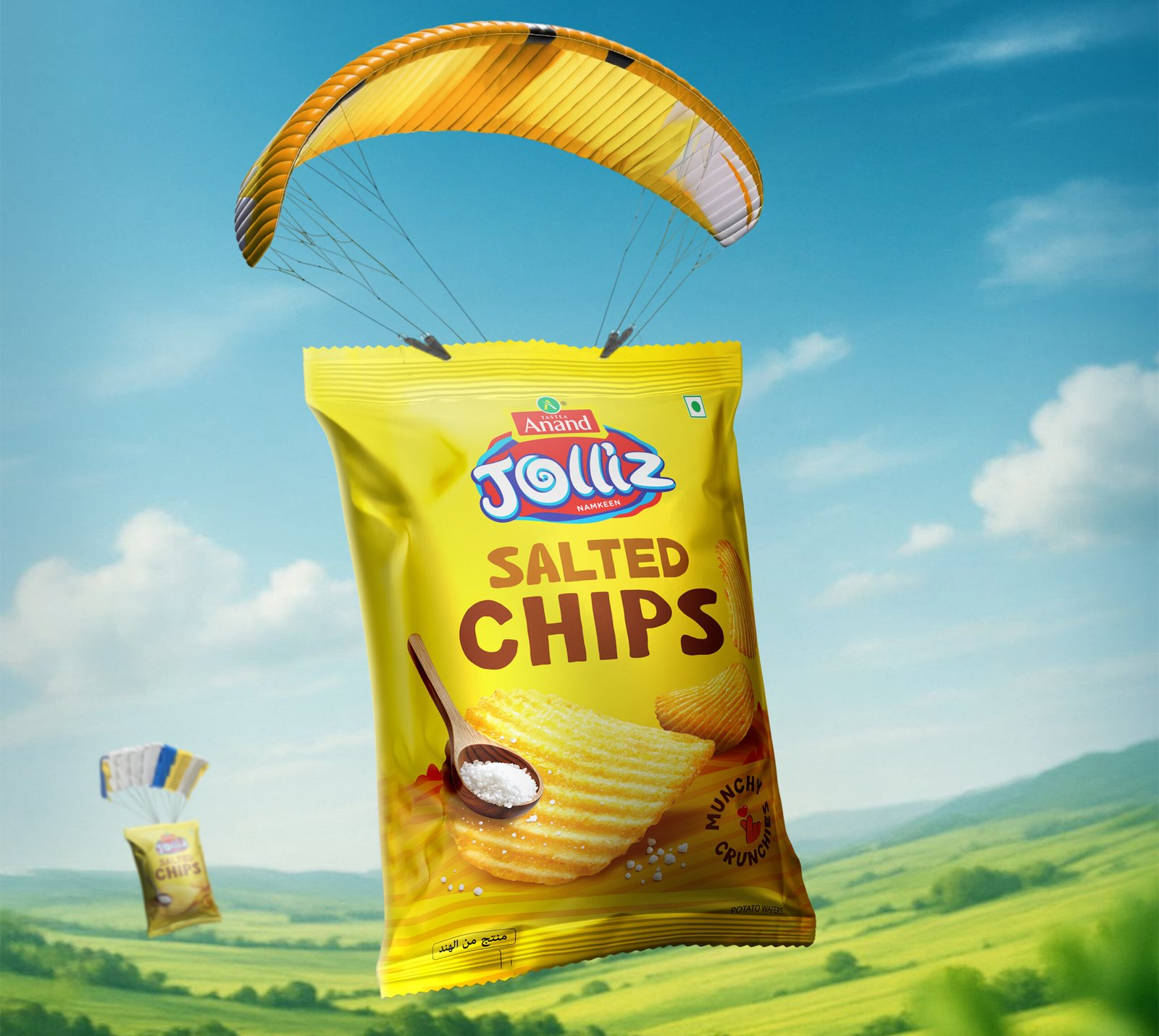
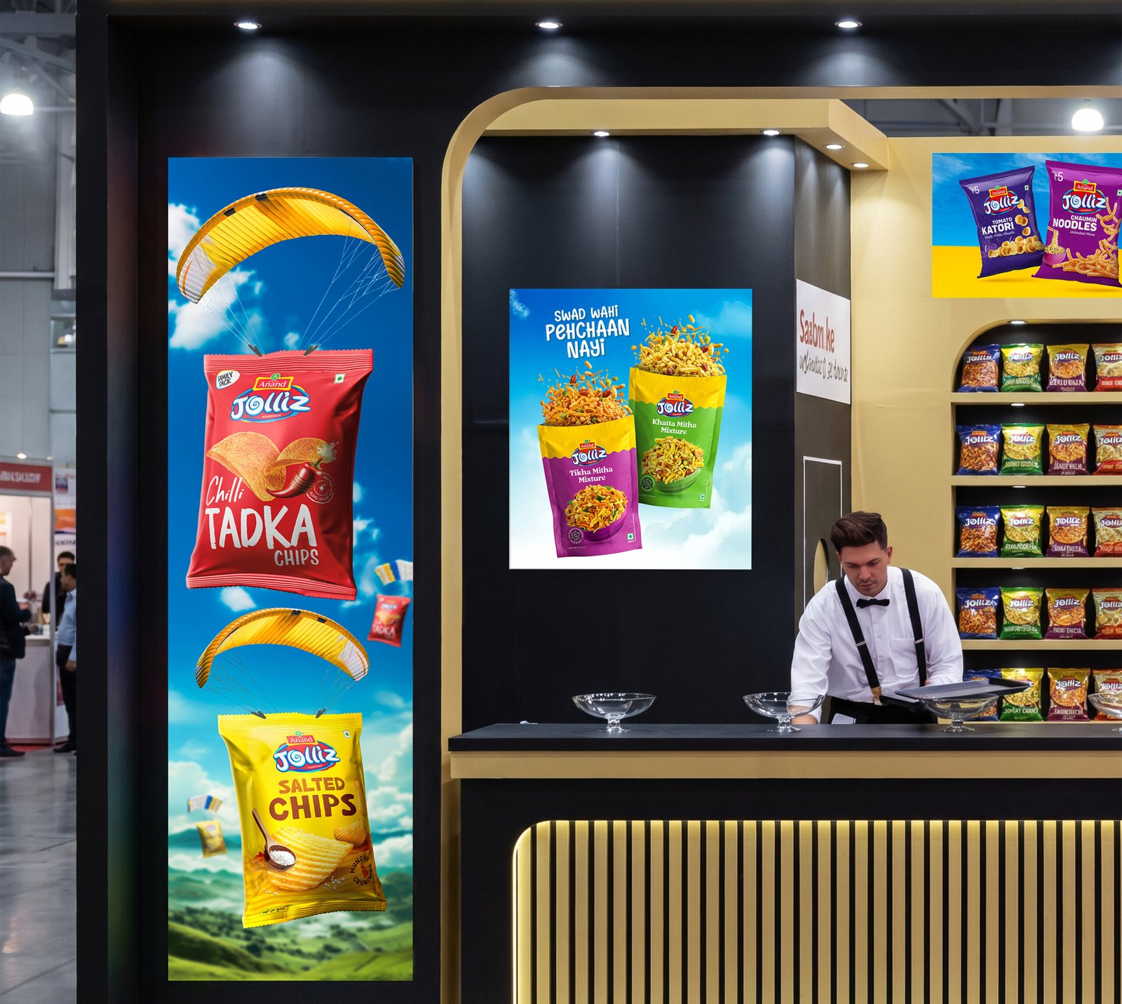
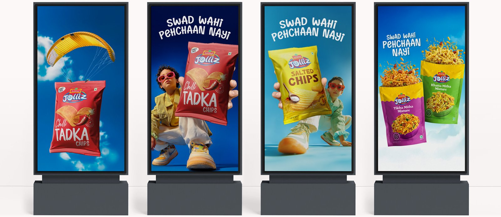
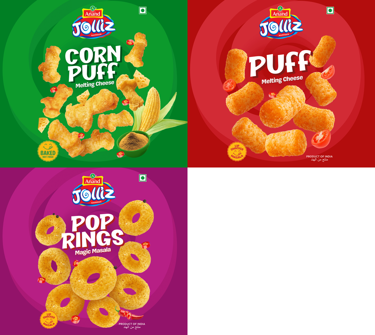
Crafting a High-Impact and Experience-Driven Identity for Anand Jolliz
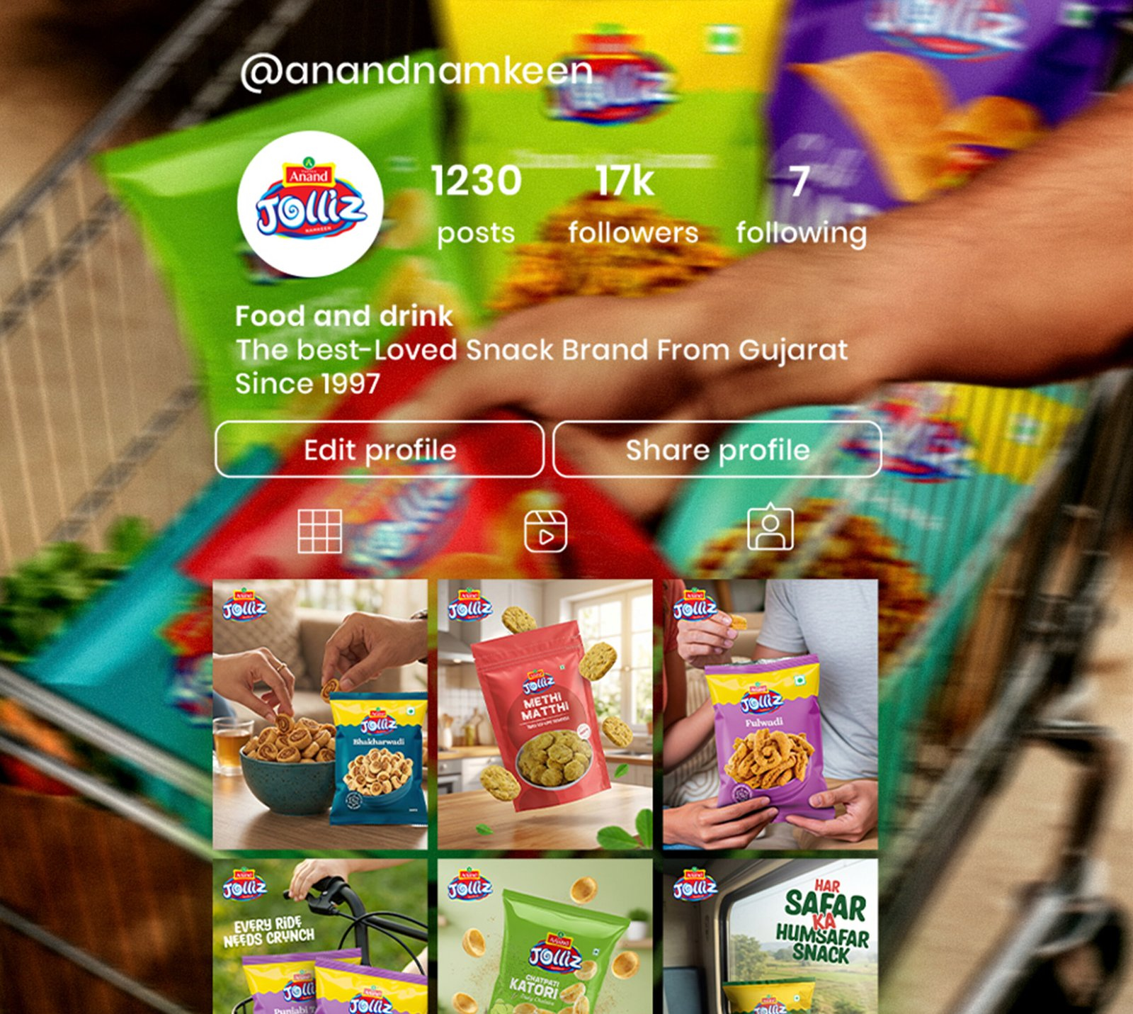
Richest Branding developed a punchy, flavour-first packaging and visual identity system for Anand Jolliz that works seamlessly across snack packs, event collaterals and marketing materials. We crafted an expressive design language, bold colour coding and dynamic layouts to reflect the brand’s playful attitude and growing market presence.
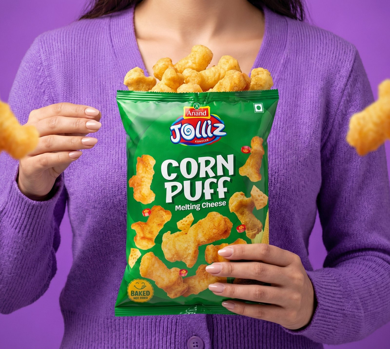
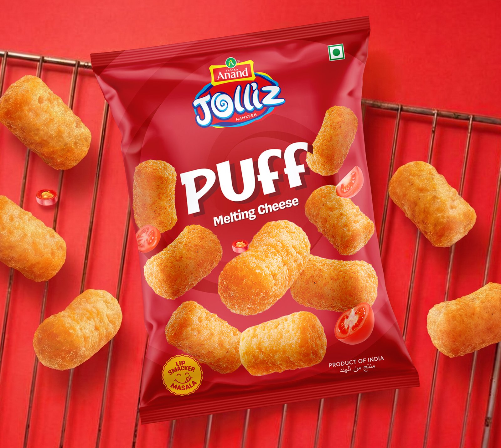
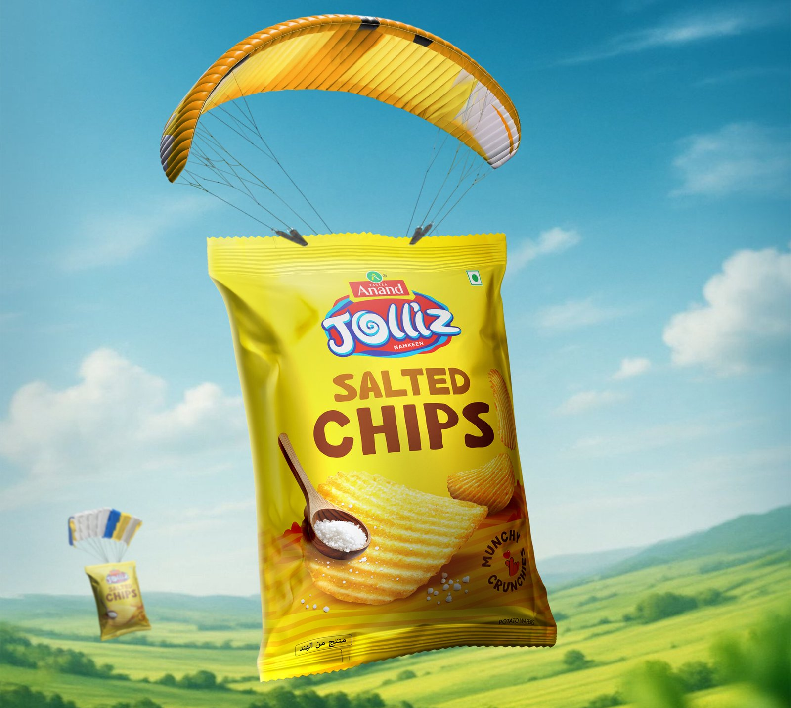
The communication system features large product visuals, confident colour blocking and a packaging architecture that keeps every variant instantly recognisable while staying true to the core brand identity. Each execution reinforces flavour, energy and recognition, positioning Anand Jolliz as a bold, taste-driven choice for snack buyers across India.
What's Next