Kap’s Delight
Kap’s Delight
Kaps Delight is a spice-led masala brand built for people who value depth, aroma and everyday flavour in their cooking. Rooted in the rich tradition of Indian seasoning, the brand needed a visual identity that could reflect authenticity, quality and distinction across its diverse masala range. Richest Branding partnered with Kaps Delight to create a vibrant packaging system that brings every blend to life with clarity, confidence and shelf appeal.
Industry
Services
Challenge
Kaps Delight operates in a category where buyers often choose quickly, based on trust, familiarity and the visual strength of the pack. The brand needed a packaging system that could distinguish different masala variants clearly while still feeling like one cohesive family. The challenge was to design a look that feels rooted in tradition, stands out in a crowded spice aisle and communicates quality without becoming overly complicated or generic.
Approach
We anchored the identity in one core idea: flavour with authenticity. Every design decision began with the character of the spice itself, from the bold colour cues to the structured packaging hierarchy that helps each variant stand apart. The approach blended cultural richness with modern clarity, creating a visual language that feels familiar, premium and easy to trust at a glance.
Process
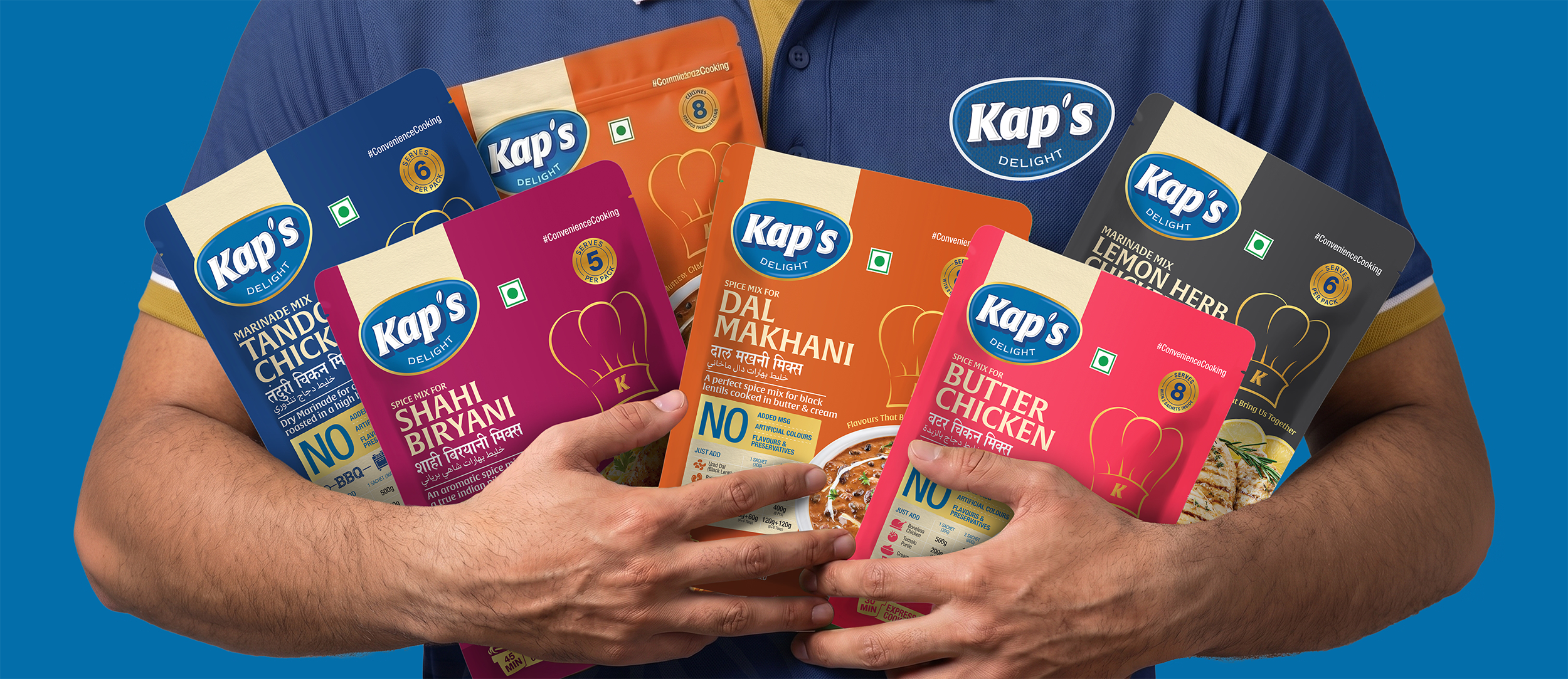
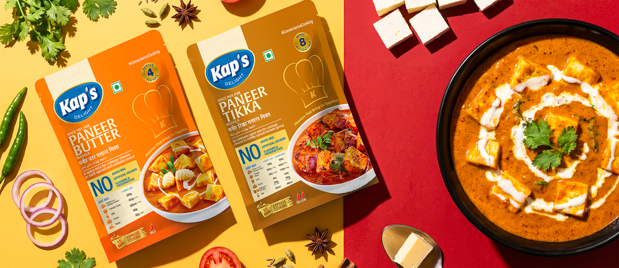
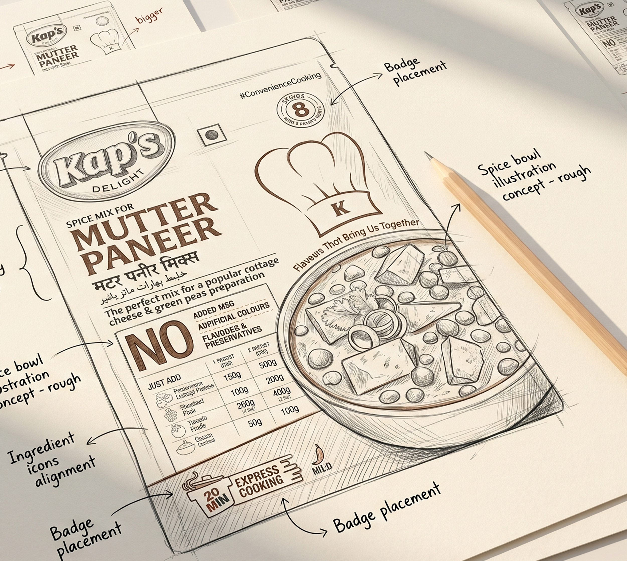
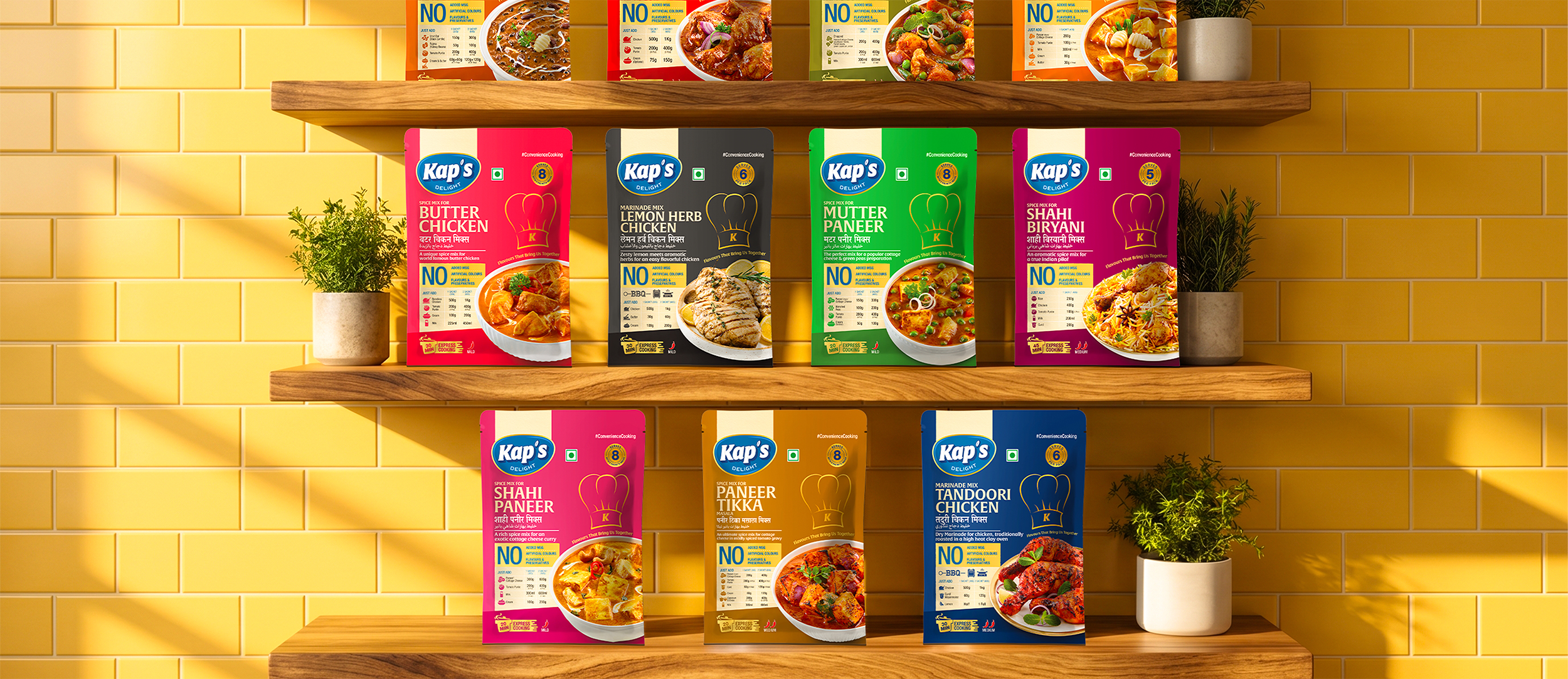
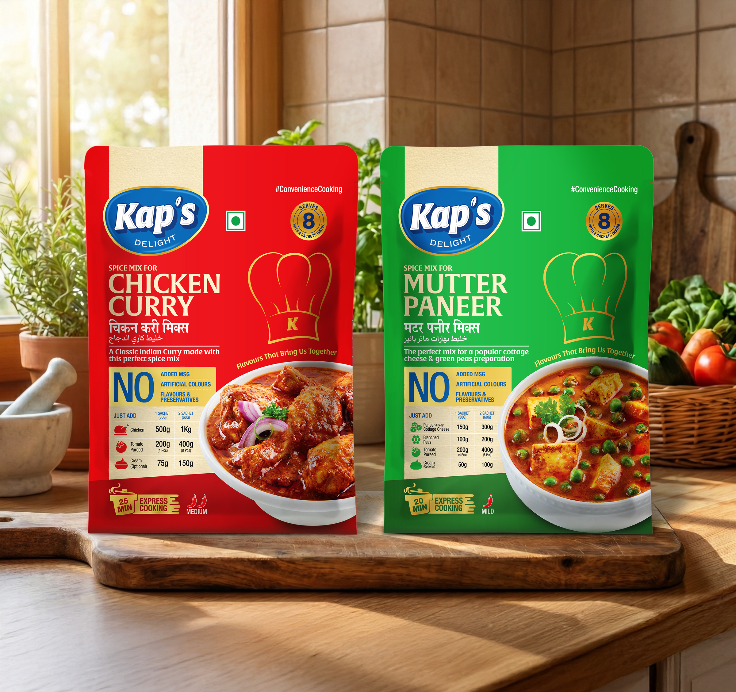
We began by studying Kaps Delight’s full masala range to understand how each blend could have its own visual cue while remaining part of a unified system. From there, we developed a packaging architecture that balances strong product naming, ingredient visibility and colour differentiation. The system was extended across packs, labels and marketing collaterals so the brand could maintain the same identity across retail and promotional touchpoints.
Result
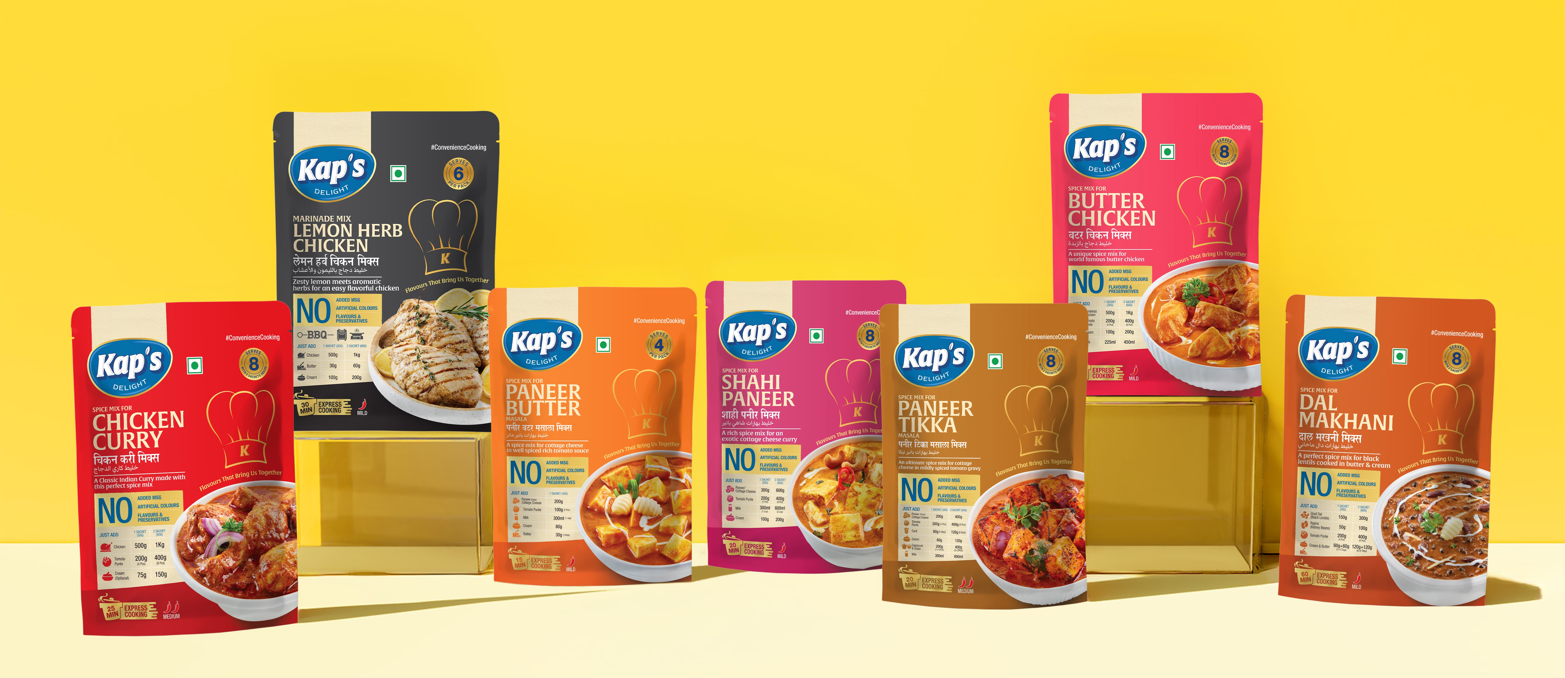
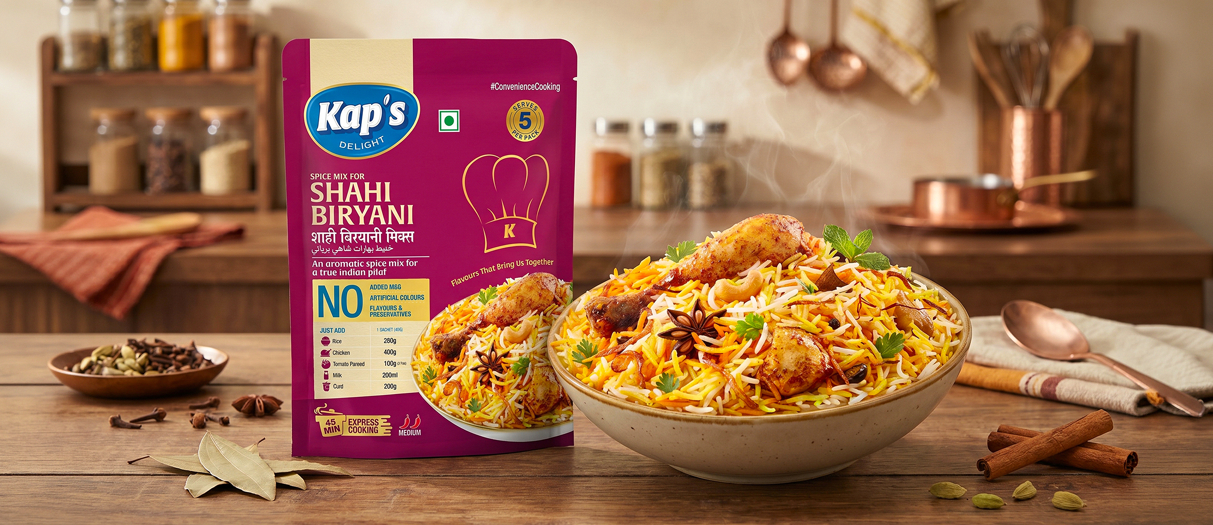
Kaps Delight now has packaging that gives each masala variant its own identity while keeping the full range visually connected. The packs feel clear, bold and rooted in flavour, helping the brand build stronger recognition on shelf.
The brand today reads as dependable, vibrant and made for kitchens that value both tradition and taste, exactly what a modern spice brand needs to earn trust and stand out.
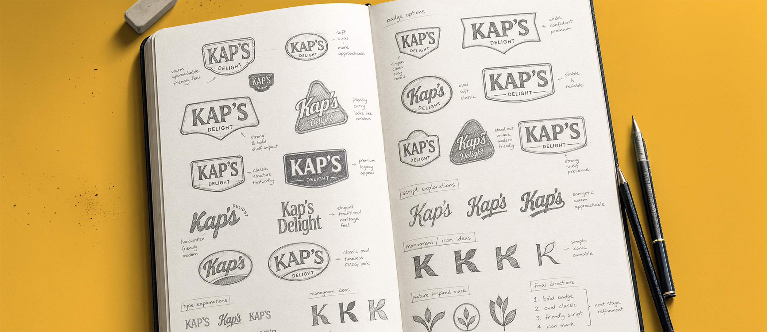
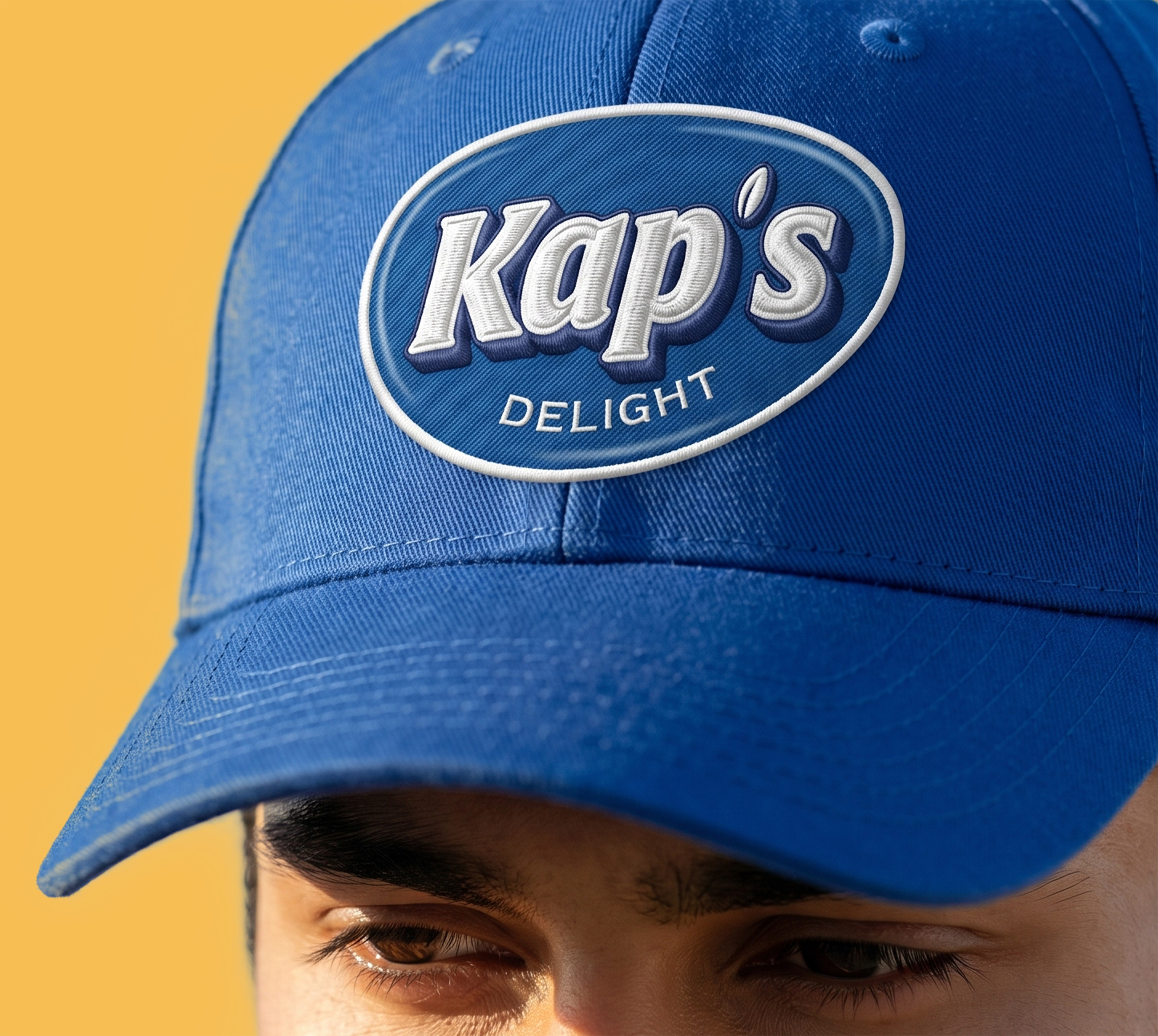
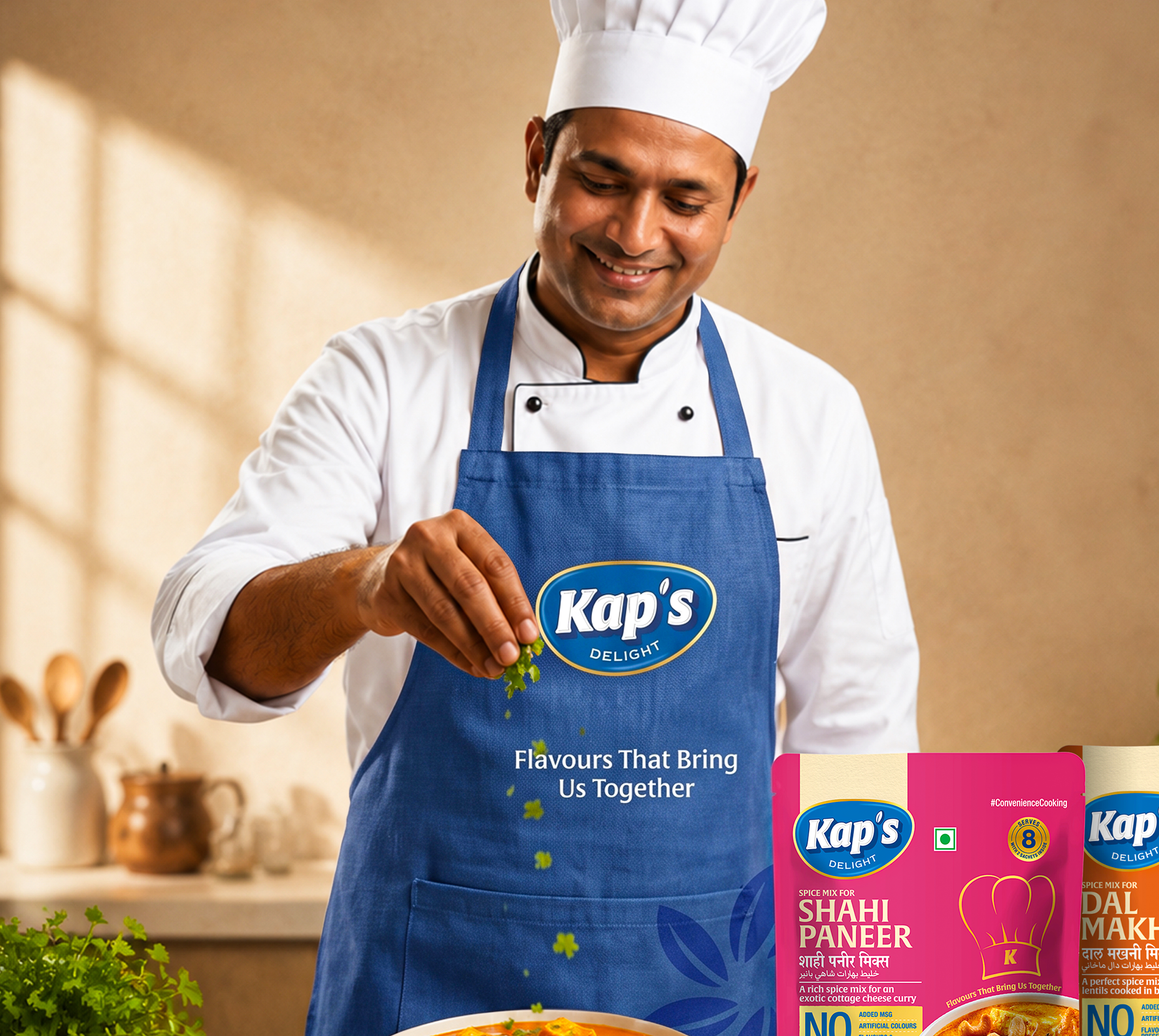
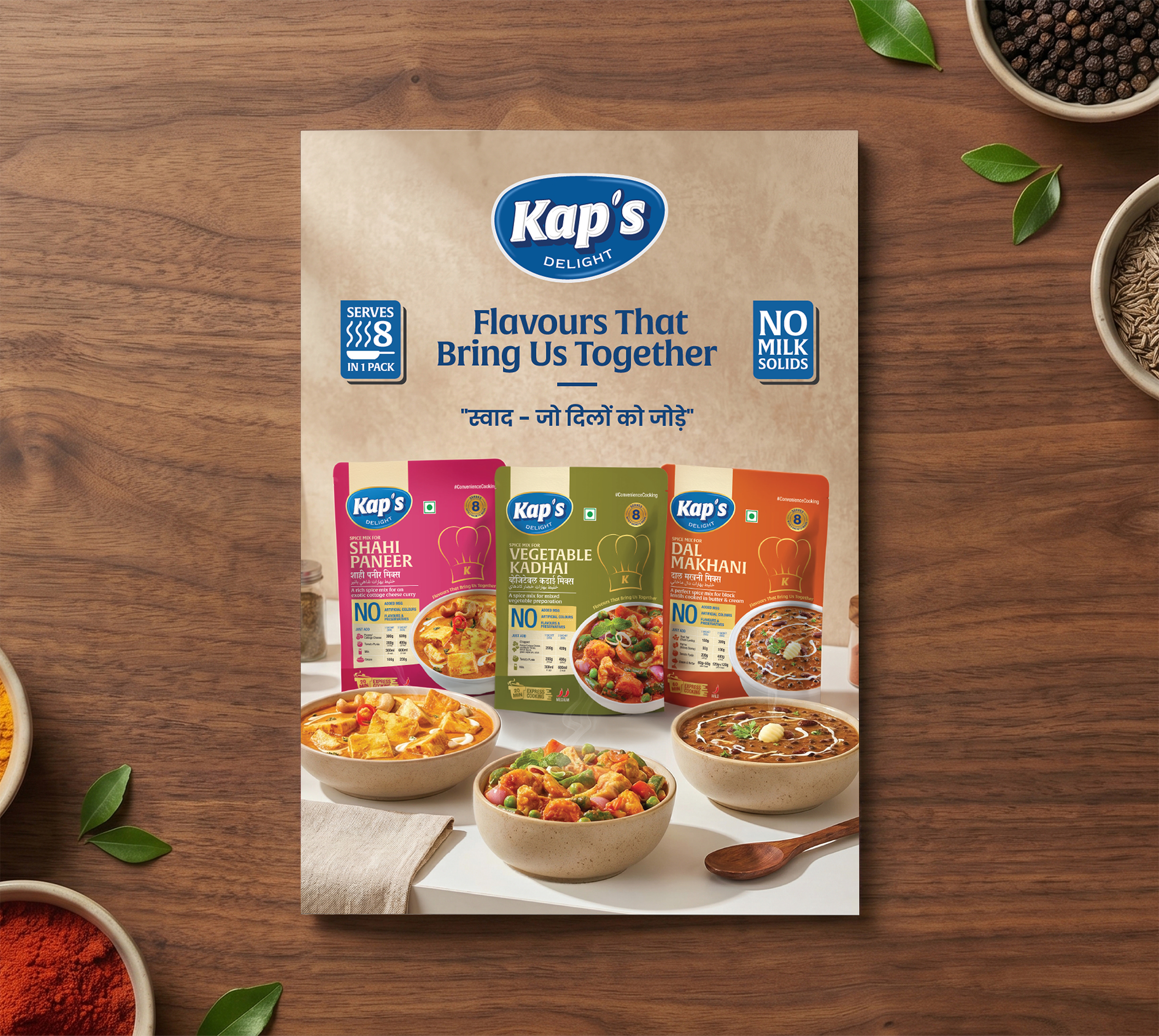
Crafting a High-Impact and Experience-Driven Identity for Kaps Delight
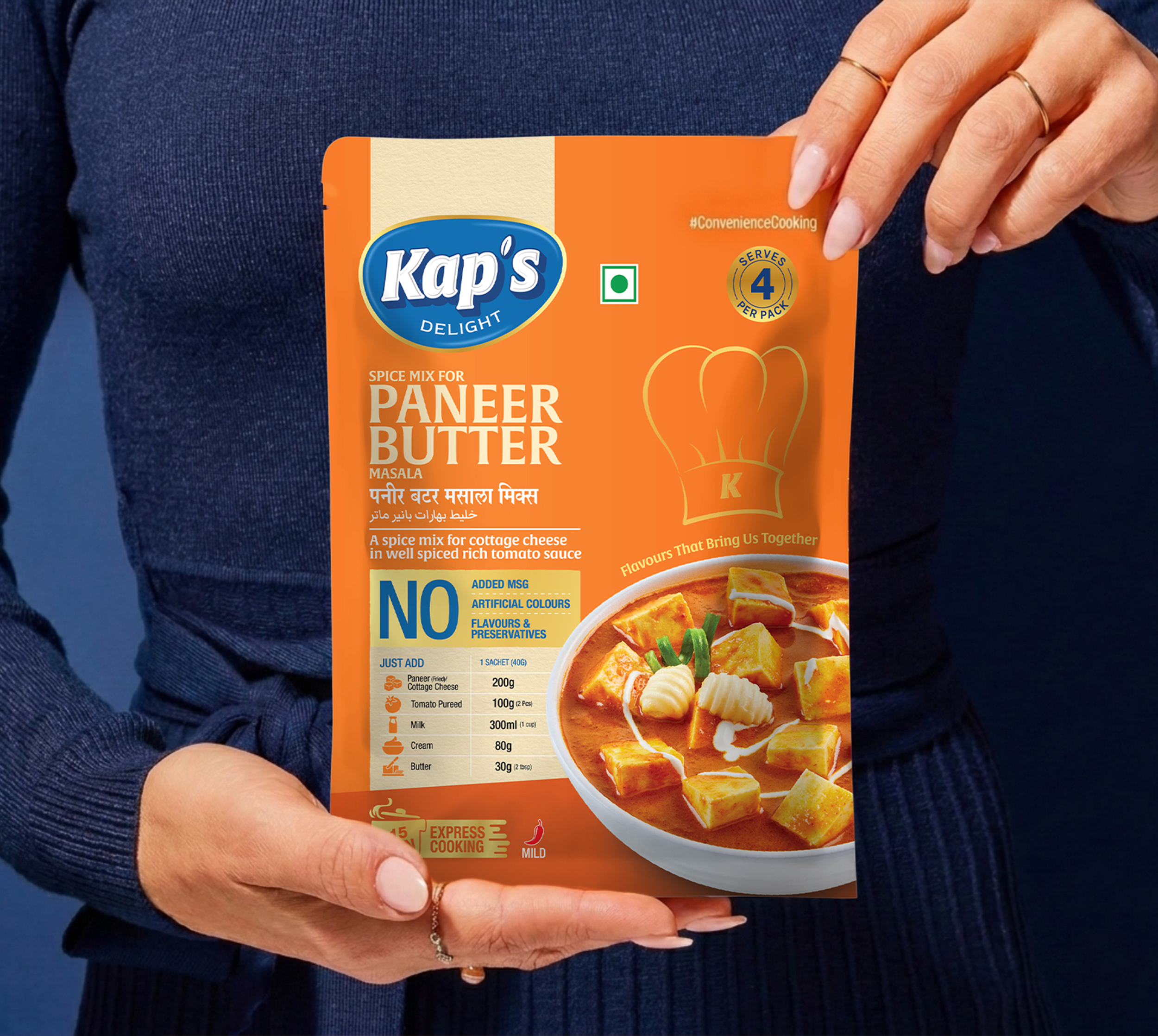
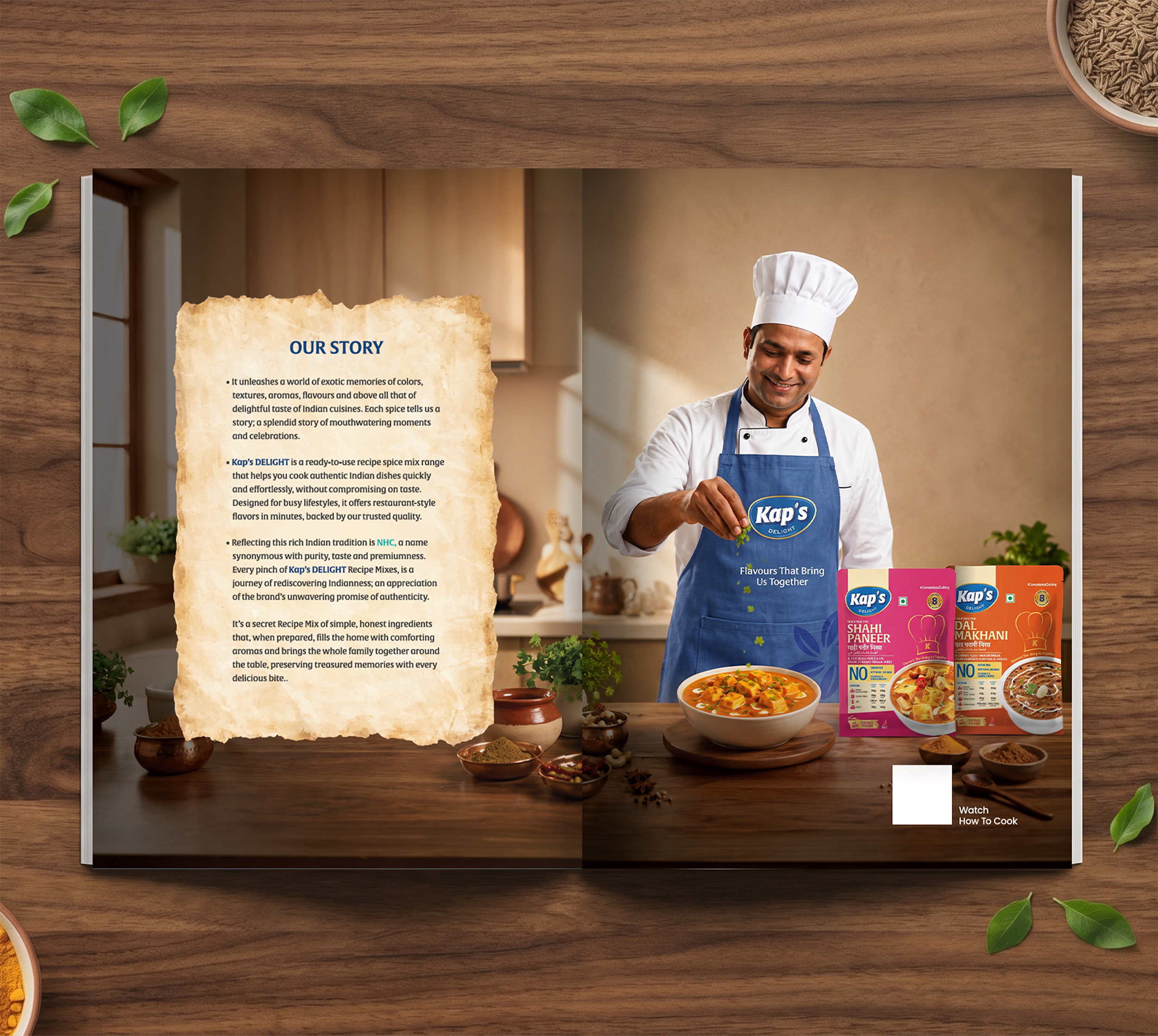
Richest Branding developed a flavour-first identity and packaging system for Kaps Delight that works seamlessly across masala packs, retail collaterals and marketing materials. We created a structured design language, strong colour coding and confident layouts to reflect the brand’s depth, quality and everyday relevance.
The communication system features clear product hierarchy, bold visual cues and packaging architecture that keeps every variant easy to recognise while staying true to the core brand story. Each execution reinforces authenticity, flavour and distinction, positioning Kaps Delight as a spice brand built for modern kitchens.
What's Next