Battle Cry
Battle Cry
Battle Cry for Man is a men’s makeup and grooming brand built for everyday performance and clean confidence. Designed for men who want to look sharp without looking like they’ve tried too hard, the brand wanted a visual identity that could challenge stereotypes and own a new category in the Indian market. Richest Branding partnered with Battle Cry to build a strong, functional, no-nonsense branding and packaging system that speaks the language of modern masculinity, direct, confident and built for the everyday battle.
Industry
Services
Challenge
Battle Cry for Man operates in a category that barely existed in India until recently: makeup for men. The brand needed a visual identity that could do three things at once: normalise the idea of men using makeup, differentiate itself from women’s beauty brands and create immediate trust with a sceptical, first-time buyer. The challenge was to design packaging that feels like grooming, not cosmetics, confident and functional without becoming aggressive or overly masculine.
Approach
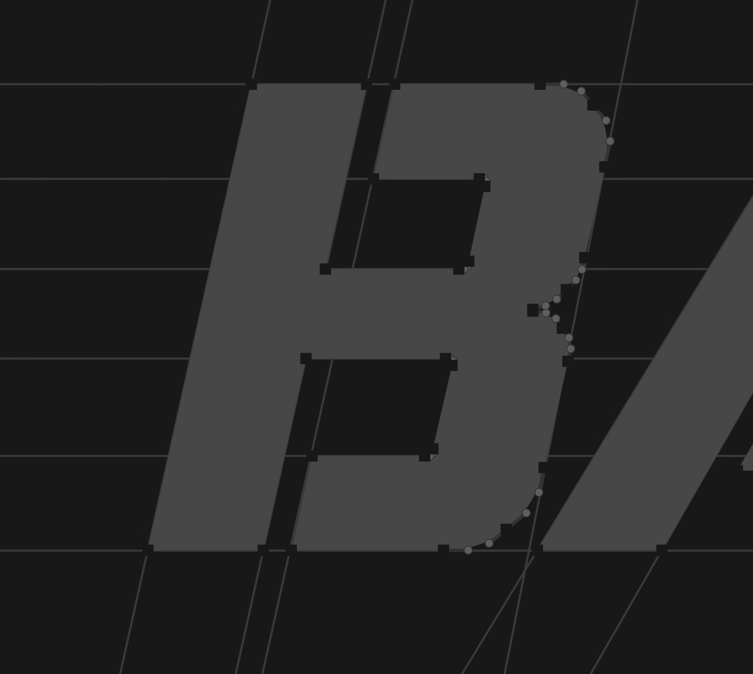
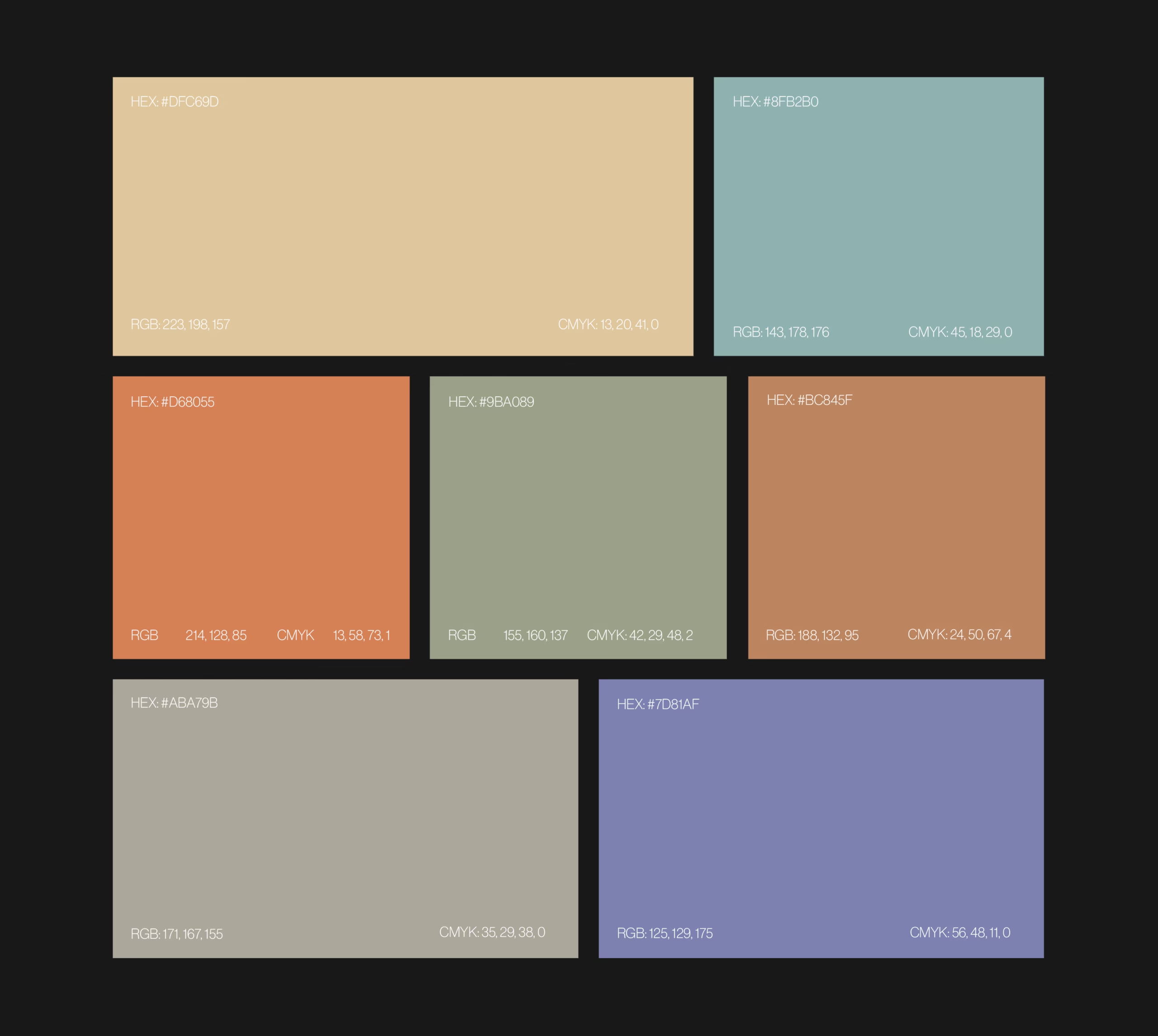
We anchored the identity in three qualities that define the brand’s philosophy: performance, simplicity and confidence. Clean, bold typography, a restrained colour palette and packaging that feels more like grooming gear than beauty products. The approach balanced the credibility of function with the confidence of modern masculinity, ensuring the brand felt accessible and aspirational in equal measure.
Process
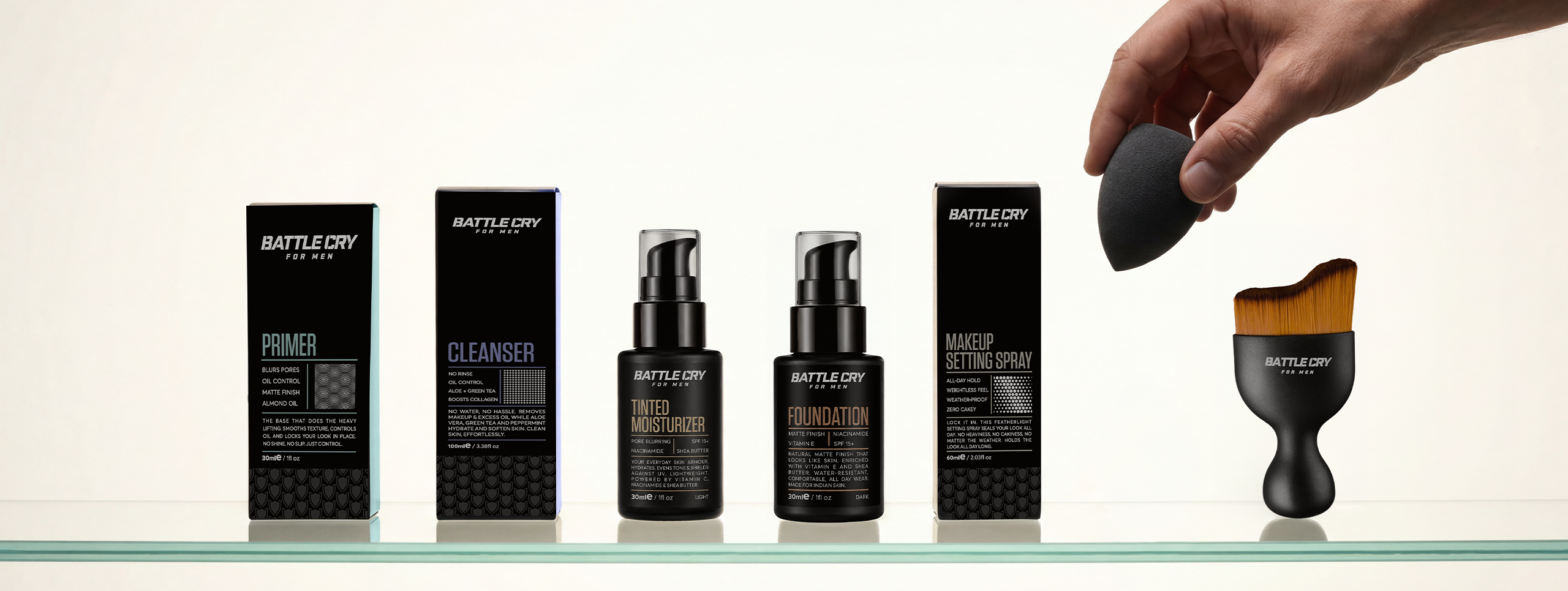
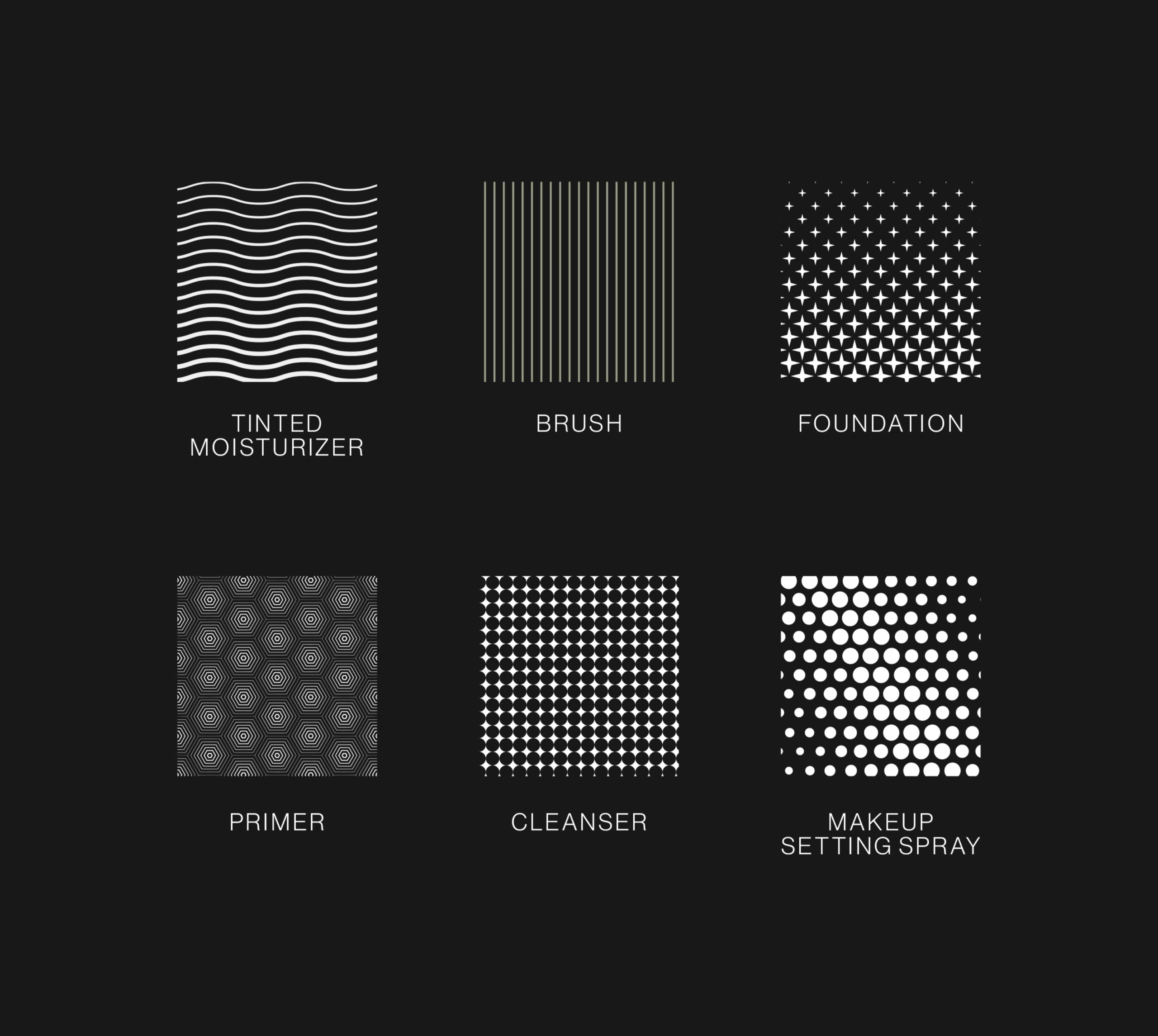
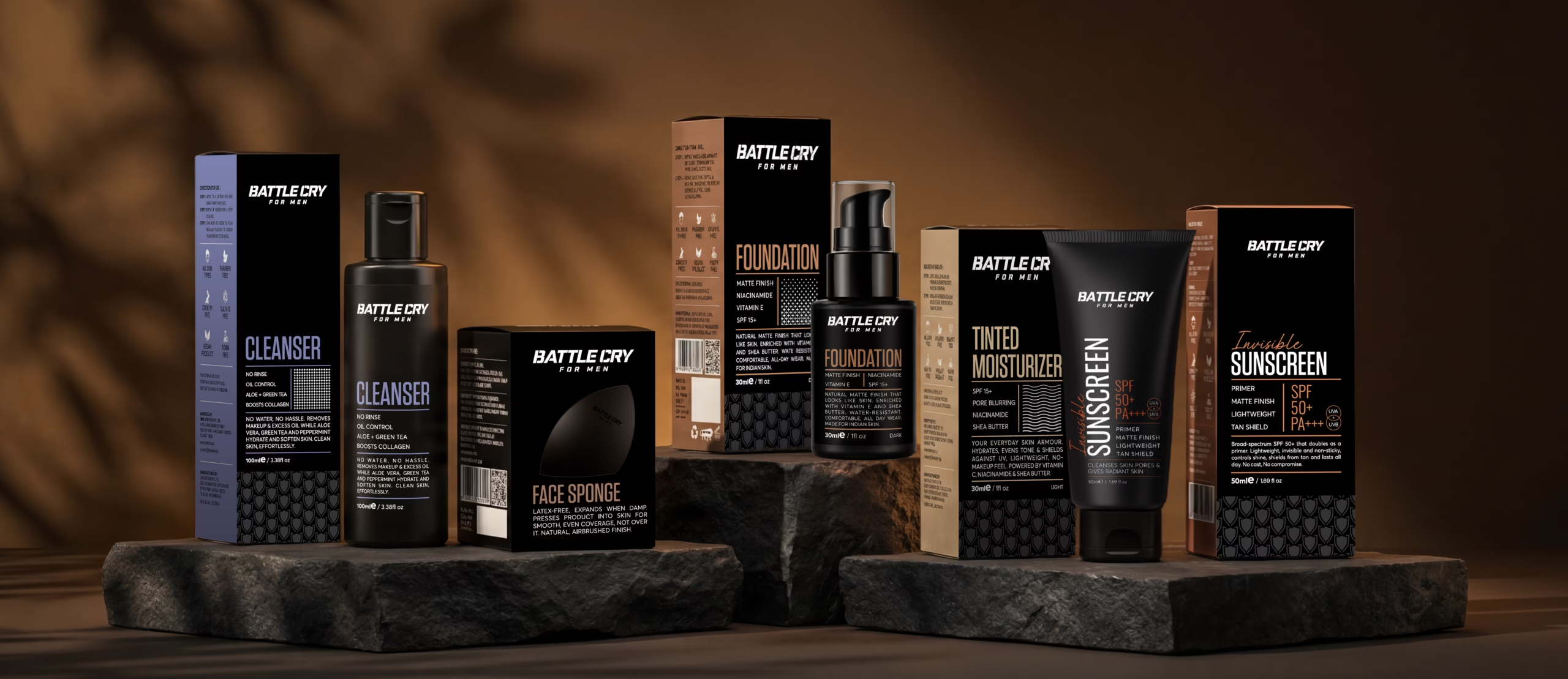
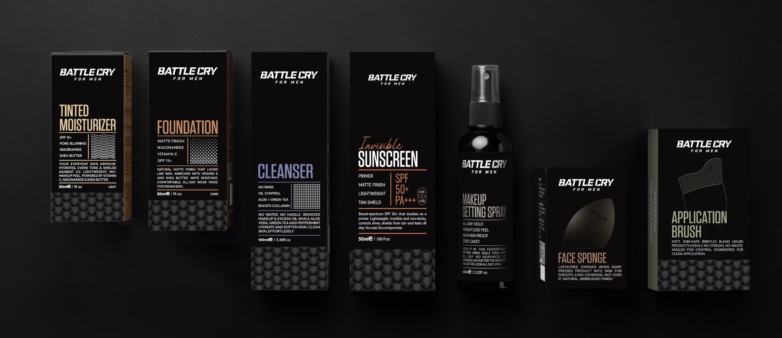
We began by mapping Battle Cry’s core product range, from tinted moisturisers to concealers and primers, to understand how one visual system could flex across categories and skin tones without losing consistency. From there, we built the packaging architecture, defined the product naming and extended the system across tubes, compacts, boxes and digital collaterals, ensuring every touchpoint carried the same standard of confidence and clarity.
Result
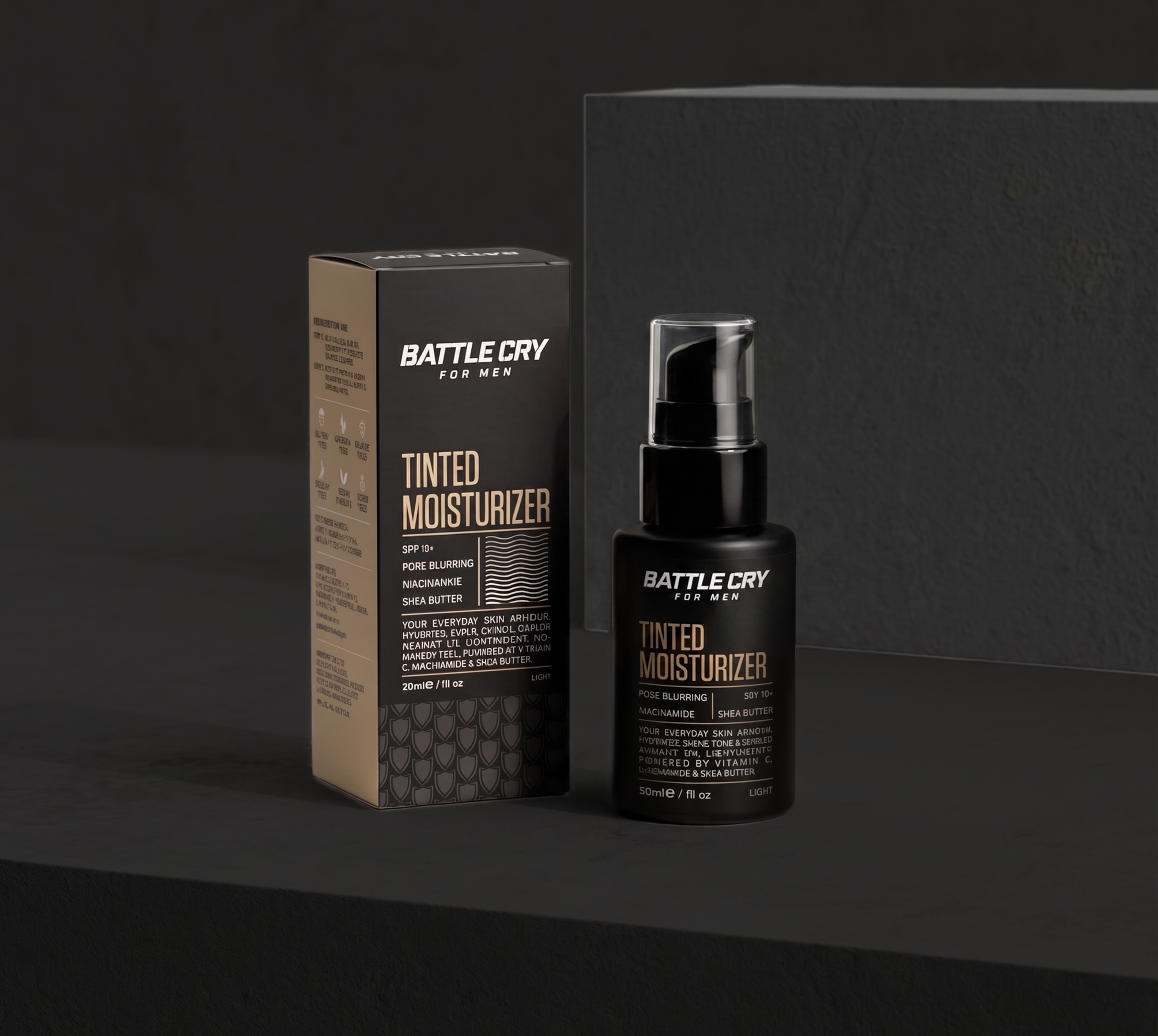
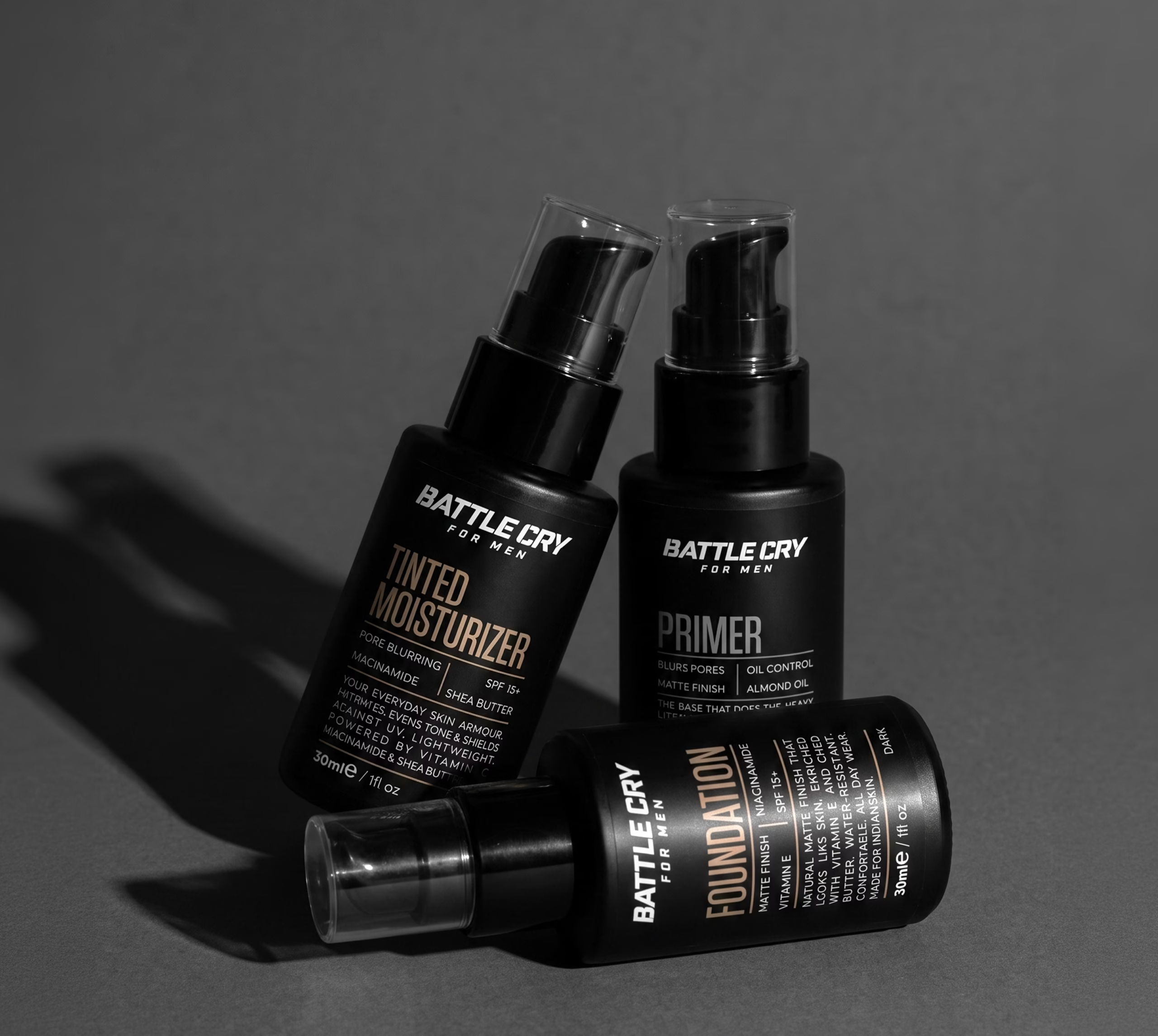
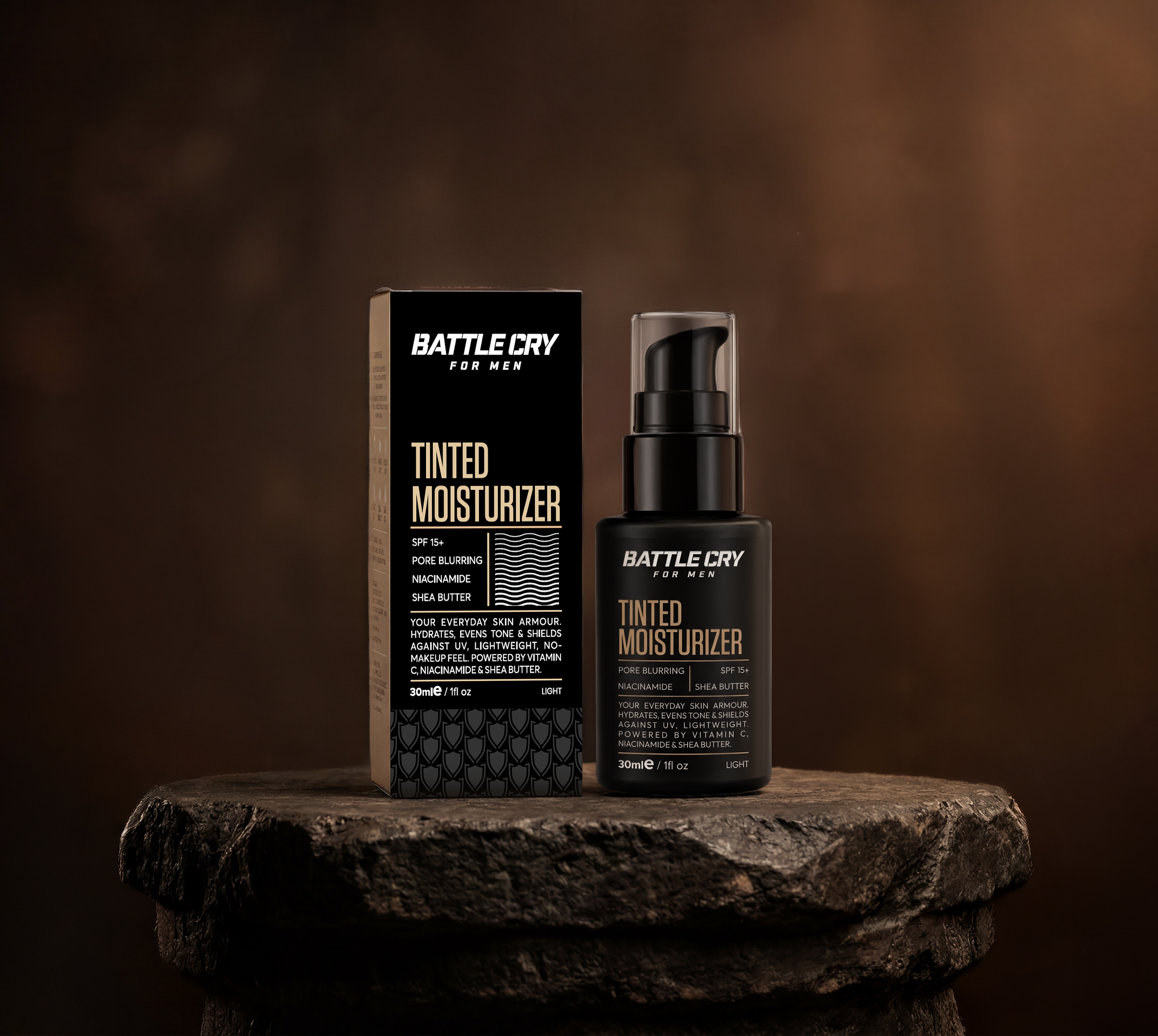
Battle Cry for Man now carries packaging that feels consistent across every product, giving buyers instant recognition whether they’re picking up a tint or a primer. Tubes, compacts and digital assets all speak one visual language.
The brand today reads as confident, functional and modern at first glance, exactly what a category-creating men’s grooming brand needs to normalise makeup and win trust from first-time buyers.
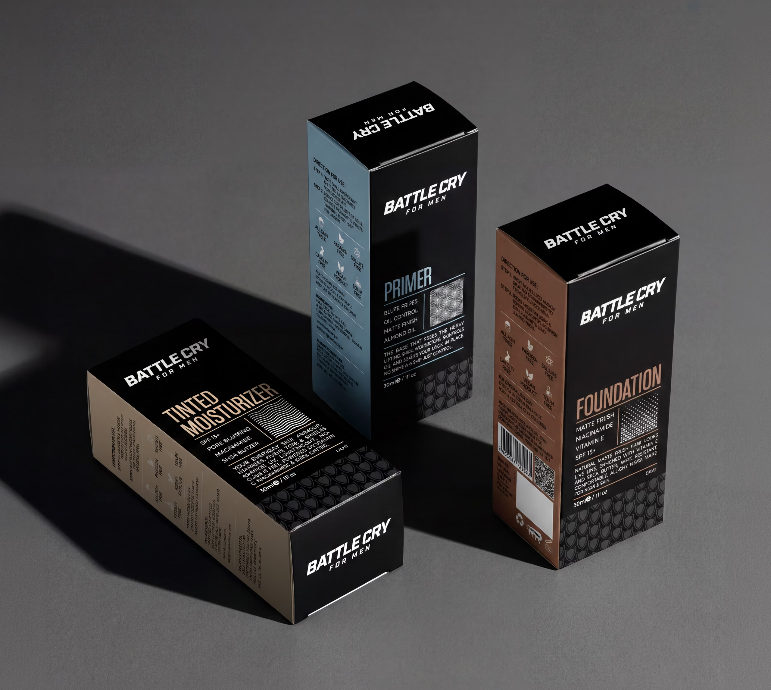
Crafting a High-Impact and Experience-Driven Identity for Battle Cry for Man
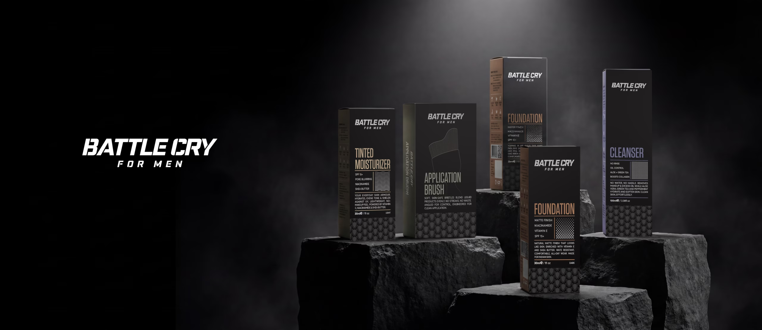
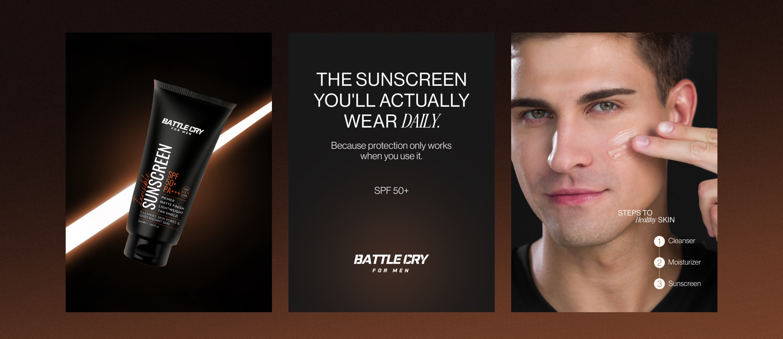
Richest Branding developed a strong, performance-driven visual identity system for Battle Cry for Man that works seamlessly across packaging, digital and marketing materials. We crafted a clean, confident design language, restrained colour system and functional layouts to reflect the brand’s no-nonsense positioning and category-leading ambition.
The communication system features bold typography, a minimal colour palette and packaging architecture that stays consistent across every product category. Each execution reinforces confidence, performance and recognition, positioning Battle Cry for Man as a modern, trustworthy choice for men who want to upgrade their look without compromise.
What's Next