
Kawkab
Kawkab
Kawkab Global Pharma is a global exporter of quality generic medicines, serving markets across the Middle East, Africa and Asia. Known for its wide-ranging product portfolio spanning antibiotics, cardio-diabetic care and cosmetics, the brand wanted a visual identity that could carry the same trust across every category and every border. Richest Branding partnered with Kawkab to build a cohesive branding and packaging system that speaks the language of global pharma, precise, credible and instantly recognisable.
Industry
Services
Challenge
Kawkab operates across 15+ countries and a dozen distinct product categories, from antibiotics to skincare. The brand lacked a unified visual system that could hold this range together while meeting the compliance and clarity standards pharma buyers expect. The key challenge was building packaging that reads as trustworthy at a glance, stands apart on crowded pharmacy shelves and stays consistent across languages, markets and product lines.
Approach
We anchored the identity in two qualities every pharma buyer looks for first, trust and precision. Clean typography, a controlled and clinical colour palette and a mark built to read confidence across formats. The approach balanced scientific credibility with visual warmth, ensuring the brand felt reliable without feeling cold.
Process
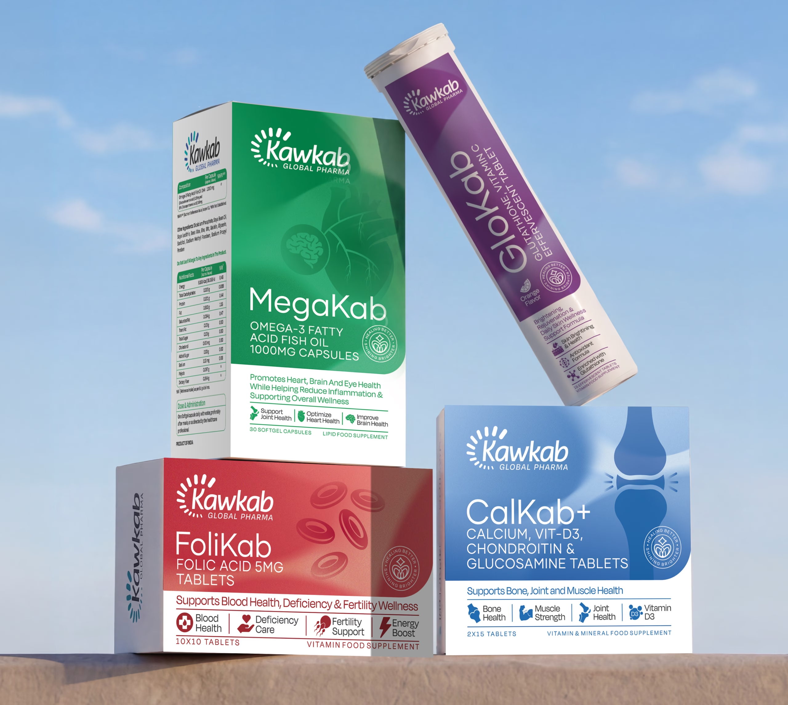
We began by mapping Kawkab’s full product range, from antibiotics to injectables to skincare, to understand how one visual system could flex across categories without losing consistency. From there, we built the logo, defined the packaging architecture and extended the system across labels, cartons and export documentation, ensuring every touchpoint carried the same standard of trust.
Result
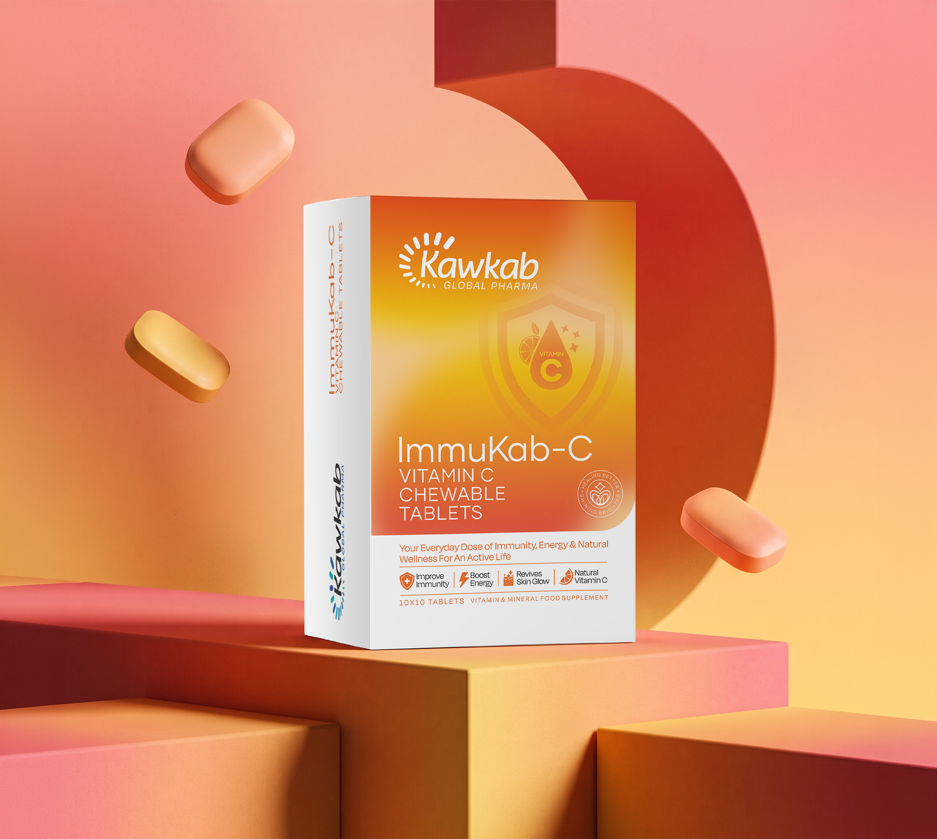
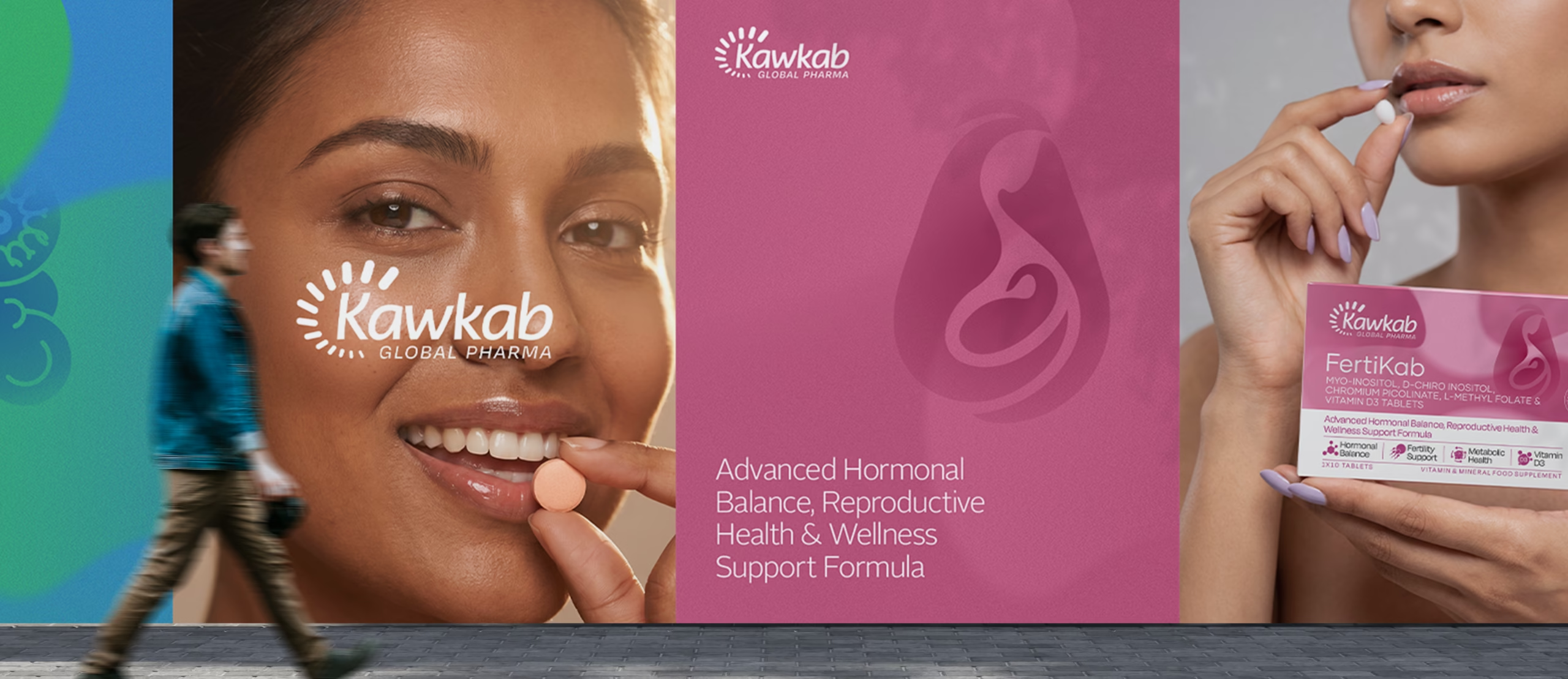
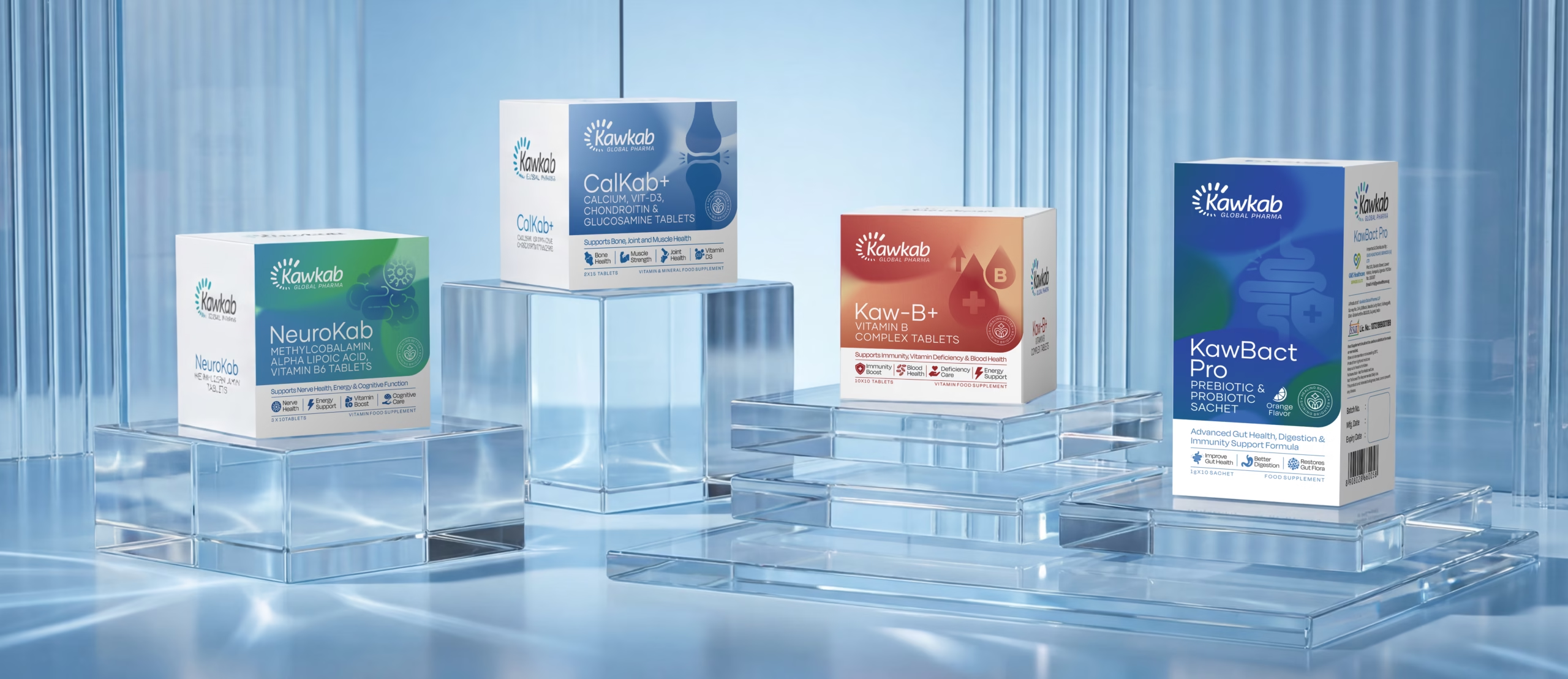
Kawkab now carries packaging that feels consistent across every category, giving buyers instant recognition whether they’re sourcing antibiotics or cardio-diabetic ranges. Labels, cartons and collateral all speak one visual language. The brand today reads as premium and dependable at first glance, exactly what a global pharma exporter needs to earn trust before a single word is read.
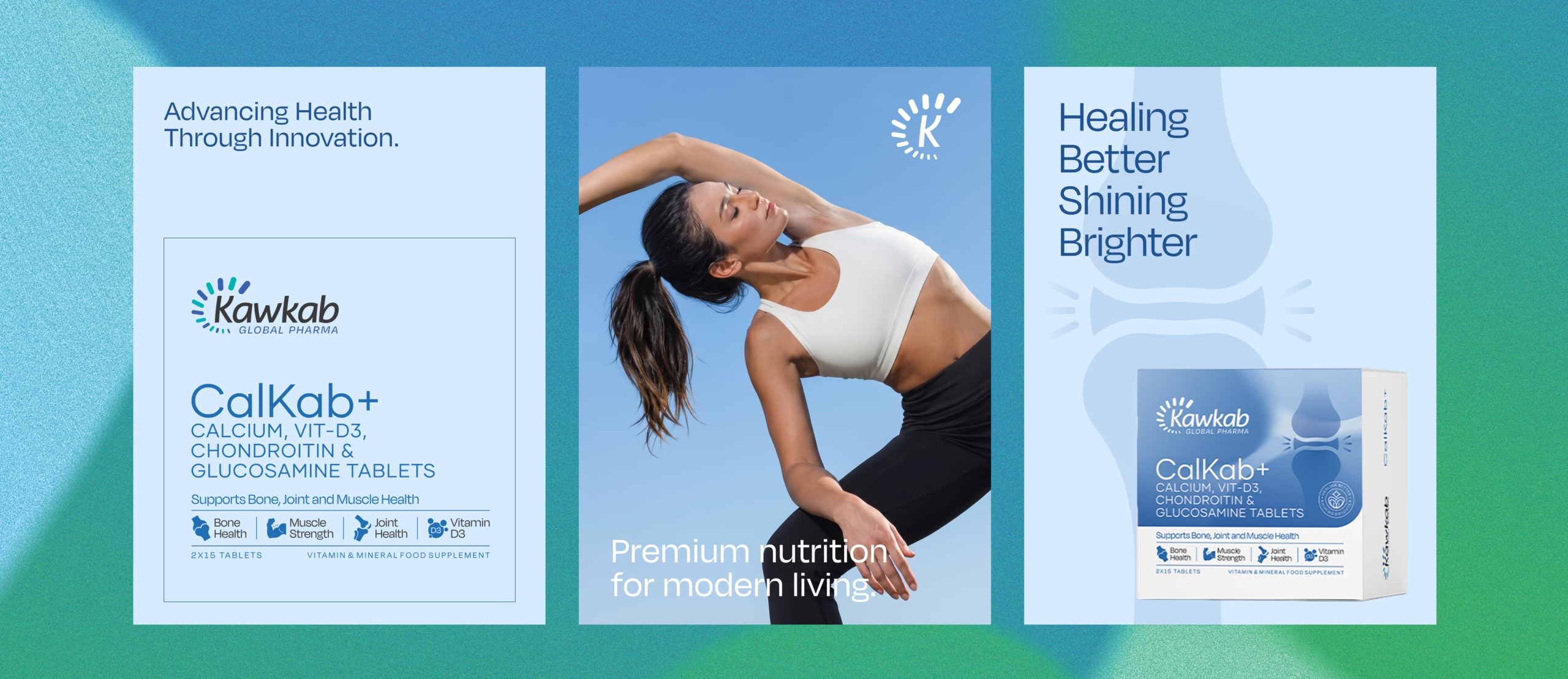
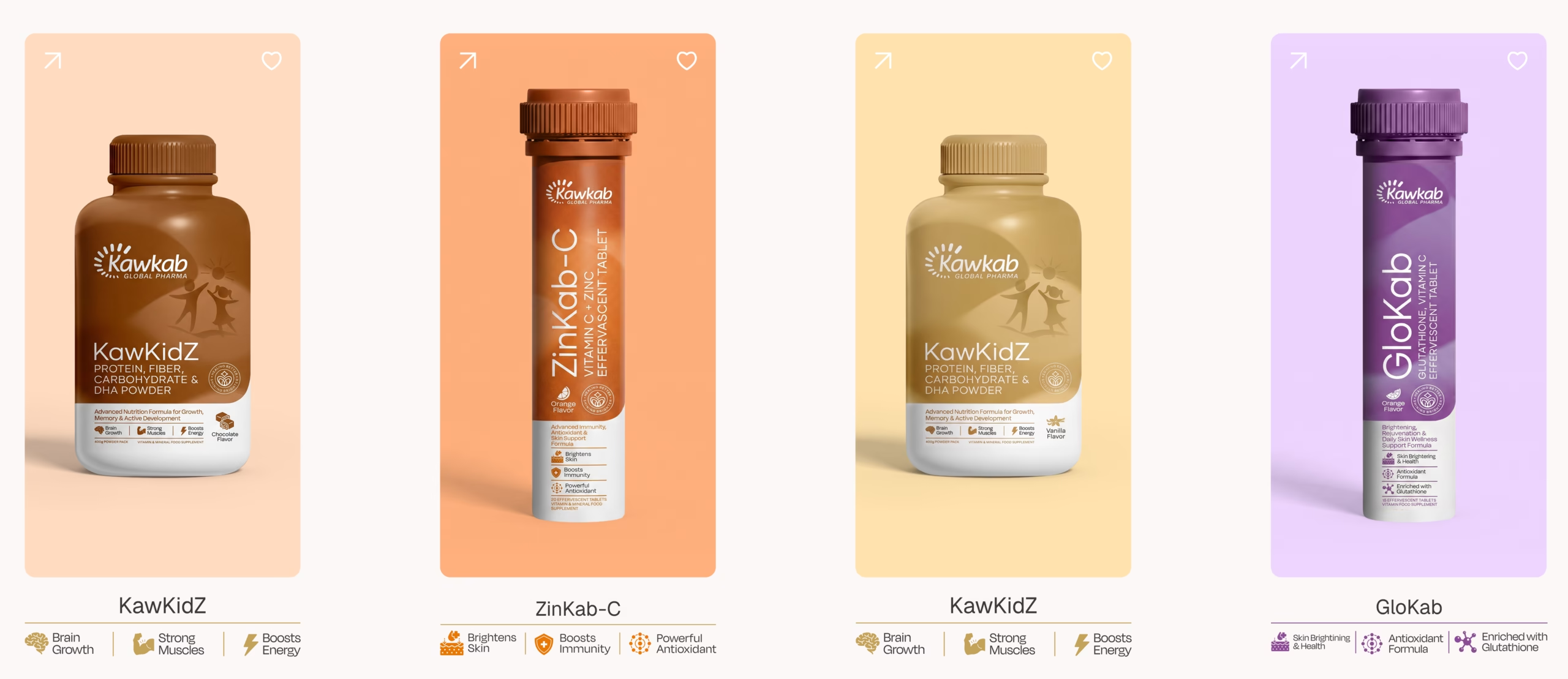

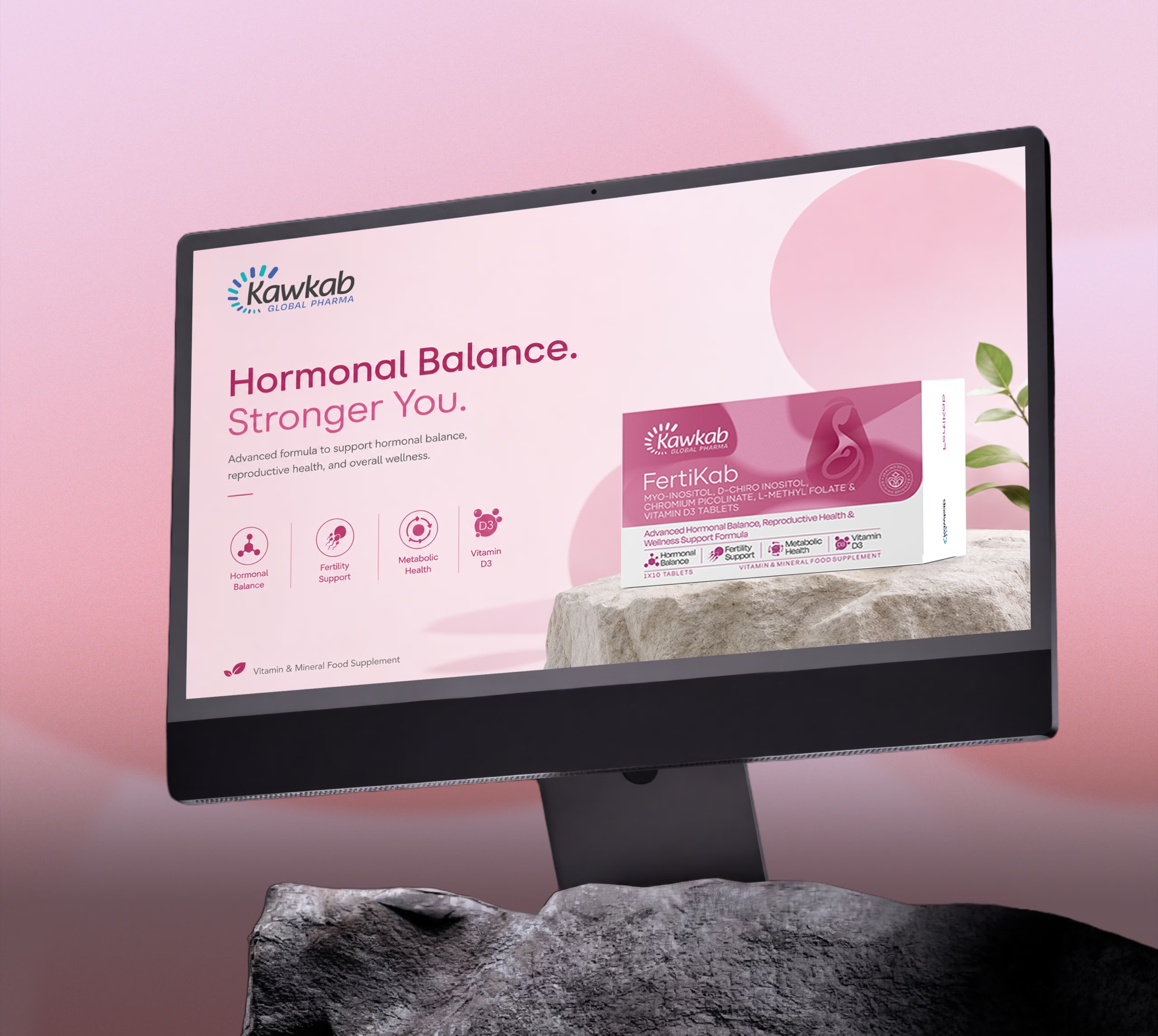
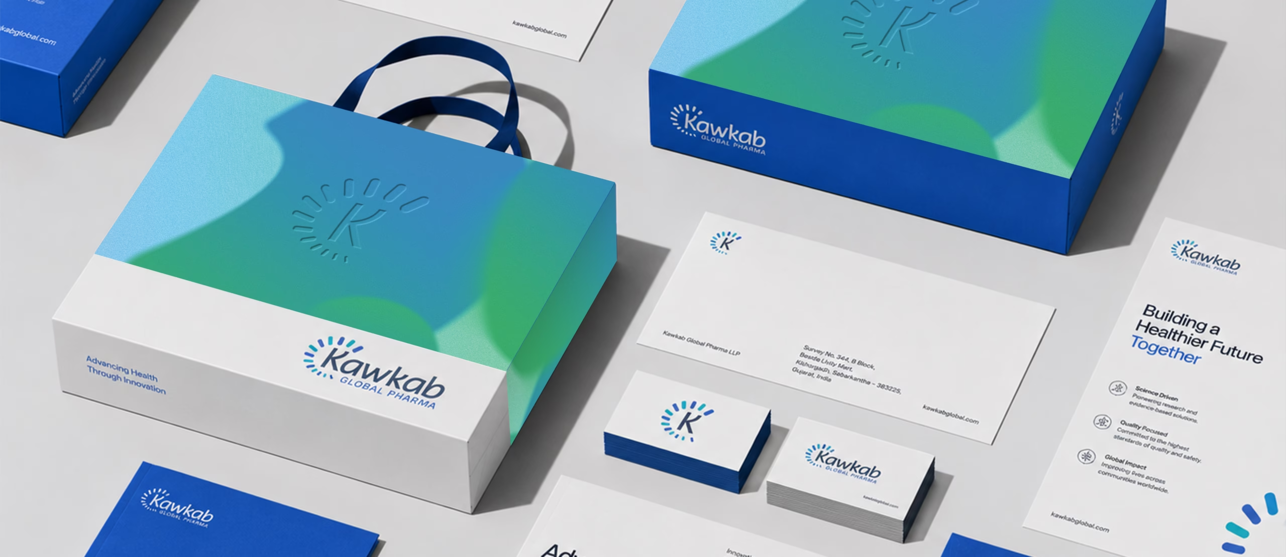
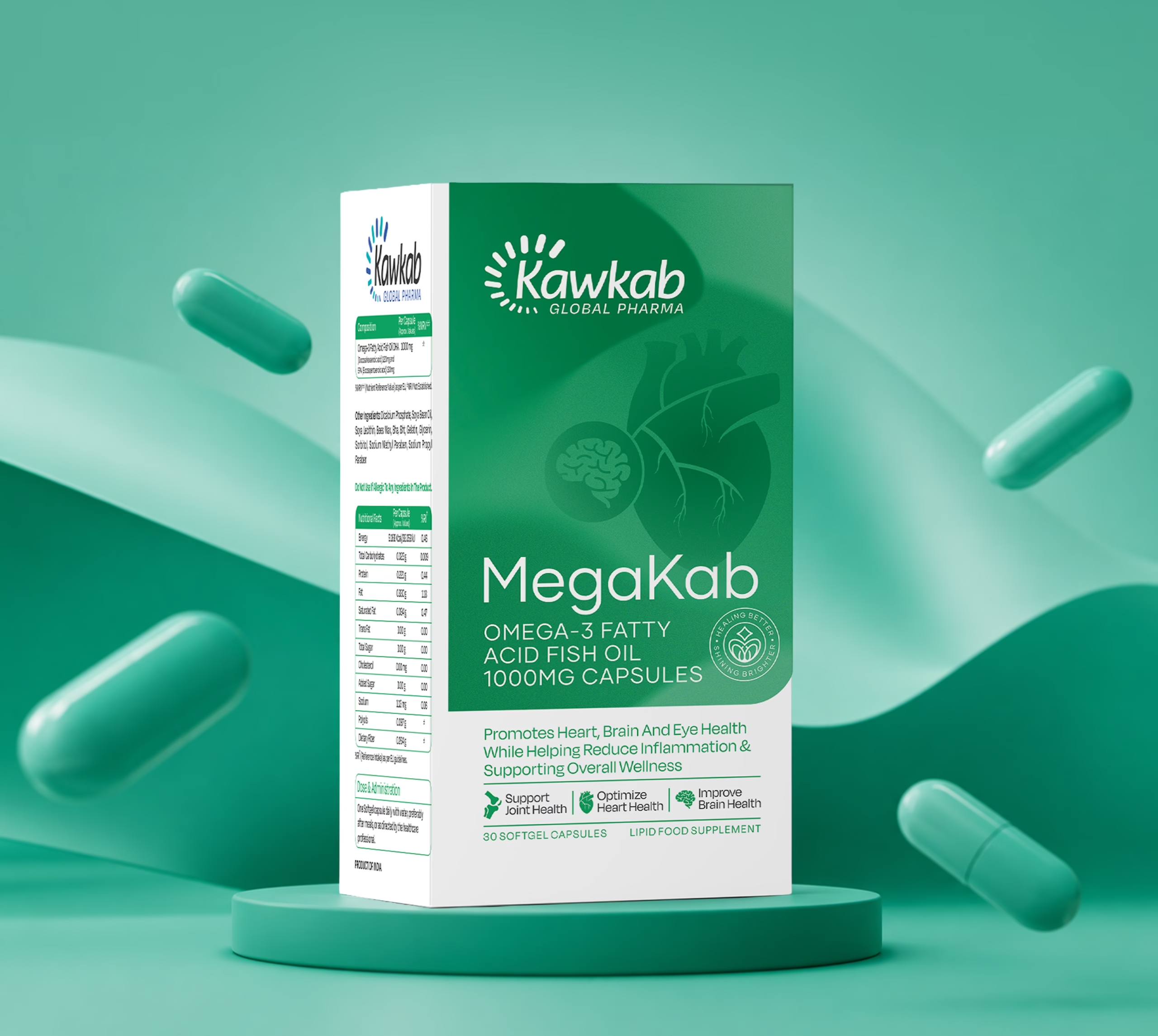
Crafting a High Impact and Experience Driven Identity for Kawkab
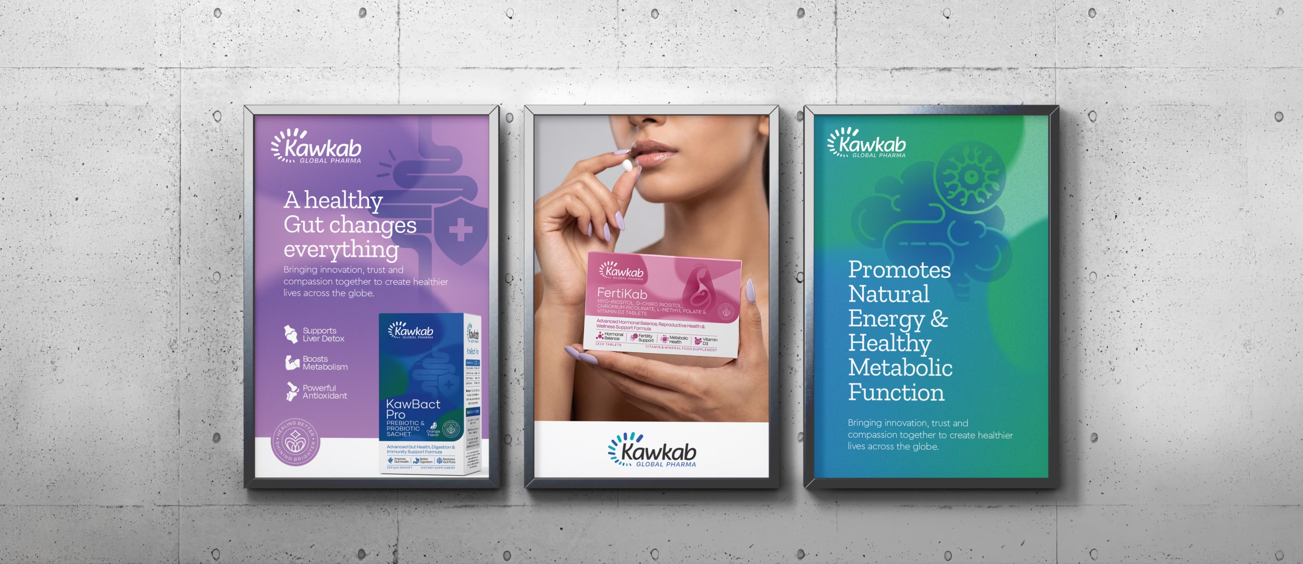
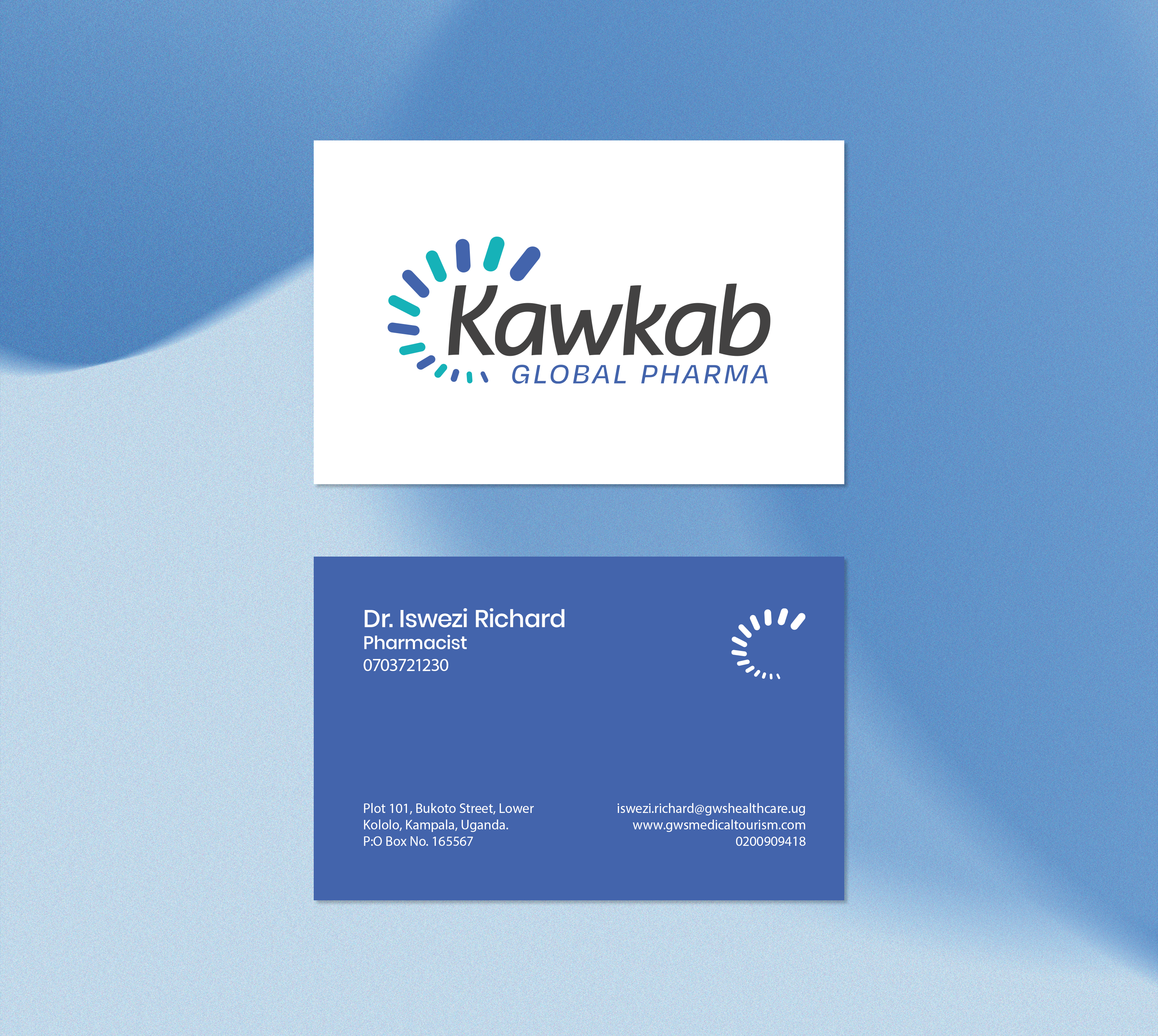
Richest Branding developed a precise, high-trust visual identity system for Kawkab Global Pharma that works seamlessly across packaging, export documentation and digital presence. We crafted a clinical yet approachable design language, structured layouts and a controlled colour system to reflect the brand’s credibility and global reach.
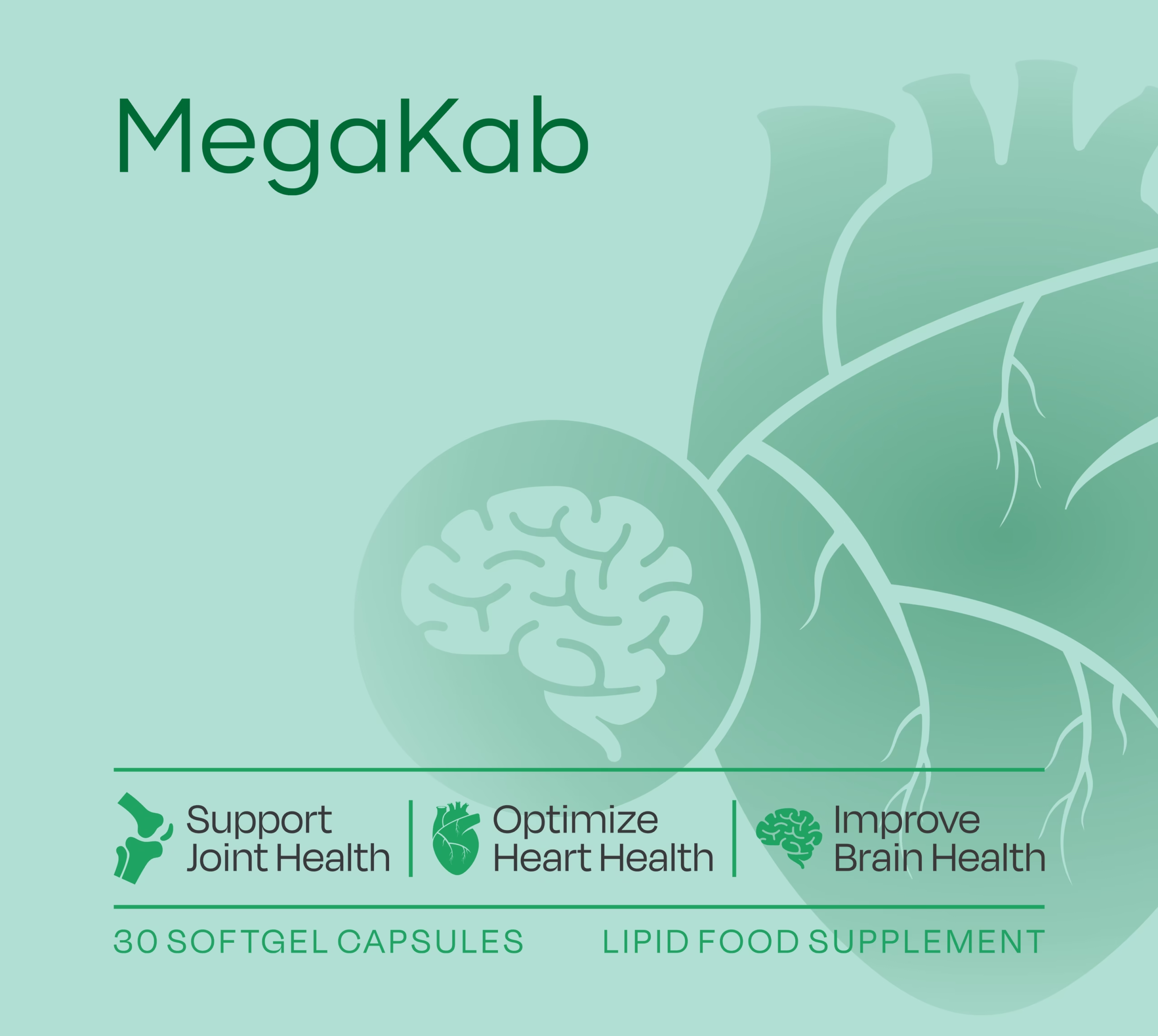
The communication system features clean typography, a disciplined colour palette and packaging architecture that stays consistent across every product category. Each execution reinforces trust, compliance and recognition, positioning Kawkab as a dependable, quality-first choice for pharmacy buyers and distributors across every market it serves.
What's Next