Mowglis & Cafe
Mowglis & Cafe
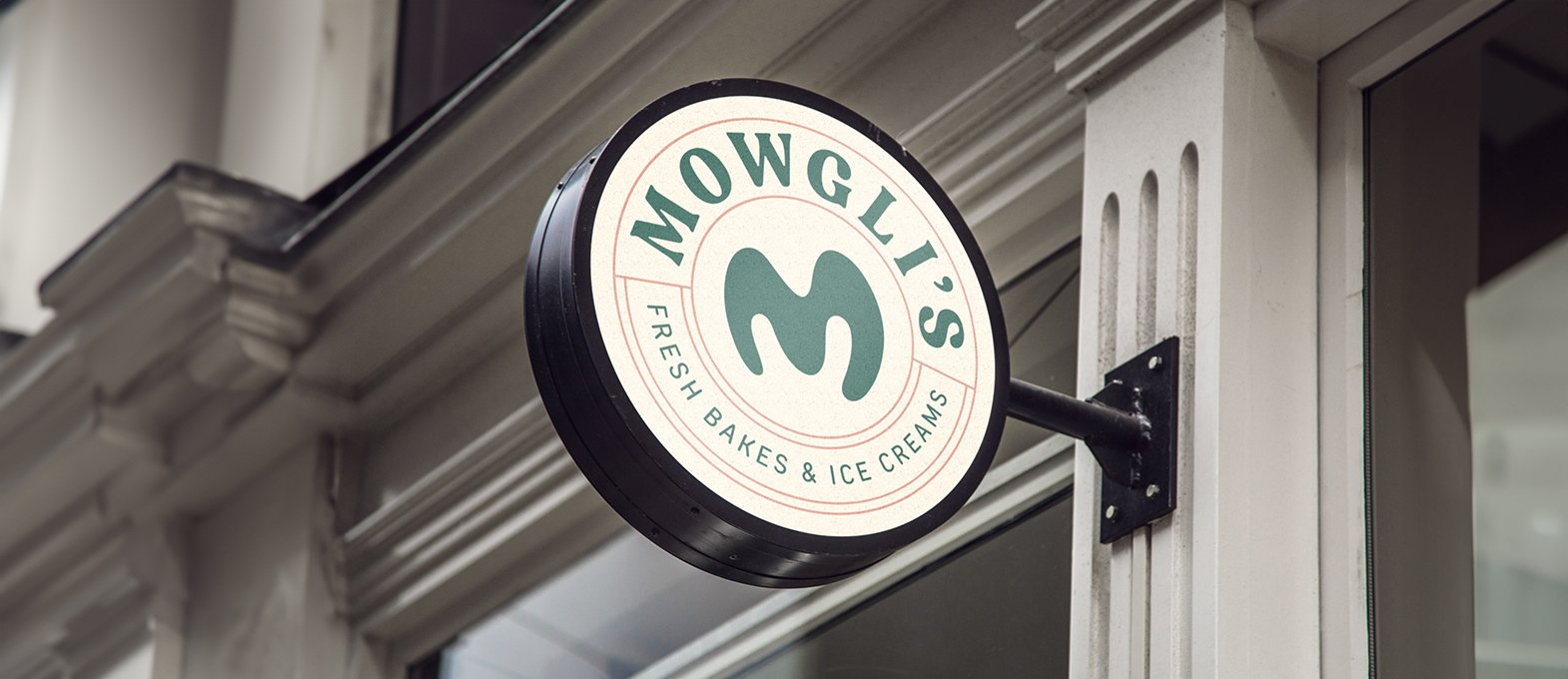
Mowglis is an ice cream brand built around indulgence, fun and bold flavour appeal. The brand needed a visual identity and packaging system that could make each flavour feel exciting, premium and easy to spot on shelf. Richest Branding partnered with Mowglis to create a fresh and playful branding system that brings together appetite appeal, clarity and strong retail presence.
Industry
Services
Challenge
Mowglis needed an identity that could stand out in a crowded ice cream market where the freezer shelf gives very little time to impress. The challenge was to create packaging that feels delicious, modern and easy to recognise while still giving the brand its own distinct personality. It also had to communicate flavour clearly and make each variant feel like part of one strong brand family.
Approach
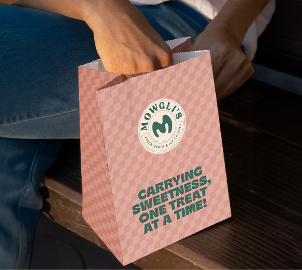
We focused on three ideas: taste, freshness and shelf appeal. A bright colour system, bold typography and flavour-led packaging cues helped give the brand a clear and attractive look. The design approach was kept lively and simple so the product feels tempting, memorable and easy to shop.
Process
We began by studying the ice cream range, flavour names and the kind of visual cues that would work best in the freezer environment. From there, we developed a packaging structure that highlights flavour, product appeal and brand recognition in a direct way. The identity was then extended across packs and supporting brand materials to keep the look consistent and easy to spot.
Result
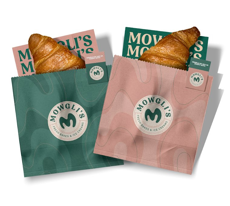
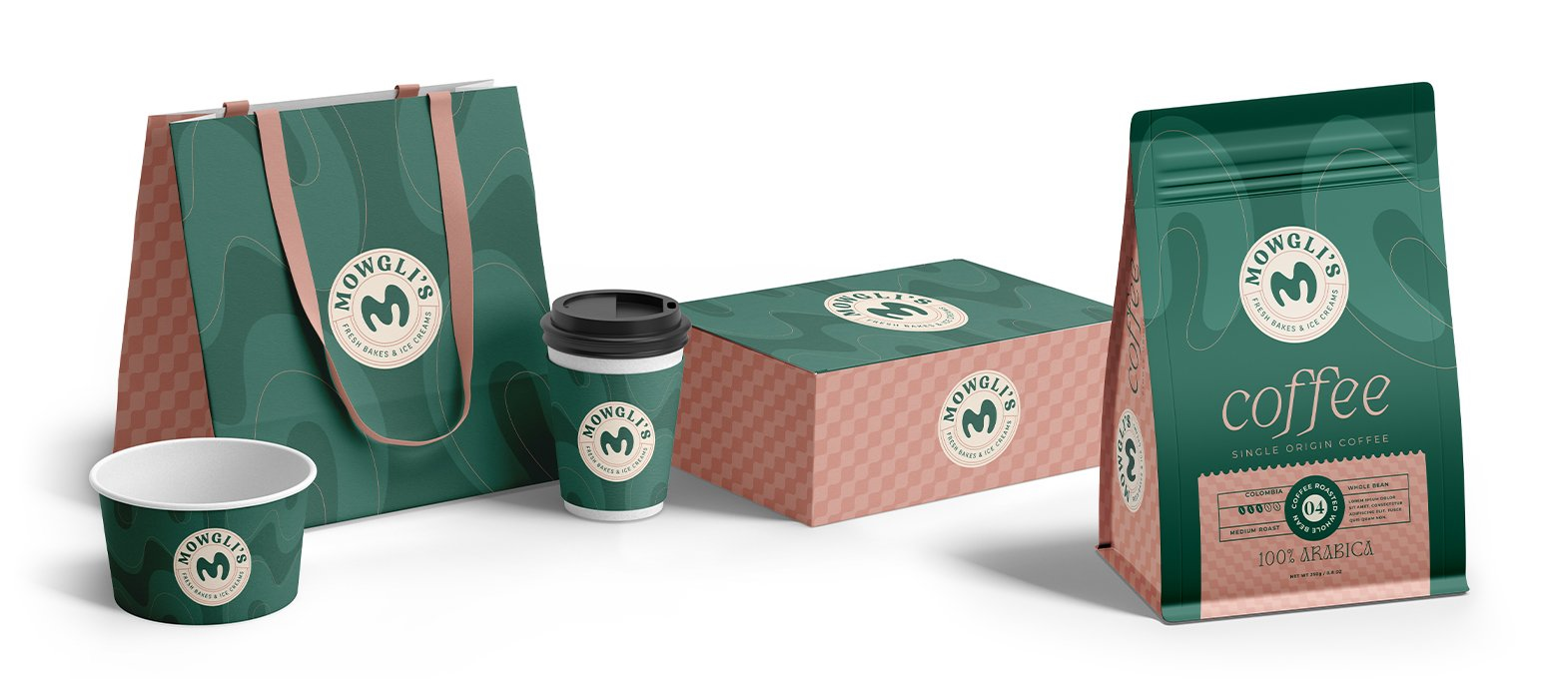
Mowglis now has a packaging system that gives every flavour its own appeal while keeping the full range visually connected. The packs feel fresh, bold and easy to notice, helping the brand build a stronger presence in a competitive category.
The brand today reads as playful, appetising and premium enough to win attention quickly, exactly what an ice cream brand needs to drive trial and repeat purchase.
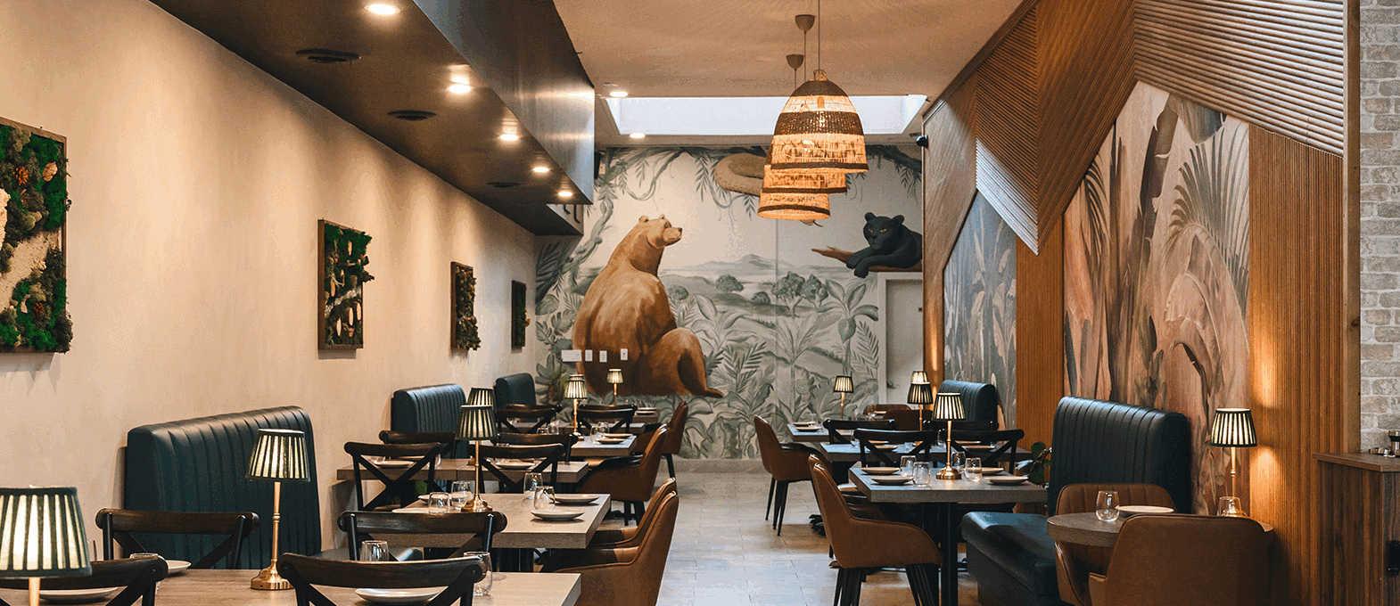
Crafting a High-Impact and Experience-Driven Identity for Mowglis
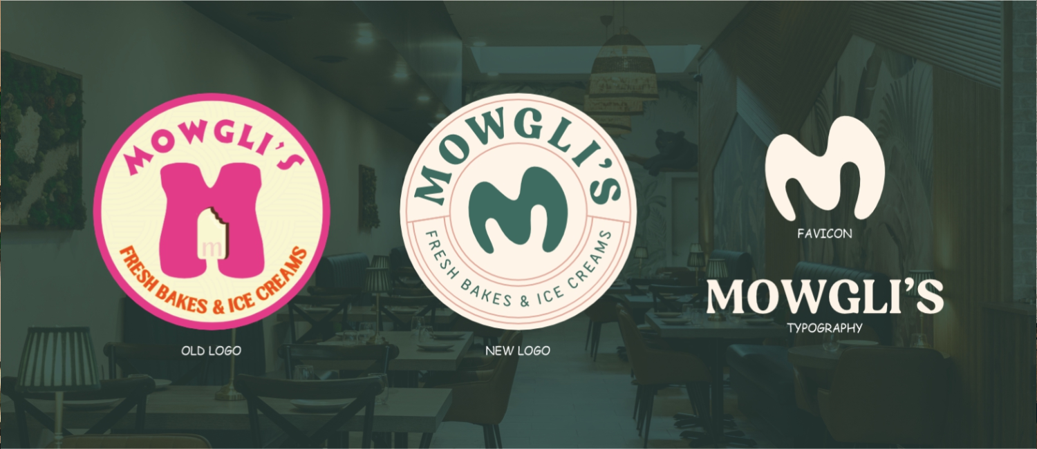
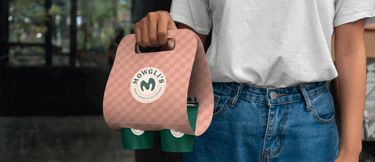
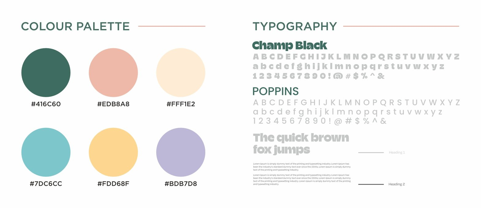
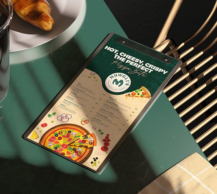
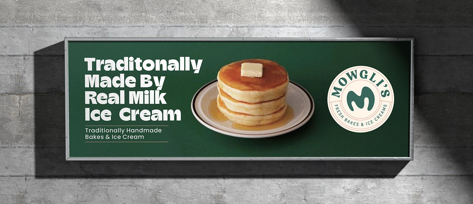
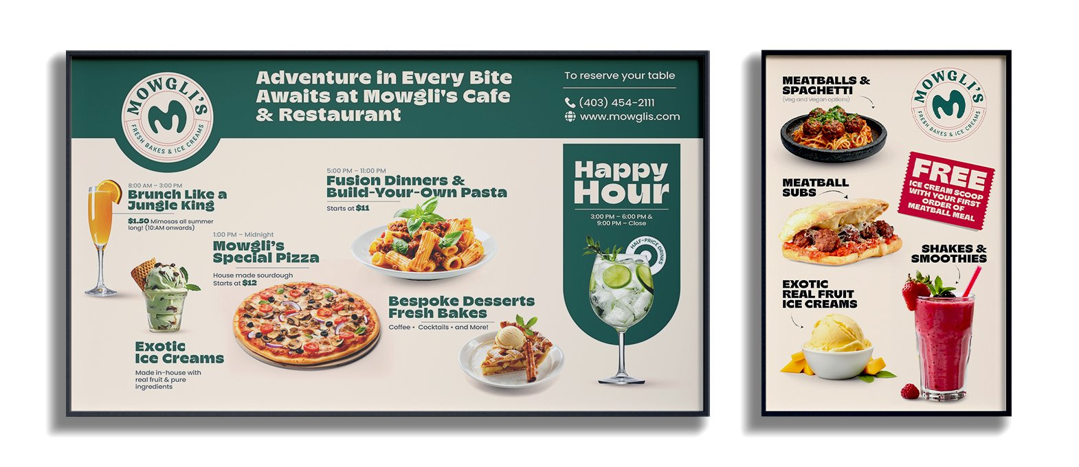
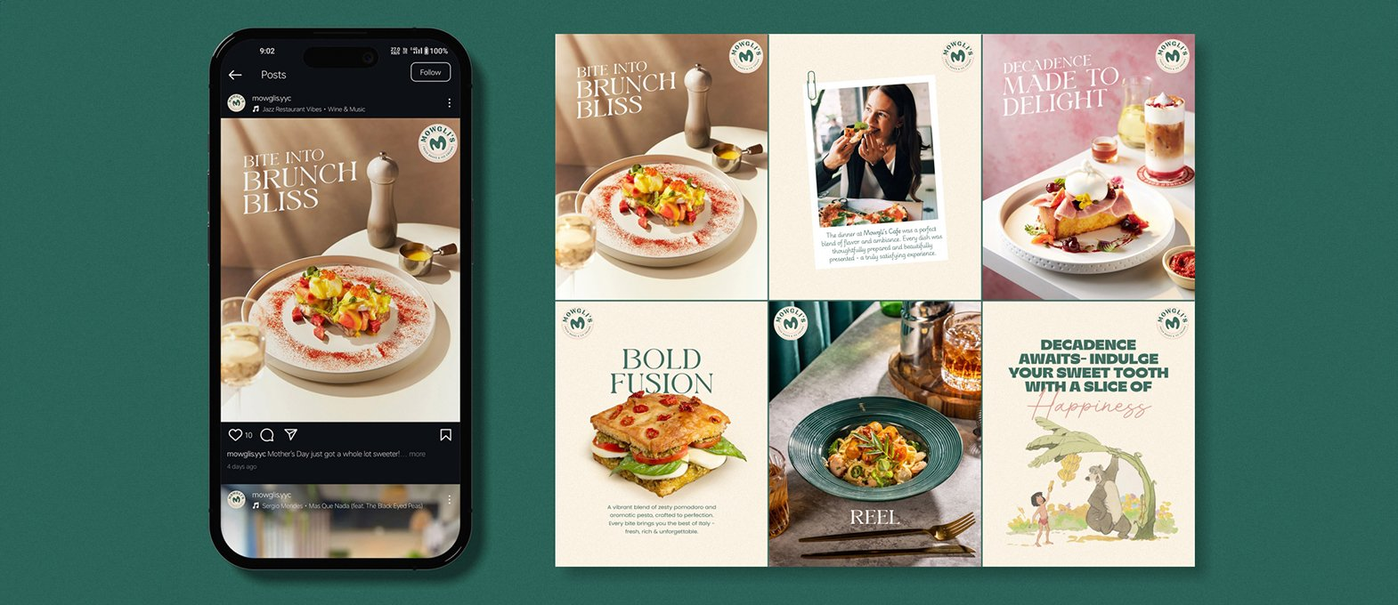
Richest Branding developed a flavour-led identity system for Mowglis that works across packaging, digital and brand communication. We created a bright design language, strong colour palette and clean typography to reflect the brand’s focus on ice cream, flavour and visual appeal.
The communication system keeps the product easy to understand and easy to remember. Each detail supports flavour recognition and shelf impact, positioning Mowglis as an ice cream brand built for modern retail.
What's Next