Rootin
Rootin
Rootin is a preserved food brand built around convenience, quality and everyday usability. With a product range that includes baby corn, olives, pineapple slices, jalapeño, baked beans and other ready-to-use food essentials, the brand needed a visual identity that could feel clean, dependable and easy to trust. Richest Branding partnered with Rootin to create a practical packaging system that brings clarity, freshness and shelf appeal to a category where consistency matters.
Industry
Services
Challenge
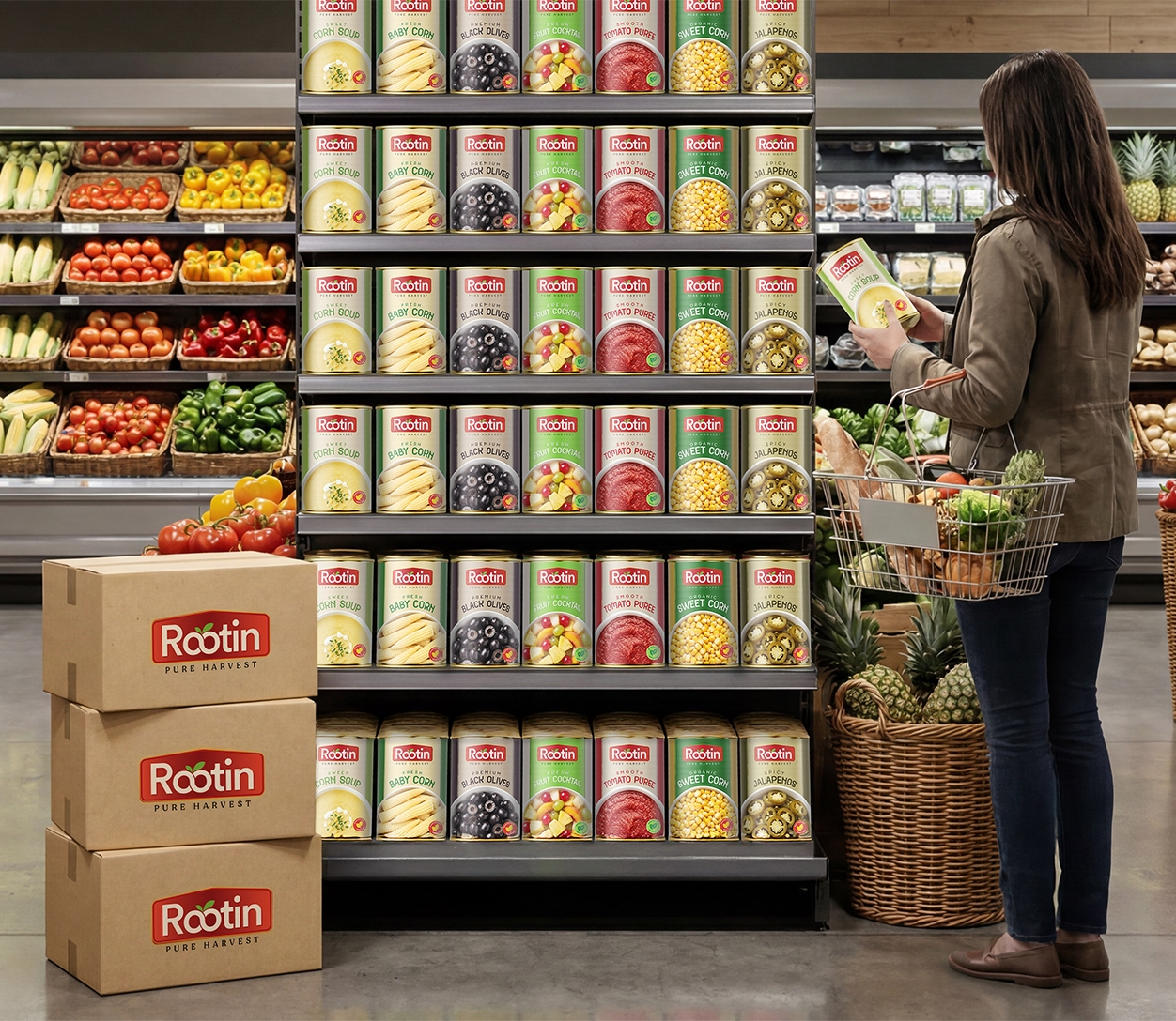
Rootin operates in a category where buyers look for quick recognition, product clarity and confidence in quality. The brand needed an identity that could make a range of preserved food items feel organised and easy to navigate while still standing out on crowded supermarket shelves. The challenge was to build packaging that feels fresh, reliable and versatile across different products without losing a coherent brand system.
Approach
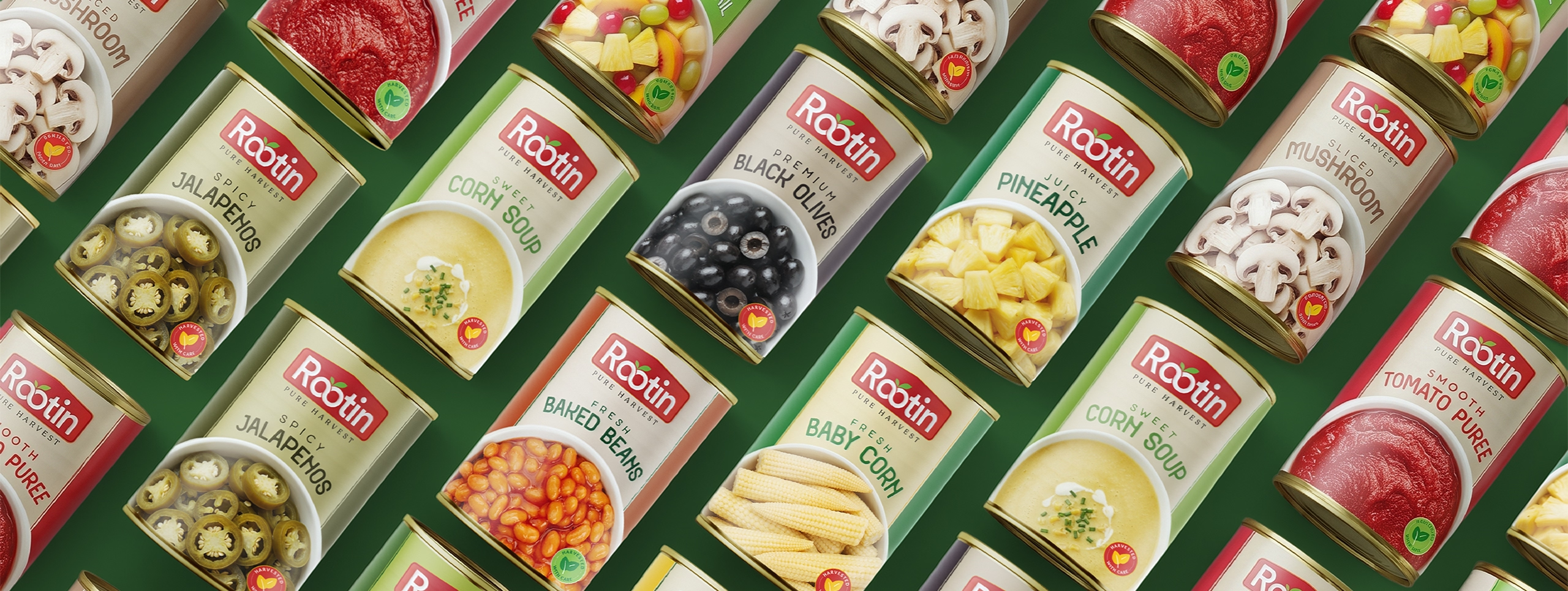
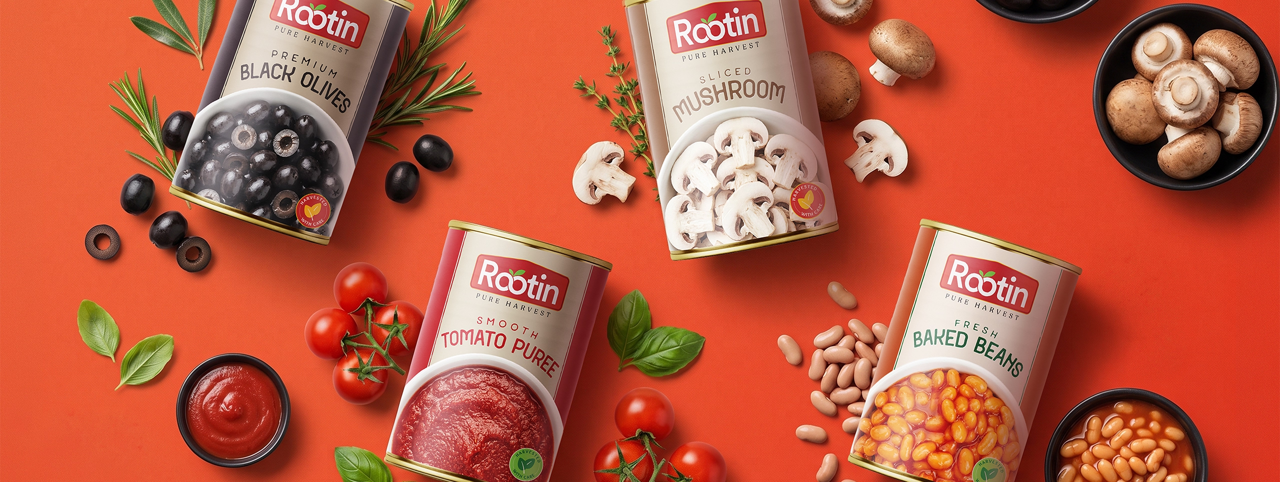
We anchored the identity in three core ideas: freshness, clarity and trust. A clean, product-led visual language, a structured colour system for easy flavour and category distinction, and typography that feels straightforward and modern. The approach focused on making every pack informative, visually balanced and commercially strong at shelf level.
Process
We began by mapping Rootin’s product range to understand how each item, from vegetables to fruits to legumes, could be visually differentiated while staying within one system. From there, we developed a packaging architecture that clearly highlights product name, imagery and category cues. The identity was then extended across labels and digital assets to ensure every touchpoint felt practical, consistent and easy to shop.
Result
Rootin now has a packaging system that gives each product its own clarity while keeping the full range visually connected. The packs feel organised, fresh and dependable, helping the brand earn trust quickly in a competitive retail environment.
The brand today reads as practical, reliable and easy to recognise, exactly what a preserved food brand needs to win repeat purchase and build long-term shelf confidence
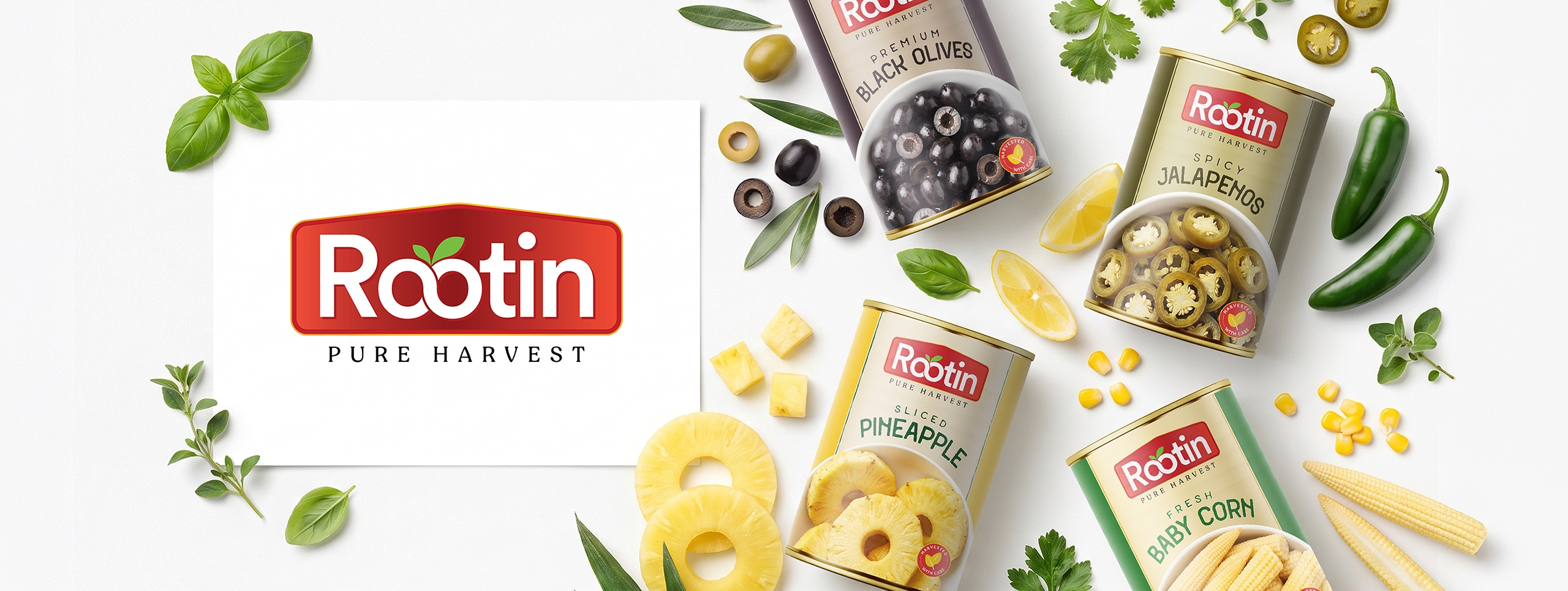
Crafting a High-Impact and Experience-Driven Identity for Rootin
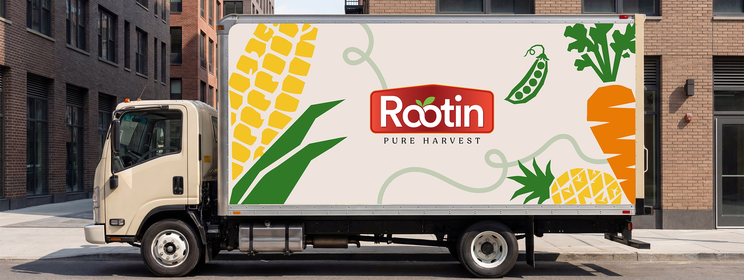
Richest Branding developed a clean, retail-ready visual identity system for Rootin that works seamlessly across packaging, labels and digital communication. We created a structured design language, product-specific colour cues and clear layouts to reflect the brand’s focus on convenience, quality and everyday food essentials.
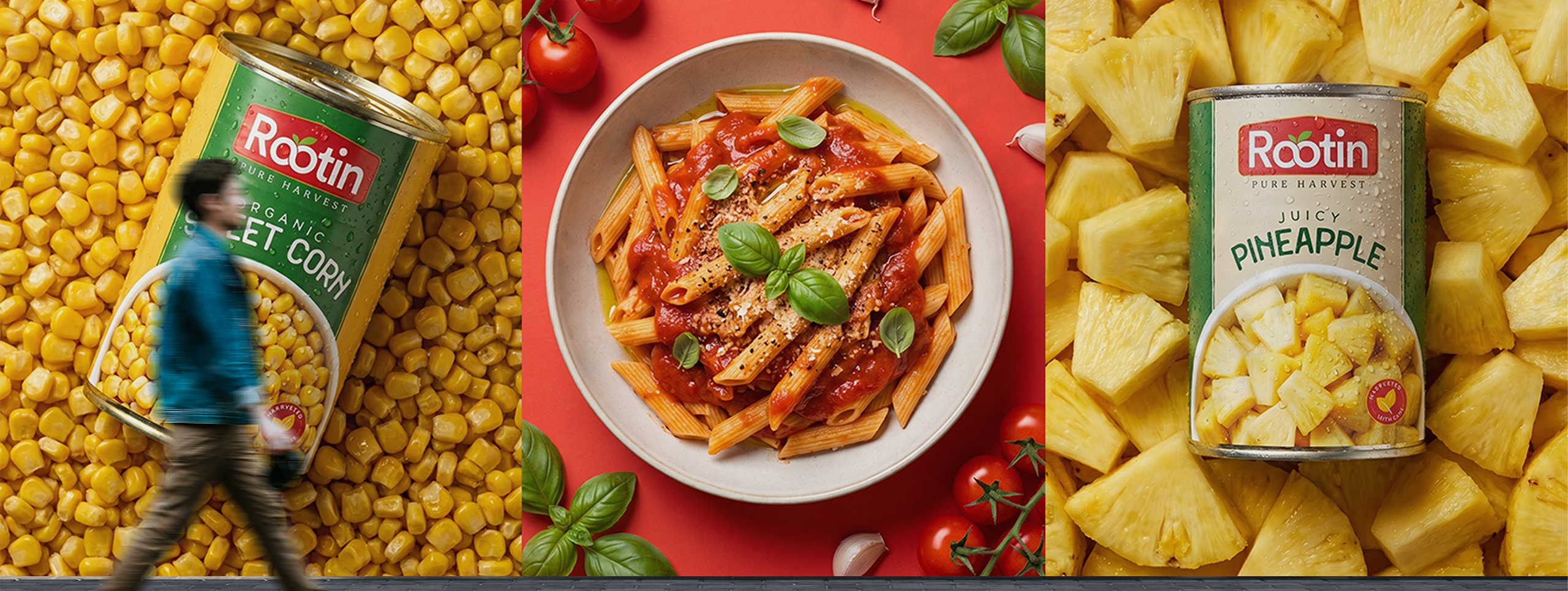
The communication system features strong product hierarchy, fresh visual cues and packaging architecture that keeps every item easy to identify while staying true to the core brand story. Each execution reinforces clarity, trust and recognition, positioning Rootin as a dependable brand for preserved foods and pantry staples.
What's Next