
SaveGrid Energy
SaveGrid Energy
Savegrid is a solar energy brand built around clean power, reliability and practical energy solutions. The brand needed a visual identity that could reflect trust, efficiency and modern technology while staying clear and easy to understand. Richest Branding partnered with Savegrid to create a strong branding and communication system that brings solar energy to life in a simple and confident way.
Industry
Services
Challenge
Savegrid needed an identity that could stand out in a growing solar market where buyers look for trust, clarity and long-term value. The challenge was to build a brand that feels modern and dependable while making the service easy to understand for both residential and commercial customers. It also had to work across digital, marketing and brand communication without losing consistency.
Approach
We focused on three ideas: clean energy, trust and clarity. A fresh colour palette, simple typography and a strong logo direction helped shape a brand that feels reliable and future-ready. The visual language was kept direct and practical so the brand feels easy to trust and easy to remember.
Process
We studied the solar market and how customers evaluate energy brands, then built a system that highlights clarity, performance and reliability. From there, we developed the logo, colour system and communication style to keep the brand consistent across digital platforms, marketing materials and brand assets.
Result
Savegrid now has a visual identity that feels clear, modern and trustworthy across every touchpoint. The brand stands out with a clean and confident look that supports its solar energy offering.
The brand today reads as dependable, future-focused and built for real energy needs, exactly what a solar brand needs to earn trust and grow.
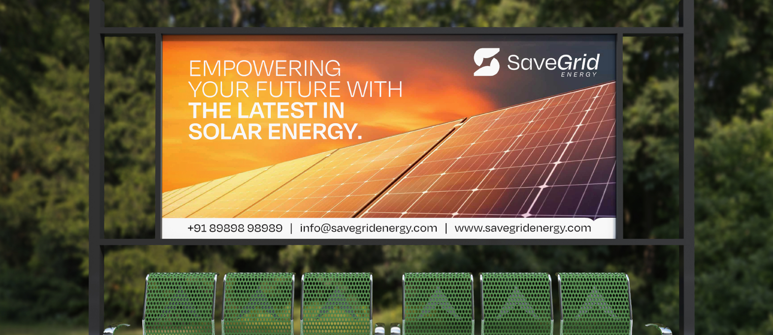
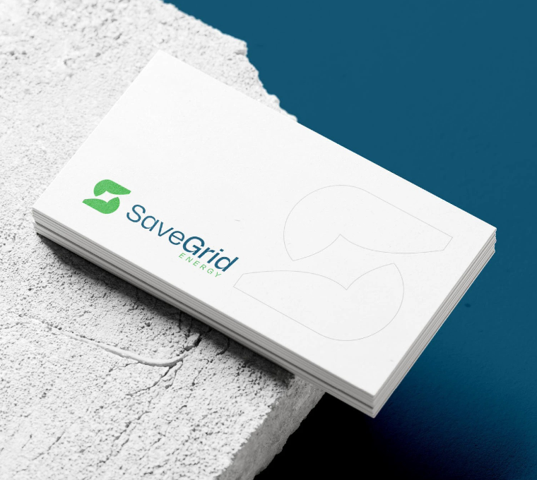
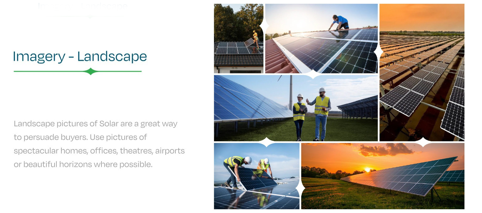
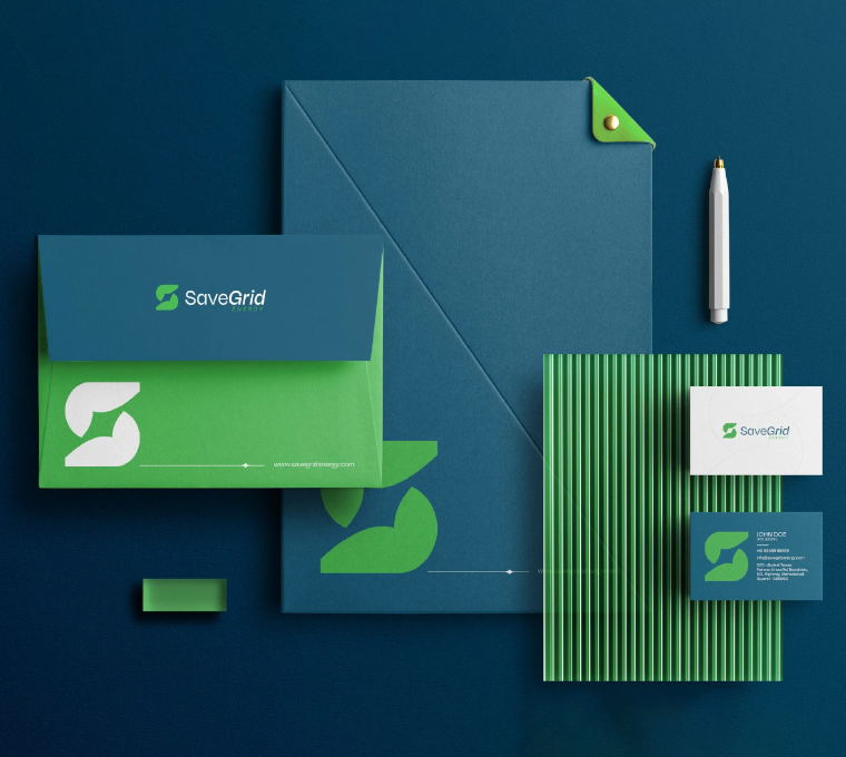
Crafting a High-Impact and Experience-Driven Identity for Savegrid
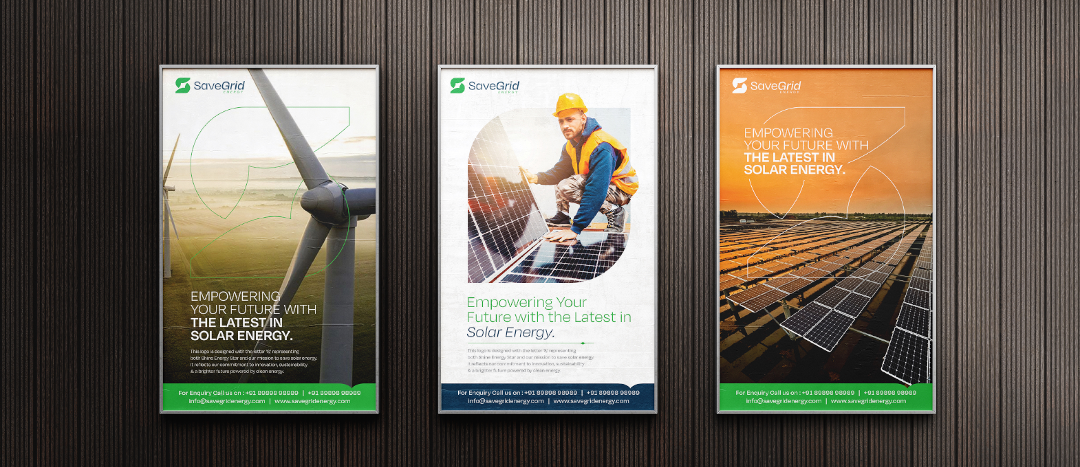
Richest Branding developed a clear and modern identity system for Savegrid that works across digital, marketing and brand communication. We created a simple design language, fresh colour palette and clean typography to reflect the brand’s focus on solar energy, efficiency and trust.
What's Next