Wildora Honey
Wildora Honey
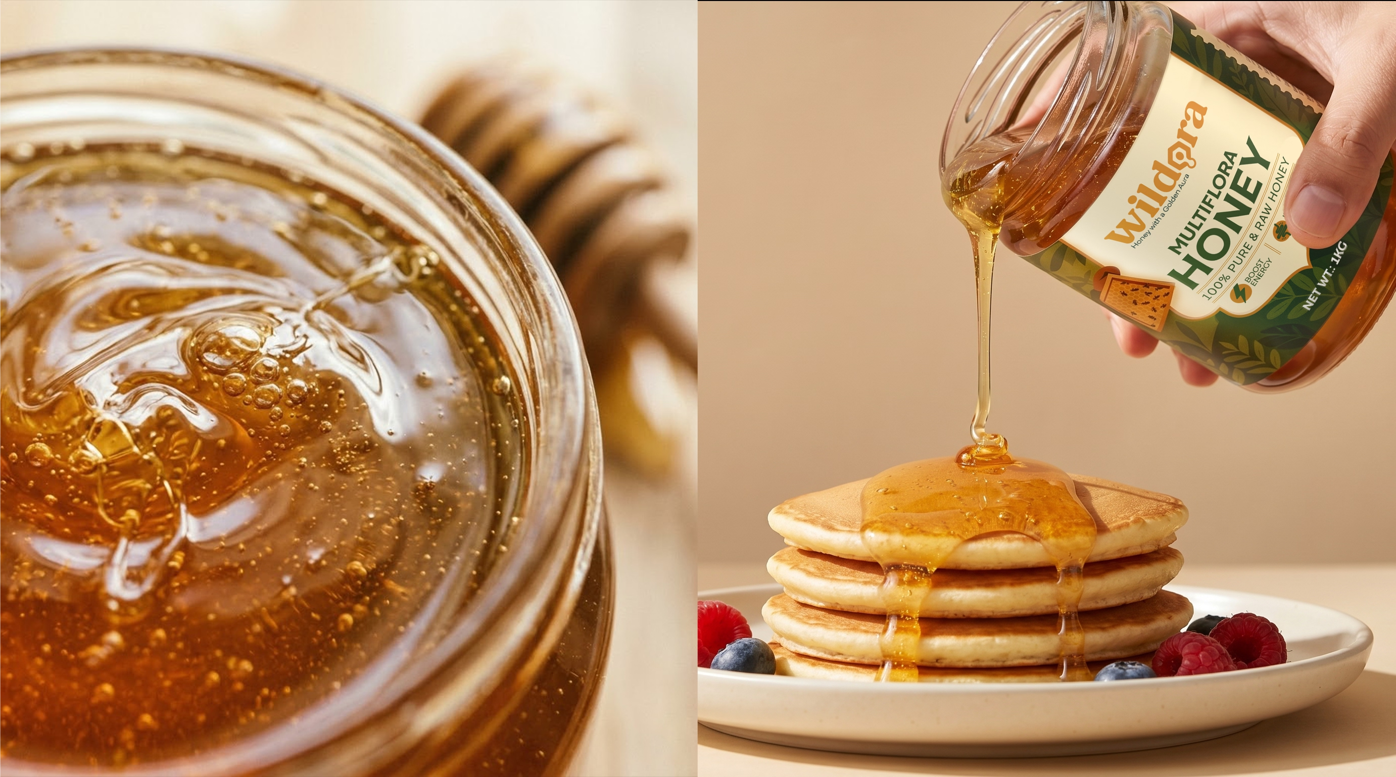
Wildora is a raw multiflora honey brand built around purity, origin and everyday nourishment. The brand needed a visual identity that could reflect the richness of natural honey while feeling clean, trustworthy and premium on shelf. Richest Branding partnered with Wildora to create a warm, grounded branding and packaging system that brings together nature, quality and product clarity.
Industry
Services
Challenge
Wildora needed an identity that could make raw multiflora honey feel distinct in a category where many brands look similar. The challenge was to create packaging that communicates natural purity, product value and shelf appeal without relying on overused rustic visuals. It also had to feel modern enough for today’s buyer while still staying true to the raw, honest character of the product.
Approach
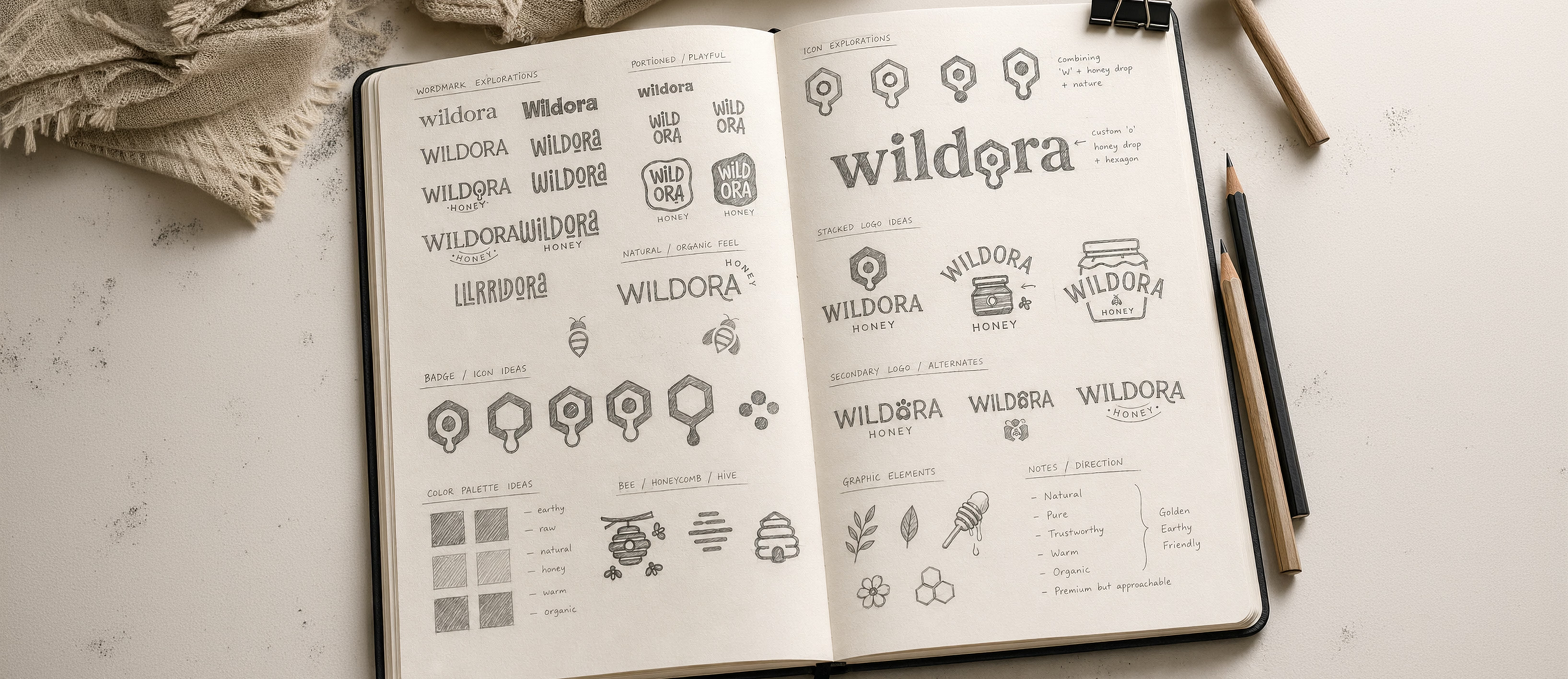
We anchored the identity in three ideas: purity, origin and warmth. A natural colour palette inspired by honey, clean typography and a packaging style that feels honest and premium helped shape the visual language. The approach was kept simple and direct so the product could feel fresh, real and easy to trust.
Process
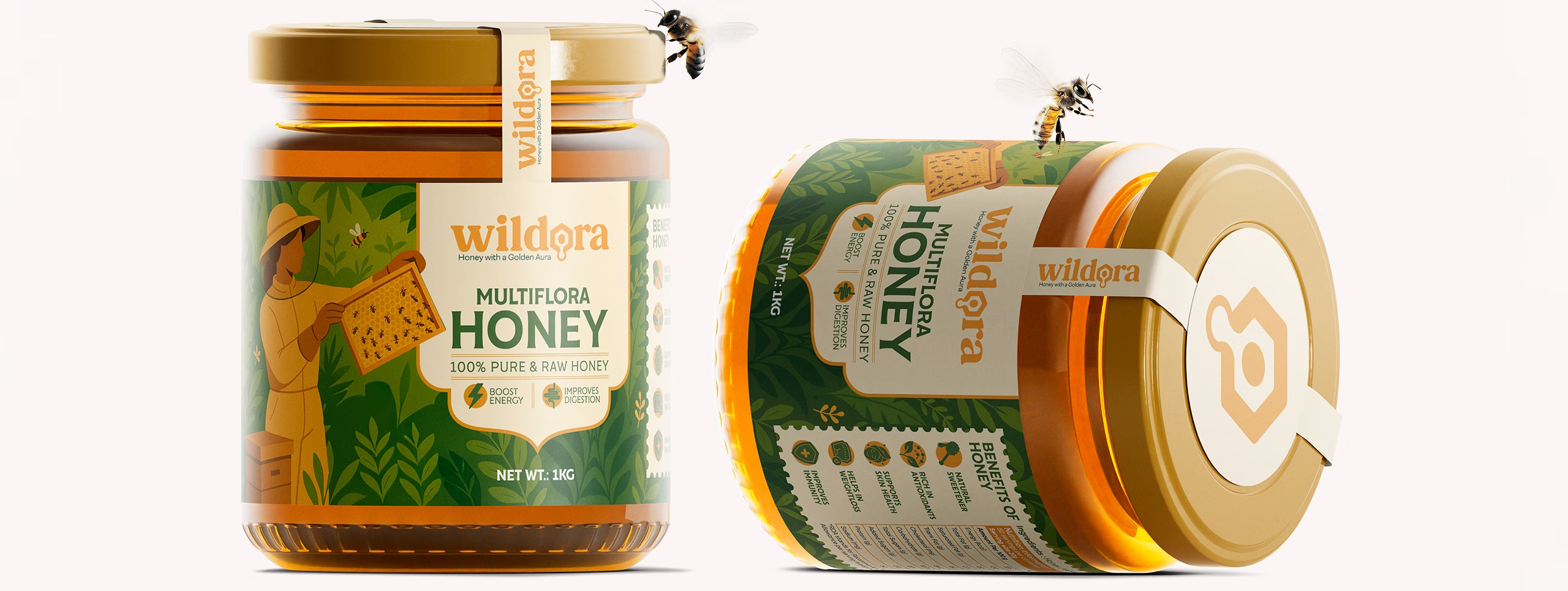
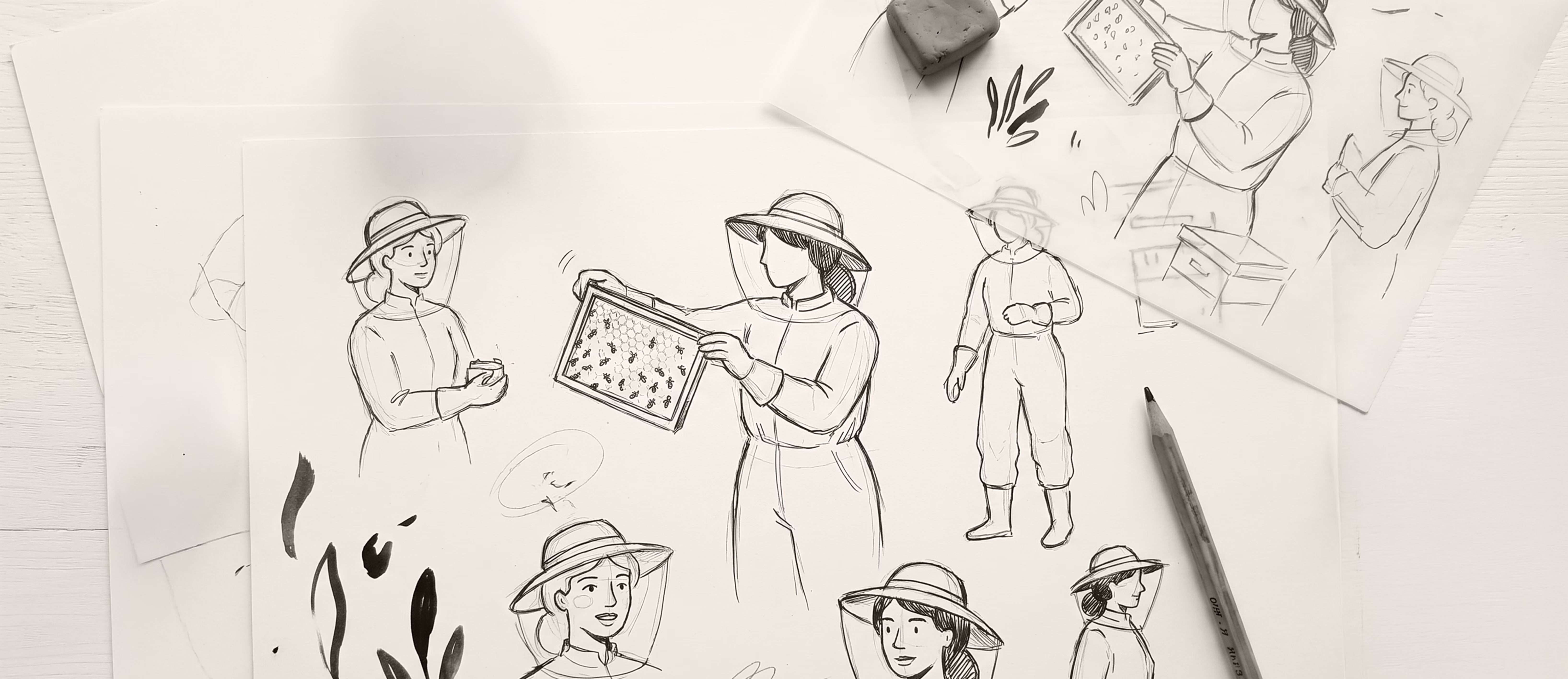
We began by understanding Wildora’s honey story, the source of the product and the kind of buyer it needed to reach. From there, we built a logo and packaging system that highlights the natural character of the honey and makes the product easy to identify. The identity was then extended across labels and digital touchpoints to keep the brand consistent and recognisable.
Result
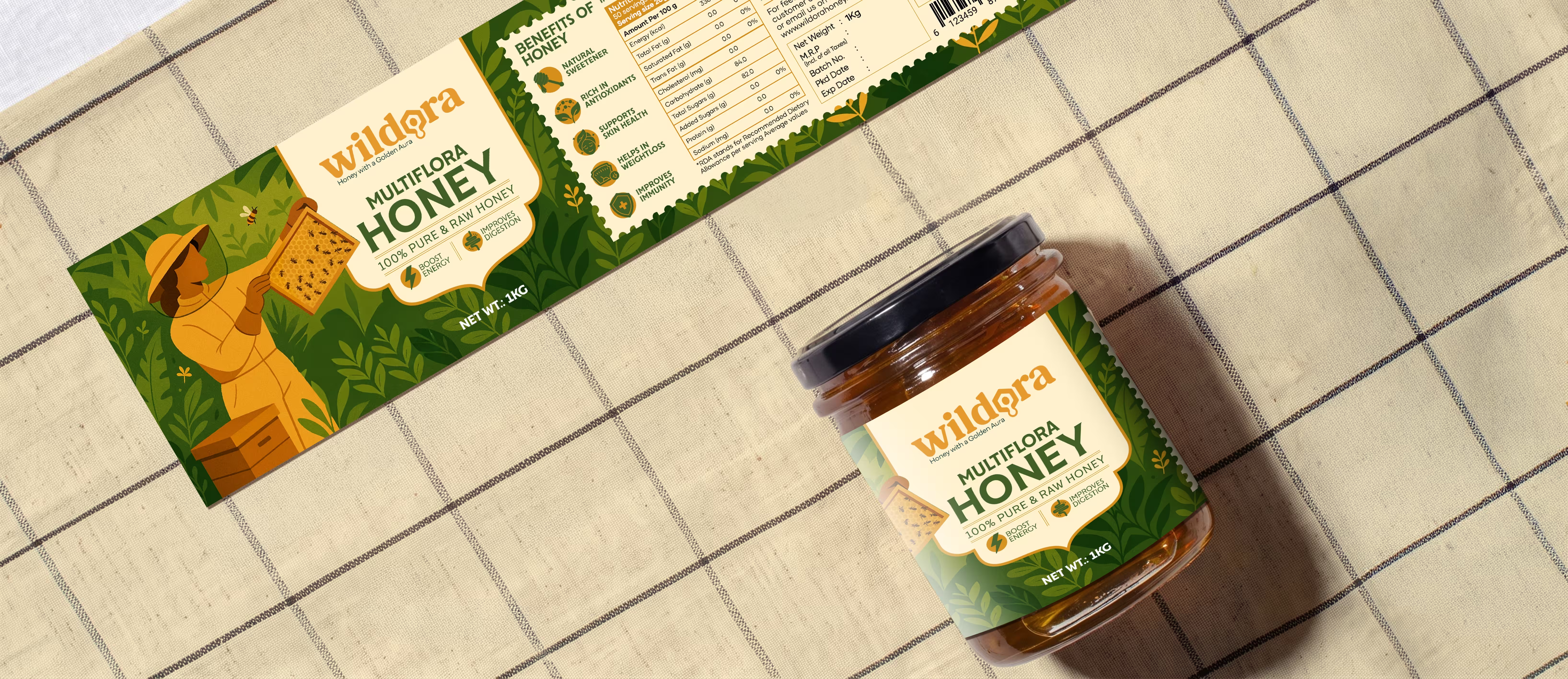
Wildora now has a packaging system that gives the honey a premium and trustworthy presence across every touchpoint. The product feels clean, natural and easy to remember, helping the brand stand out in the raw honey category.
The brand today reads as pure, refined and dependable, exactly what a honey brand needs to build trust and repeat purchase.

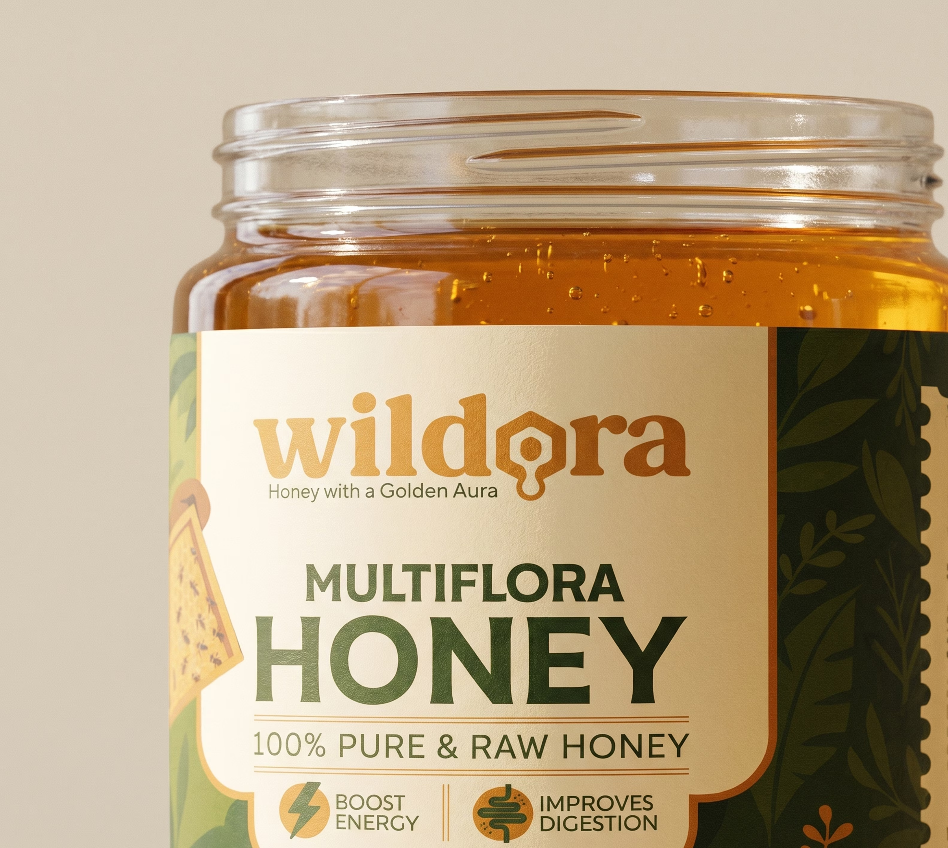
Crafting a High-Impact and Experience-Driven Identity for Wildora
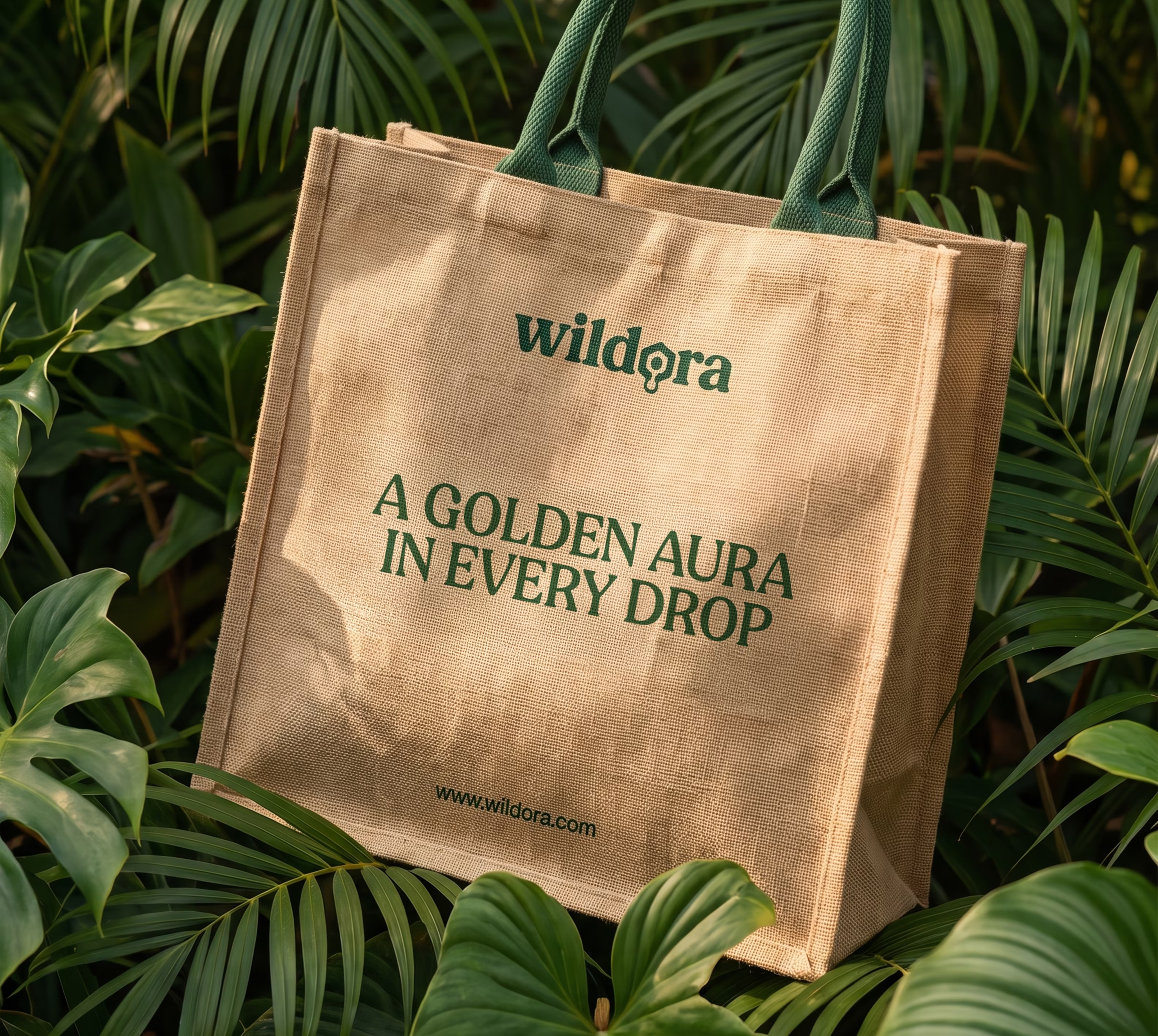
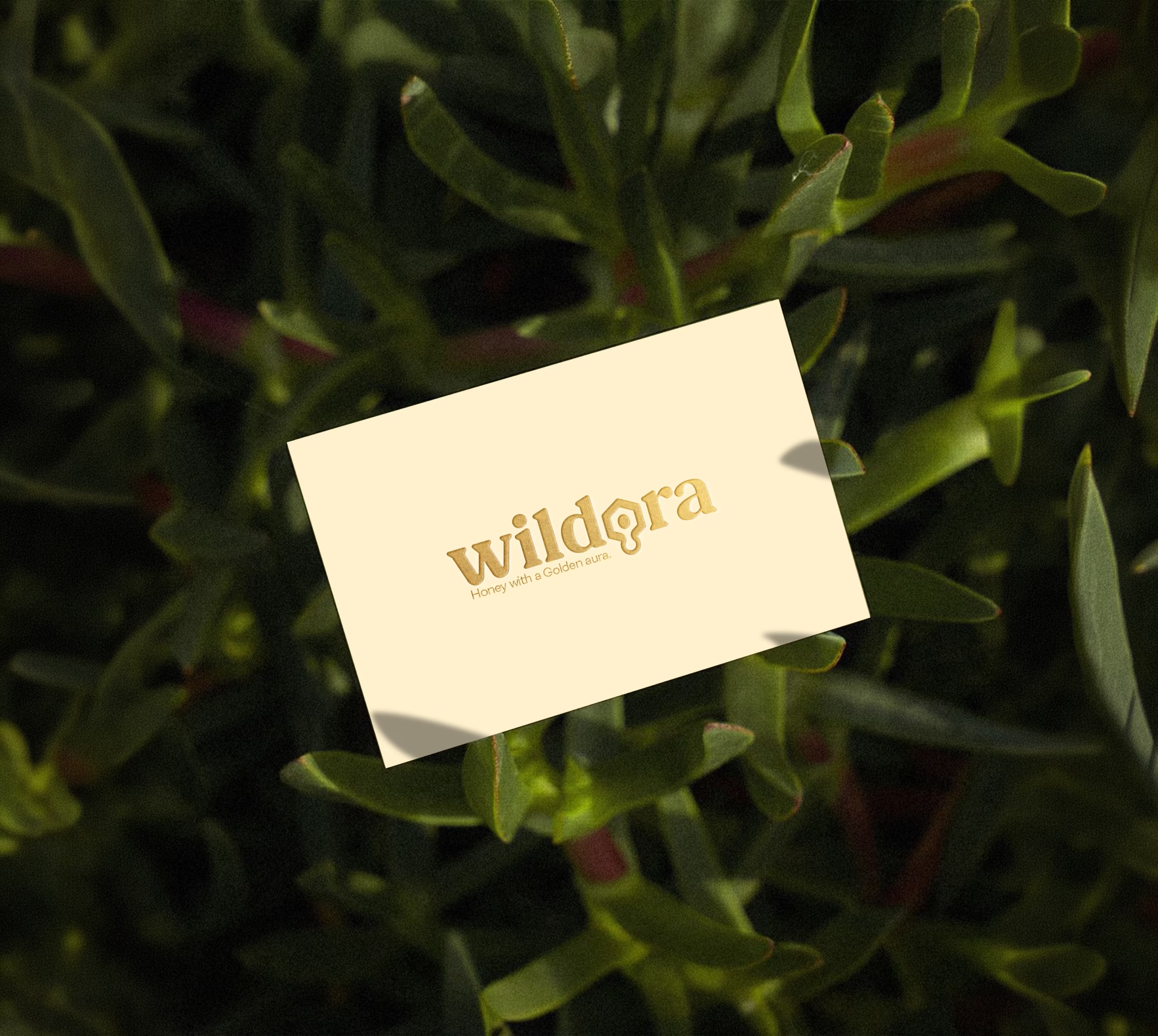
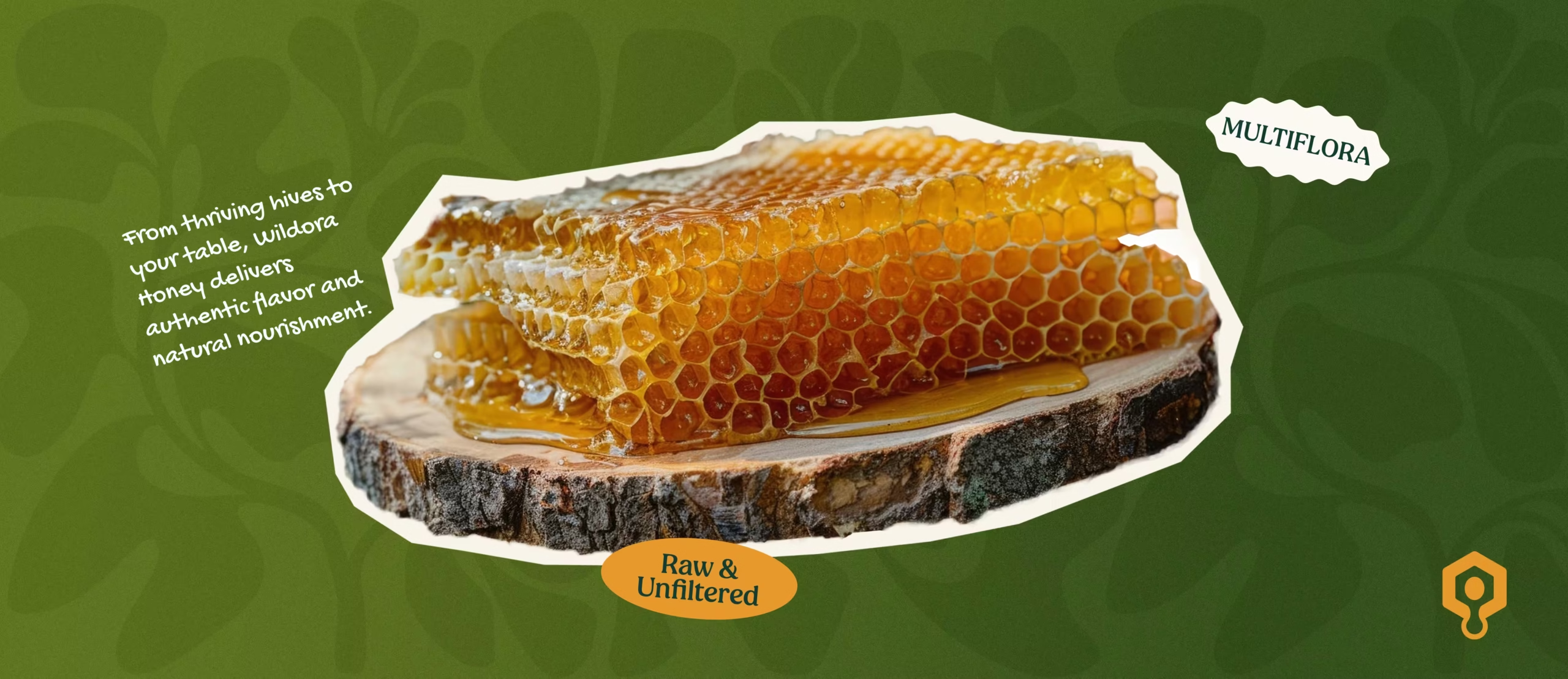
Richest Branding developed a natural, product-focused identity system for Wildora that works seamlessly across packaging, digital and brand communication. We created a warm design language, earthy colour palette and clean typography to reflect the brand’s focus on raw honey, purity and everyday use.
The communication system keeps the product clear and easy to trust. Each detail reinforces origin, quality and recognition, positioning Wildora as a raw honey brand made for modern shelves.


What's Next